


In the modern enterprise, end-users, ranging from internal employees to customers, struggle with digital processes that span multiple applications and are subject to constant change. Users often improvise throughout unclear flows, which results in lost productivity, inaccurate or misleading data capture, and low user adoption that affects your organization’s business KPIs.
According to SQ Magazine’s recent SaaS report, even when a new enterprise software implementation is high, as many as 75% of end-users fail to realize full adoption post-onboarding and end-user training. Furthermore, overall adoption suffers when usage is inconsistent or unrelated to specific roles and use cases.
With so much at stake, how can your organization avoid these common pitfalls in the enterprise? User flow optimization provides a governance function that positively influences compliance, productivity, and digital transformation outcomes by enabling end-users with contextual guidance in the flow of work and hands-on learning opportunities to become confident power users.
In this guide, we’ll walk you through a step-by-step flow optimization process that empowers your user base to be well-informed and more likely to complete the tasks that fuel adoption and your business goals.
With Whatfix as your partner, you’ll use our simple framework to create elegant user flows that include onboarding that leads users to their aha! moment fast, accurate data capture, resources that empower your users to succeed autonomously, and more.
What Is the Difference Between User Flows and User Paths?
Before we dive into our step-by-step user flow optimization framework, let’s clarify some key terms and concepts that are essential to understanding throughout the process.
User flows
User flows refer to the intended steps for completing tasks within an application.
Often, enterprise teams design flows without validating real user behavior or cross-app dependencies, which results in flows that don’t align with user needs or perceptions. Flows are prescriptive; they reflect how product owners want processes to occur. When we optimize user flows, we create harmony between those intended flows and user behavior.
With tools such as Whatfix, you can avoid this common issue by guiding users step-by-step, keeping them aligned with the intended workflow through contextual in-app guidance that governs workflows and assists users in the moment of need.
User paths
User paths refer to the actual routes that users take in any given workflow, which often highlight confusion, workarounds, and inefficiencies.
Comparing your ideal user flows to actual user paths is critical for uncovering hidden friction, because it tells you where your platform diverges from what users know and assume. For example, if you see that users drop off at a given point in a user flow and take a different path, you can iterate on this point in the flow by providing on-the-spot guidance to help users take the appropriate action and succeed in the task at hand.
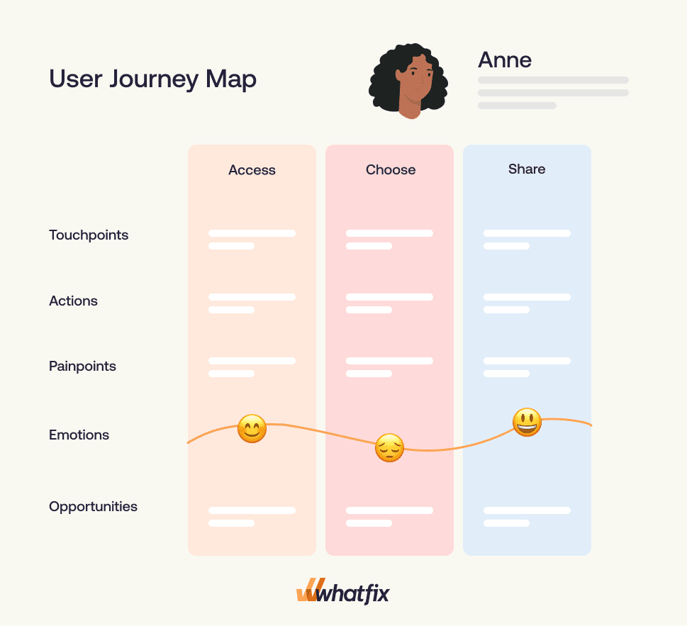
Journey mapping
Journey mapping is an exercise that enables your team to visualize the higher-level, cross-application process needed for end-to-end governance.
For example, if you create a user journey map for a sales-to-renewal user flow, your entire team will see and understand:
- Every step that users and your internal team need to take, in chronological order, to bring a customer from their first touchpoint with your sales rep to their first renewal
- All compliance guidelines and requirements for each step of the process
- Every application or platform involved in each step that your users and/or internal teammates need to take
By visualizing this journey as a source of truth, you can ensure that all of your internal teams understand what they need to do, and what users need to do, to keep things running smoothly.
Together, user flows, user paths, and journey maps are one discipline: designing, analyzing, and governing digital workflows. None of these is effective without the others, but they form an elegant way of bringing it all together.
Digital-first enterprises choose Whatfix to bridge these approaches by combining prescriptive guidance to your employees and customers with our digital adoption platform (DAP), along with behavioral analytics that guide your iterations and help you define success. In the framework introduced later in this guide, you’ll learn more about how to do this in practice.
Why User Flow Optimization Matters for Enterprises
Enterprises make decisions based on north-star goals driven by business outcomes. CIOs are concerned about governance, risk reduction, and measurable ROI. Application owners want visibility into performance and friction that drive impactful iterations, and L&D leaders want contextual enablement that reduces training hours and speeds up proficiency.
Ultimately, all of these concerns drive adoption and profitability, and user flow optimization addresses all of them. Let’s take a look at the outcomes of user flow optimization in more detail:
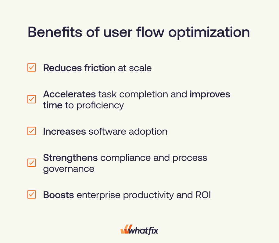
- Reduces friction at scale: Reduced user friction means higher adoption and compliance. Powered by data in the right context, you can eliminate redundant steps, decrease cognitive load by guiding users on what to do next, and overall improve clarity across workflows.
- Accelerates task completion and improves time to proficiency: With data-informed user onboarding, you can create quicker and more effective education for your new users that positively influences initial and continuous adoption. For example, with the Whatfix DAP, you can create guided onboarding experiences, such as product tours and task lists, that are tailored to each user type. This enables every user to learn only what they need to know to become proficient in the platform more quickly.
- Increases software adoption: Your user flow optimization process yields clearer workflows and provides effective in-app guidance. As a result, customers are less dependent on support channels, and employees are more likely to stick with new tools.
- Strengthens compliance and process governance: Flows that are optimized are intuitive; customers and employees are far more likely to know what actions they need to take, and in what order. Overall, this produces more predictable behavior and reduces deviations from standard operating procedures.
- Boosts enterprise productivity and ROI: While user flow optimization may involve some UX changes, the process itself is deeper. It’s an enabler for digital transformation. With optimized flows, your internal team is adept and compliant across multiple processes and tools, and your customers are working faster, better, and more efficiently toward their goals. Overall, your organization is more efficient, and your users are successful, which positively influences your business ROI.
The decision to prioritize user flow optimization is an exciting one because it means improving everything from the efficiency of your organization to customer proficiency. Ultimately, your internal team and your customers are more effective, and it shows in your most important metrics, like adoption and revenue.
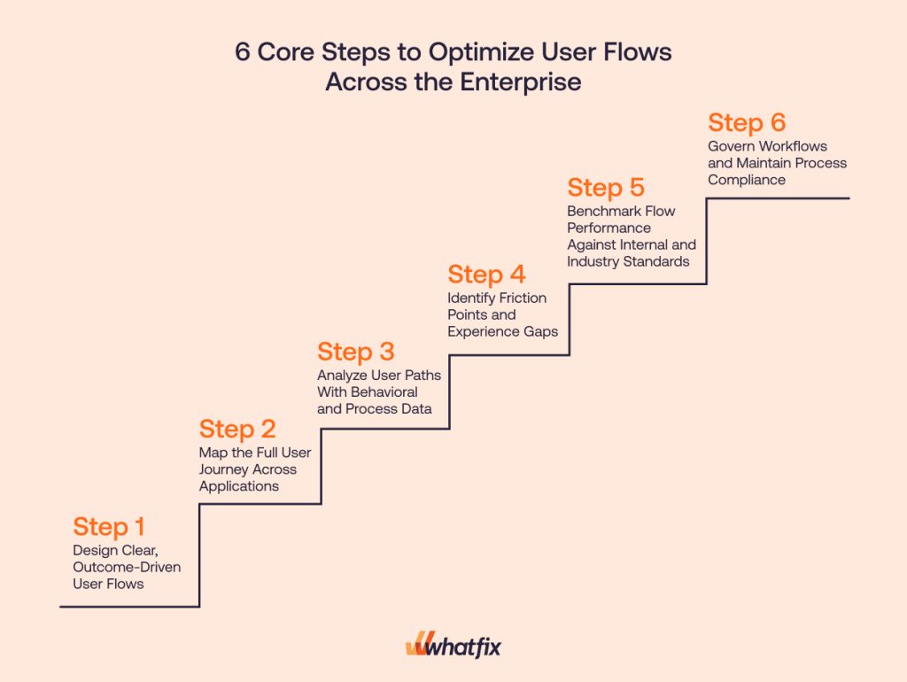
6 Core Steps to Optimize User Flows Across the Enterprise
Our framework for user flow optimization is tactical, allowing enterprises to adopt it immediately and repeat it as needed. In this section, we’ll go step-by-step and share some examples and best practices to help guide your work.
Step 1. Design Clear, Outcome-Driven User Flows
Every workflow that your customers or employees need to complete has a desired outcome. The first step in user flow optimization is to ensure that every flow is clear and that each step of the process is intuitive, leading to the necessary outcome.
An ideal workflow:
- Is as simple as it can be
- Includes only the tasks that must be completed to get to the desired outcome
- Gives users the confidence that they’re on the right path throughout
For workflows that carry risk, like approvals, financial entries, claims updates, or patient billing changes, clarity alone is not enough. Users need a safe way to practice the flow before they do it live. With Whatfix Mirror, teams can replicate key workflows in a risk-free sandbox so users can complete hands-on training and build confidence before touching production data.
As you go through your various flows, here are some important best practices to keep in mind:
- Use consistent UX/UI patterns: As users move through related workflows, they develop habits based on what they’ve done previously. For example, if your platform auto-saves textual input from a user as they work in a particular flow, they are likely to assume that their text will always be auto-saved. If that’s not the case, it’s an inconsistency that can cause confusion and frustration. A big part of making your flows clear is ensuring that they behave similarly whenever possible.
- Simplify points in the process where users need to make decisions: Decision paralysis is the hesitation caused by users overanalyzing their choices or fearing the wrong choice. In enterprise workflows, decision paralysis can cause both frustration and drop-off, all of which work directly against adoption and task completion. When users need to make a decision, be sure to limit their options and provide some brief, powerful guidance regarding the implications of each choice.
- Align flows with business rules: Enterprise workflows typically involve different team members to complete tasks, various compliance and policy requirements, and data governance rules. It’s critical to make certain that every step of your flow is aligned with all of the associated business rules when working on flow optimization.
Step 2. Map the Full User Journey Across Applications
It’s rare for enterprise workflows to live in a single system, and your whole organization needs to have full visibility into every step of every workflow, across different applications. For example, from the first touch point with a customer via email through to platform adoption, your Sales team may need to complete tasks in a CRM and a CPQ before they move to a legal platform for signing a contract. That’s three different applications before a new customer even implements the platform.
By mapping out all of your employee and customer journeys across applications, all teams can make certain that your workflows reflect the reality in which all of your users are working and that nothing falls between the cracks. Overall, this supports compliance and adoption.
Step 3. Analyze User Paths With Behavioral and Process Data
When you began your flow optimization journey, you and your team made existing processes as clear as possible, but your journey analytics will likely offer you an opportunity to optimize for even further clarity.
In this step, you’ll use event data, path analysis, and heatmaps to understand what your users actually do so that you can ultimately turn flawed or disjointed user paths into ideal flows that fuel desired outcomes. Here’s how each of these three categories of journey analytics helps you understand user paths:
- Event Data: Events tell you what users click, submit, and/or navigate to. These metrics will help you understand what users do and don’t do. For example, is there a required step that users are missing? Important information that they’re forgetting to submit? These could all be indicators of things like unclear field requirements or hidden CTAs.
- Path Analysis: Path analysis shows you what users do or don’t do and in what order. While that may sound simple, quality path analysis will illuminate things like flow drop-off or other indicators of user confusion, like too much time spent in a particular area of a flow.
- Heatmaps: Heatmaps tell you where users click, hover, or scroll on each screen. This is useful in user flow analysis because it can tell you whether users can easily find what they need, or if they know where to go after completing a task within a workflow. For example, if a user needs to click a particular CTA to move to the next task in a flow, your event data will tell you whether or not they eventually find it, but your heatmap will tell you whether they hovered elsewhere or needed to scroll around to locate it in the first place.
Once you identify where users hesitate, repeat steps, or drop off, the next move is to reduce that friction with targeted enablement. In some cases, that means in-the-moment guidance. In others, it means giving users a place to practice the exact step they’re getting wrong. Whatfix Mirror makes this practical by enabling hands-on training in a sandbox environment that mirrors the real workflow, so users can build proficiency without creating real-world errors.
Step 4. Identify Friction Points and Experience Gaps
Now that you’ve created a vision for your ideal user flows and analyzed actual user paths, you’re ready to make sense of your journey analytics and find the friction points and experience gaps that will help you refine your flows further.
When it comes to enterprise workflows, there are a few different types of friction that are worth knowing about. Let’s take a quick look at each one and how they may show up in your data:
- Terminology confusion: Sometimes, a platform refers to an action or an item in a way that users don’t understand. For example, if you know that your employees routinely upload the wrong version of a document to your CRM but you see in your event data that most do upload something, you may realize that you aren’t referring to the required document in a way that’s different from how your employees refer to it.
- UX inconsistencies: If different flows have different UX patterns, your users may be confused about what to do next. One way that this can show up in your data is when similar actions (ie, filing in a text field) cause a drop-off in one part of a flow but not in another. Different behavioral data in similar situations are an indicator that you have an opportunity to develop more consistent UX across processes.
- Validation errors: You’ll see validation errors in your analytics, and when the percentage of errors is high, it’s a red flag that something in your flow is unclear to your users. For example, if you ask users to enter their billing address and there is a high validation error, the required formatting may not be clear. Validation errors are a type of friction that is typically easy to fix once you understand the cause.
- Missing guidance: Sometimes, users need some explanatory help in the moment, even when your terminology, UX patterns, and field requirements are clear. For example, if a platform requires users to complete multiple actions, but users aren’t sure what order to do them in or when they’ll finally be done, this can cause confusion or frustration. This type of friction is typically resolved with a DAP such as Whatfix, which allows you to add in-the-moment guidance without waiting for a release cycle.
- Hands-on practice gaps: In high-stakes workflows, users may understand the instructions but still struggle without repetition. A sandbox environment like Whatfix Mirror lets users practice the workflow safely until the steps become muscle memory.
Regardless of which types of friction plague your workflows the most, the result is almost always the same. When an employee or a customer experiences frustration or confusion, they’re more likely to abandon flows or complete them incorrectly, which results in higher abandonment, lower adoption, and inconsistent data capture.
Step 5: Benchmark Flow Performance Against Internal and Industry Standards
Benchmarking is a critical element of the flow optimization framework because it’s a way to assess and continuously monitor workflow health. By using specific metrics, you can understand how your flows are doing in general, and also how specific flow iterations affect them.
Your team will need to determine the right metrics for your organization and user base, but let’s go through some common metrics used to benchmark flow performance to get started:
- Completion Time: This measures the amount of time that it takes users to complete a task or workflow. When you find that goes up meaningfully after an iteration, or that it generally takes longer than you would assume, it’s an indication that you may need to figure out what’s causing friction and make optimizations.
- Step-Level Dropout Rate: This measures the percentage of users who drop out of a workflow at a particular step. When you observe an acute or gradual increase in drop-off at a particular step in a workflow, this is also a clear indicator of friction. Conversely, if you see the drop-off rate improve when you make iterations, such as adding more guidance for users, you know that you’ve positively influenced the quality of your flow.
- Rate of Repeat Attempts: This metric looks at the percentage of users who make more than one attempt to complete a step or an entire workflow. When users need to try and try again, it’s a clear indication of friction that needs to be addressed.
Step 6: Govern Workflows and Maintain Process Compliance
Since enterprise workflows are dynamic due to changing compliance standards, platform iterations across applications, and evolving user needs, flow optimization is never truly over. It’s essential to use your benchmarking metrics to identify and address needed improvements on an ongoing basis.
At this point in the framework, your DAP becomes your key partner in resolving any friction that your journey analytics identify. With the right DAP, you can make changes to your existing workflows to increase clarity for your users based on what you see in the data without waiting for release cycles.
DAPs enable you to create in-app walkthroughs, onboarding iterations, pop-ups, knowledge base updates, and more, without needing to involve a developer. This means that your flow optimizations become far faster and more efficient, delivering results to your users and impacting your KPIs faster.
Working with an analytics platform to understand usage and a DAP to react to friction, in tandem, is a scalable way to manage workflow performance across the enterprise. This way, you’re always in a cycle of monitoring and optimization, keeping your flows ideal and your business metrics healthy.
Tools and Methods for Enterprise User Flow Optimization
As you move through the enterprise user flow optimization framework, there are specific tools with key functionality that will make the initiative both possible and more efficient. In this section, we’ll go through some of the key tools that your team should consider.
Analytics, Behavior Tracking, and Path Analysis
Your journey analytics and behavioral data drive the entire optimization process by helping you understand the gaps between what users should do and what they actually do, and identify points of friction in each workflow. Having the right set of tools for your data stack is a huge part of succeeding with flow optimization. Let’s take a look at some of the core product analytics tools categories for tracking and improving user flows:
- Path analysis platforms: These tools surface everything from bottlenecks and drop-off patterns. Typically, path analysis platforms generate visualizations to make it easier to identify friction and opportunities for improvement.
- Heatmapping tools: With a heatmapping tool, you’ll be able to make sense of your metrics that indicate friction by getting data about where users scroll, hesitate, and hover. You can then use these insights to optimize flows with more intuitive CTAs or added guidance for users.
- Session replay platforms: Your quantitative data tells you a lot, but session replay platforms add a qualitative element to your understanding. On these platforms, you can choose users who fit a certain description (for example, users with an unusually high session time for a specific workflow) and actually watch their sessions to understand what’s taking so much time. Typically, these replays give your team more direction in terms of optimizations than numbers alone.
- Process mining solutions: Process mining solutions do a lot of path analysis, but they differ from typical path analysis platforms because they’re typically able to collect data from multiple applications within a given flow. If your employees or customers use several applications in their enterprise workflows, you’ll likely benefit from this cross-platform data.
Your analytics, behavior tracking, and path analysis tool kit enables your team to stay on top of how users are moving through your workflows and alerts you to friction that needs to be addressed. Not only that, but your data platforms also shed light on the severity of various forms of friction, making it easier for your team to prioritize related improvements.
Flow Design and Journey Mapping Tools
Design tooling allows you to create visualizations that ensure internal alignment around what users need to do and when. Although flow design and journey mapping tools primarily provide documentation, they are an important consideration when optimizing flows, as they facilitate communication, planning, and collaboration.
These are the two primary categories of design tools typically used by teams during the flow optimization process:
- Workflow design platforms: With a workflow design platform, you can plan each workflow visually. This allows your whole team to have visibility into what users need to do and when, and many of these platforms have collaboration features like commenting. By visualizing workflows step-by-step and giving the whole team access, your team can collaborate digitally until alignment is achieved.
- Journey mapping tools: CX and EX teams can use these journey mapping platforms to show all user actions, internal and external, along with tasks and workflows that span different applications. Journey maps help make sure that everyone in your organization has the same understanding of the user journey when they complete processes or build tools for your users to do so.
Using workflow design and journey mapping tools will ensure that your team is aligned on the ideal user flows. However, it’s critical to remember that real user behavior and user paths may not always follow your planned workflows and journeys. These gaps, which you’ll see in your journey analytics, are opportunities for further optimizing flows.
Digital Adoption Platforms
Your analytics and design tools will empower your team to create and monitor ideal user flows and actual user behavior. The gaps between ideal behavior vs. actual behavior give important direction for iterating on workflows and prioritizing those changes. Digital adoption platforms are the operational layer of your tool set, allowing you to optimize flows for customers and employees at scale.
Many enterprise companies partner with Whatfix and utilize its best-in-class DAP and Product Analytics platform to quickly identify friction and change flows accordingly without ever needing the help of a developer.
Let’s take a deeper look at how the Whatfix DAP, powered by Whatfix, makes user flow optimization simpler and more effective:
- Whatfix Flows guides users through complex tasks: Through the use of overlays that don’t require code, your customers and employees are guided through each workflow, step-by-step, and never have to guess what to do next.
- Whatfix Smart Tips reduce confusion and errors: When you see that users experience any type of friction, use the Smart Tips to give users some context right in the flow of work. In other words, you can preempt the friction with the information that each user needs.
- Whatfix Self Help provides instant task support: Create and maintain a self-serve knowledge base so that users can get help when they need it, without ever leaving your platform, and decreasing the chances that they’ll abandon their workflow.
- Whatfix Analytics captures real user behavior across workflows: Make your flow optimization more efficient and effective by extracting key takeaways from your journey analytics in Product Analytics. Then, utilize the DAP, which is also available within the Whatfix platform, to release quick iterations that address flow friction.
- Whatfix Pop-Ups reinforce compliance and process changes: Even your seasoned users will need platform and compliance updates as they happen, and Pop-Ups make it simple to alert users within the flow of work.
With Product Analytics and a DAP, Whatfix connects guidance and analytics, enabling continuous flow monitoring, iteration, and overall optimization. In the next section, we’ll take an even closer look at the Whatfix use cases that enterprises value most.
Whatfix Use Cases That Enable User Flow Optimization
In this section, we’ll show you how to get started on your journey with Whatfix as your key partner in optimizing your user flows now and over time. Let’s dive in!
Onboarding and Training
An optimized flow occurs as quickly and intuitively as possible, and onboarding is crucial in providing your customers and employees with the knowledge they need to navigate their workflows efficiently. Whatfix minimizes ramp-up time by guiding new users through the required flows from day one.
With Whatfix, you can:
- Use Product Analytics to cluster users into specific groups based on role or behavioral data
- Use the Whatfix DAP to create customized, guided onboarding for each user group, showing only what each user type needs to know.
- Use Whatfix Mirror to deliver hands-on practice in a risk-free sandbox for workflows where production mistakes carry real cost.
- Reinforce that training in production with Whatfix Flows and Smart Tips, so users get both practice and in-the-moment support.
- Create personalized onboarding experiences that are robust, interactive, and tailored to each user’s needs.
- Govern new employee training with in-app Task Lists that ensure every new employee completes core software training to adopt proper workflow compliance.
By investing in onboarding and role readiness with Whatfix, you’ll enhance the productivity of both your customers and employees. With the ability to tailor your onboarding flows to each user type, you’ll have more nuanced, accurate data about where each one of them is succeeding and struggling.
Reducing Friction in High-Value Processes
High-value processes are the workflows that most influence key business and efficiency KPIs. Examples range from opportunity updates, case escalations, budget approvals, and employee lifecycle tasks. With Whatfix, you can quickly identify friction in these valuable flows and react to them without waiting for a release cycle. Here’s how:
- Using Whatfix Analytics, you’ll be able to see and monitor friction in each of your high-value workflows.
- Using Smart Tips within the Whatfix DAP, give users contextual hints wherever you see friction in the data, decreasing key markers of friction like drop-off or validation errors by giving users the information they need right in the flow of work.
- Using Flows, also within the Whatfix DAP, easily create a UI overlay experience where users are directed to where they need to go within a workflow, step-by-step.
As with all Whatfix DAP functionality, you can create and iterate on these experiences without the help of a developer, quickly removing ambiguity and speeding up flow completion for your users.
Driving Compliance and Process Consistency
Enterprise platforms are notoriously complex, and some workflows even involve multiple apps, making compliance and consistency a real challenge for enterprise users. Here are two of the primary ways that enterprises partnering with Whatfix guide users to follow the requirements:
- Implement Pop-Ups to give users quick tips to remain compliant in the flow of work, decreasing errors
- Create guided workflows with Flows that reinforce compliance requirements and foster policy alignment
You can create and iterate on Pop-Ups and Flows in real time, without ever writing a line of code, so that any changes in compliance and policy can immediately be communicated to users.
Overall, the Whatfix DAP enables quick and timely communication with users that reduces the risk of non-compliance and ensures audit readiness.
Self-Sufficiency and Support Reduction
Providing quick, contextual guidance will dramatically reduce the need for users to reach out to support, and for the more complex friction that users can sometimes face, Self-Help fuels self-sufficiency with a dynamic knowledge base.
With Self-Help, your team will:
- Create knowledge base articles on more complex workflow issues that are easily searchable for users
- Iterate on articles when there are changes regarding policies, compliance requirements, or significant UX/UI updates without waiting for a release cycle.
Self-Help reduces dependence on training modules and helpdesk teams for your employees, while lowering the volume of support tickets from your customers. Not only that, but making your customers and employees more self-sufficient increases their confidence in the ability to complete workflows successfully, fueling adoption.
Continuous Optimization With Insights
Whatfix Product Analytics reveals friction with flow visualizations and behavioral data, guiding you toward the most important improvements in your employee and customer-facing workflows.
Here are some of the key ways in which Product Analytics functions as your ideal analytics partner:
- Visualize user journeys and workflows with Funnels, surfacing friction quickly and accessibly.
- Use Cohorts to build user segments, giving you the most nuanced behavioral data possible, surfacing every individual user group and where they experience friction.
- Connect your behavioral data and flow insights to impact on key engagement metrics, like adoption and task completion, without needing to code or bounce between platforms.
- Utilize AI-powered insights and conversational analytics to get more insight out of your data.
Let’s walk through a quick example to see how all of this comes together.
Imagine that you’re optimizing a mult-step CRM workflow for your customers. Thanks to Cohorts in Whatfix Product Analytics, you can see that enterprise sales teams are making it through offer generation workflows successfully, but smaller companies that rely on more junior business development representatives have a much lower flow completion rate. In Funnels, you observe a significant drop-off at particular points in the flow, and higher-than-average validation errors as well. Your quick conversation with AI within Inisghts tells you that this low completion rate is correlated with significantly lowered adoption rates as well.
With all of this data collected and understood in minutes, you can migrate over to the Whatfix DAP and address those precise issues – without ever leaving the platform or needing help from your tech team.
KPIs and Measurement Framework for Optimizing User Flows
When investing in flow optimization now and on an ongoing basis, it’s important to have a measurement framework that truly assesses the health of your flows. By tracking the right metrics, you’ll be able to prioritize iterations and do the most impactful work on your user flows.
While the metrics you choose depend on your organizational needs, this is a solid list of common metrics used for flow optimization for your team to consider:
- Process completion rates: This tells you what percentage of users complete a specific workflow. When this number decreases or is generally lower than expected, it can mean that a recent iteration is causing friction.
- Time-to-complete for critical workflows: When users are confused or frustrated, they take longer to complete a flow. When this metric increases or is generally higher than expected, it indicates friction within the flow.
- Adoption rates for key features or modules: When users are confident in their ability to use a feature or complete a module, and they understand its value, they’re likely to adopt it. If you see lower-than-ideal adoption rates for something specific, it’s an indicator that there is friction or a need to reinforce the value of specific functionality or content.
- Rate of validation errors: When customers or employees don’t enter the right information, your data is inaccurate, and form completion suffers. This is an impactful type of friction that’s simple to spot when you’re consistently monitoring for a rate of validation errors that’s not as close to zero as possible.
- Team-specific productivity metrics: Depending on the team, you likely have some productivity metrics. For example, you may choose to measure the amount of time that it takes new Customer Support agents to complete their onboarding and begin working with users. When you see that this metric is either too high or increasing, you know that you can probably improve some aspect of your team’s onboarding.
- Rate of ticket deflection in relation to knowledge base usage: If your knowledge base is truly helping your users be more self-sufficient, you should see a correlation in the data between utilizing the knowledge base and a decrease in support tickets. If you don’t see this phenomenon, or if it decreases over time, it’s a good indication that you could benefit from improving your knowledge base.
- Time-to-proficiency after hands-on practice: Track whether users who complete sandbox training in Whatfix Mirror reduce repeat attempts, validation errors, and time-to-complete once they move into live workflows.
CIOs and app owners who track these flow health metrics can produce measurable ROI by identifying problems as soon as they arise. For example, if the Process Completion Rate for a key flow plummets shortly after a significant UI update, the team can:
- Find the precise points of friction in the updated flow
- Use a DAP to give guidance where users are struggling the most
- Give nuanced data points to the product team so that they can make sure that the new UI is optimal
By doing all of that, likely, the completion rate will soon stabilize, and lost users, revenue, and efficiency will be avoided.
Whatfix Product Analytics makes it simple to track the metrics highlighted in this KPI framework, giving you the data you need to measure and validate the impact of your flow optimizations. Further, you can utilize the Whatfix DAP to react to what you see in your metrics without waiting for the help of your tech team or a big platform release.
Why Whatfix Is the All-in-One Platform for Enterprise User Flow Optimization
User flow optimization is an ongoing operational capability. Enterprise workflows evolve constantly due to platform updates, process changes, and shifting compliance requirements.
As journeys expand across applications and teams, even small points of friction can lead to larger issues over time, including slower execution, inconsistent process adherence, incomplete data capture, and lower adoption.
Whatfix helps enterprises address these challenges by combining journey analytics with in-the-flow workflow governance.
Journey insights create impact when teams can act on them quickly
Behavioral data often reveals exactly where users struggle. Step-level drop-off, repeated attempts, extended completion times, and workarounds across systems are all signals that workflows need refinement.
Whatfix enables teams to respond in the moment by pairing analytics with contextual guidance, so improvements can be delivered without waiting on release cycles or rebuilding training programs. For workflows where accuracy matters, teams can also use Whatfix Mirror to provide hands-on practice in a sandbox before users complete the same process in live systems.
Whatfix enables scalable workflow optimization across critical systems
With Whatfix, organizations can optimize task execution through:
- Flows that guide users step-by-step through high-impact processes
- Smart Tips that prevent errors and reduce confusion in real time
- Pop-Ups that reinforce compliance updates and workflow changes directly in the application
- Self Help that provides embedded support without disrupting productivity
- Product Analytics that surfaces friction patterns across roles, teams, and journeys
- AI-powered insights that help teams prioritize the next best workflow improvements
Together, these capabilities make flow optimization measurable, repeatable, and scalable across the enterprise.
Drive adoption, proficiency, and execution through better user flows
When workflows are clear, supported, and continuously improved, users complete tasks with greater confidence, teams reduce operational strain, and organizations maximize the value of their software investments.
Whatfix provides the unified platform enterprises need to optimize user journeys and sustain adoption over time.
If you’re ready to improve the workflows that matter most, schedule a Whatfix demo today.