


User friction, a term ingrained deep within the UX lexicon, refers to any element or process within an application that impedes, confuses, or frustrates users. This prevents users from finding value in a product, causing frustration and drop-offs.
User friction could manifest in many ways in customer-facing applications, from a convoluted sign-up process, obscure UI, and poor app performance to unnecessary steps that obstruct task completion or users achieving their “aha!” moment.
And the consequences? Lower conversion rates, reduced customer satisfaction, and high customer and user churn rates.
Digital friction also occurs for end-users of internal enterprise software, like CRMs, ERPs, HCMs, and other mission-critical applications. To show users value in an application, new process, or digital service, it must be easy to use, have clear benefits, and be effortless and intuitive.
However, business processes are inherently clunky, and technology doesn’t always make things easier. Bad UI, convoluted forms, complex processes, lack of end-user support, and out-of-date software all lead to digital friction.
Identifying, navigating, and resolving these friction points isn’t easy. It’s like playing detective within your applications, meticulously scanning your app to identify, analyze, and fix areas, screens, and flows that detract from the overall user experience.
In this article, we will explore the concept of user friction and its implications. Awareness of digital friction—what it is and its consequences—is the first step in identifying and reducing it. We’ll also explore the impact of digital friction on end-user adoption and look at examples of how large organizations have overcome digital friction.
We’ll also equip you with the tools and strategies to diagnose and overcome these user pain points to create a better, more intuitive user experience and UI.
What Is User Friction?
User friction refers to any obstacle that stops users from completing a desired action inside an application, whether that’s customer-facing users or internal application users. It’s usually caused by structural elements that affect your product’s usability, such as poor UI design choices, branding, technical resources, convoluted user flows, etc., and by the emotion your product triggers in users.
What Are Common Reasons for User Friction?
User friction can happen due to countless reasons, but the most common causes include:
- A generalized onboarding UX that doesn’t cater to specific user personas.
- An unintuitive product experience with UI gaps that leave users guessing how to navigate them.
- Outdated user interface.
- Product bugs and poor app performance or page load times—Portent estimates that website conversion rates drop by 4.42% for every additional second of load time (between seconds 0 – 5).
- Poorly designed form fields that are overcomplicated, not labeled clearly, and lack validation or error alerts for when users are entering incorrect data.
- Products that fail to meet the intent or expectations of users.
- Core features and workflows that are complex and have too many steps to achieve an outcome.
The Hierarchy of User Friction
According to Sachin Sekhi (LinkedIn’s former Head of Product for its Relationships and Sales product lines), user friction patterns and elements can be grouped into three main categories that make up the hierarchy of user friction. These three groups are:
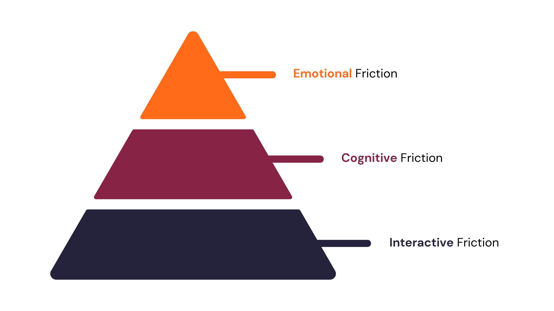
When most product managers, application owners, and UX designers think of user friction, they think of interactive friction. However, all three types of friction are critical for building natural, engaging products, user journeys, and user experiences that are easy to understand and adopt.
Let’s break down each user friction hierarchy category.
1. Emotional friction
Emotional friction happens when asking users to complete an action rubs them the wrong way and elicits negative emotions in the user experience. This can include frustration, confusion, annoyance, or even fear. Negative emotions will likely cause users to abandon tasks or hesitate to use a product again.
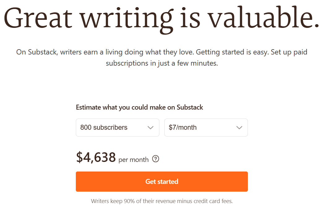
For example, a content creator might be hesitant to ask for donations, especially since there’s no clear give-and-receive relationship between a content creator and individual sponsors; likewise, a content creator might wonder whether their audience would be open to paying for content they were already offering for free, especially if you don’t consider yourself a ‘professional.’
To surmount this, Substack uses social proof aggressively, featuring newsletters like Edwin Dorsey (The Bear Cave), Brian Lund (The Lund Loop), and Michael Fritzell (Asian Century Stocks) on their landing pages to overcome initial hesitation. Substack also has a revenue calculator to help writers estimate how much they could make by bringing their audience to their platform.
Another example is using a mobile banking app; every time you attempt to deposit money into your account, it fails without any specific reason. No apparent cause without the banking app providing any in-app alerts or feedback on why this is happening. This product bug causes users to experience emotions ranging from anxiety to frustration, creating a significant user friction point and hurting your banking customer experience.
2. Cognitive friction
Cognitive friction is any type of user friction that makes a process or task more complicated or mentally challenging than it needs to be. This is mainly a result of unintuitive design or unclear copy that makes users stop and think to ensure they understand the options available to them.
Cognitive friction can include things like complex user workflows, poor instructions or user documentation, or an overall unintuitive UI design.
For an example of cognitive friction, let’s say you just started to use a new project management software tool. It has capabilities, features, and functionality (all the bells and whistles!), but it lacks a straightforward user guide or contextual onboarding flow for your specific use case.
As a new user, you’re unsure where to begin, how to set up a new project, or even how to invite your team members. The UI is cluttered with numerous options and buttons, and it’s unclear what many of them do. This causes products to suffer from poor adoption rates and high user churn.
3. Interactive friction
Interactive friction occurs when users encounter physical or action-based blockers while using a product or service. It could be related to responsiveness, speed, accessibility, or usability of interactive elements.
Interactive friction can happen when there’s a disconnect between what a user expects a UI element to do and how it responds when interacting. It can also include a product that has too many elements on screen that compete for a user’s attention.
An example is an e-commerce store with a checkout process that requires too many steps, asks users to repeat the same data multiple times, lacks a progress bar, uses unintuitive UI widgets, uses an odd type of font, etc.
The user might feel overwhelmed or annoyed by the process, leading to shopping cart abandonment.
Reducing interactive friction here could involve streamlining the checkout process, auto-filling information wherever possible, adding a progress indicator to let users know how close they are to completing their purchase, and using user-friendly and consistent font families and UI widgets across your entire website or application.
6 Types of User Friction
Here are six of the most common friction patterns users encounter. They double as symptoms to observe in the behavioral analytics process to determine whether users are encountering friction at any part of your product.
We’ll explore the following six types of user friction, with examples of how they can manifest:
1. Rage Clicks
Rage clicks happen when a user clicks a button or on-screen elements aggressively and repeatedly. They’re more of a symptom than an actual UI friction pattern. They can be caused by slow loading, unresponsive buttons, unclearly-labeled buttons, intrusive pop-ups that disrupt a user’s flow, broken links, and error messages that prevent users from completing an action.
An example: A user tries to open a dropdown menu, but the menu is unresponsive due to a coding error. Frustrated, the user repeatedly clicks the dropdown menu in a series of “rage clicks”.
2. User Dropoffs
Dropoffs happen when there’s a steep drop in the number of users who make it to successive steps in your funnel. User dropoffs are a telltale sign that users are encountering friction with parts of your product’s UI or on a specific screen or page.
An example: An online education platform might find users signing up for their product, but are not enrolling in any courses. The dropoff after sign-up suggests a friction point — and after a bit of product analysis, the product teams realize dropoff is happening on the course enrollment page, suggesting the enrollment process is too confusing.
3. Dead Clicks
Dead clicks are clicks that have no effect on a page—they don’t interact with the UI, complete any action item or show users any options or action items to choose from. These are clicks on a webpage where the clicked element has no functionality or doesn’t respond to the user’s action. This can lead to confusion and frustration for the user.
An example: A user may see an underlined text that appears to be a hyperlink and click on it, but if the text is not linked to another page, this results in a “dead click.”
4. Error Clicks
Error clicks result in error messages. They indicate that a user is trying to perform an action the system doesn’t allow or can’t execute, leading to friction. Error clicks can occur when users click broken buttons or visual elements that trigger system errors.
An example: A user attempts to submit a form on a website without filling in all the required fields. The submission attempt results in an error message, marking an “error click.”
5. Cursor Thrashing
This occurs when users move their mouse erratically, either because they’re getting impatient (with a slowly responding or completely unresponsive element) or confused with what they’re interacting with on-screen. This can signal that the user is struggling to find what they’re looking for or unsure of their following action.
An example: Suppose a user clicks on a button, but there is a delay in the response due to slow loading times or poor website performance. The user might begin rapidly moving their cursor around the screen in frustration, indicating cursor thrashing. This points to interactive friction caused by poor website performance.
6. Cart Abandonment
This happens when a user abandons a form or online shopping checkout process halfway without providing all the details you’ve asked them for or completing their purchase. Typically this occurs if it’s taking a lot of time to fill out, your forms aren’t optimized for the devices they’re browsing on, or technical issues such as slow loading, etc.
An example: A user adds a product to their cart on an e-commerce site but finds that the site requires account creation to proceed to checkout. The user, unwilling to create an account, abandons the cart and leaves the website.
Related Resources
Key Friction Points in the User Lifecycle
User friction can emerge at any stage of the user journey, but it often intensifies during pivotal moments such as new user onboarding, feature introductions, or product updates. These friction points can lead to increased drop-offs, reduced engagement, and higher churn rates.
With Whatfix, organizations can monitor user engagement throughout the application lifecycle, benchmark time-to-value and “aha!” moments, identify root causes of drop-offs, and deploy targeted in-app guidance and workflow support to eliminate friction and foster seamless user experiences.
Here are the most common friction points product owners must optimize to create frictionless workflows and eliminate friction from their user experience:
1. Onboarding: The First Critical Touchpoint
A simple, straightforward user onboarding process is key for user retention. However, many users disengage early due to complexity or lack of guidance. In fact, 61% of users drop off during the onboarding process due to complexity or time constraints.
Common friction points during the user onboarding stage include:
- Overly complex sign-up forms or lengthy registration processes.
- Lack of clear guidance on initial steps or feature usage.
- Delayed realization of product value leading to early drop-off.
Whatfix enables the creation of interactive, in-app onboarding experiences that guide users through essential features and workflows. By providing contextual assistance and reducing cognitive load, users can achieve value faster, increasing the likelihood of retention.
2. Introducing Advanced Features
Advanced capabilities are often not introduced during initial onboarding, and are surfaced over time to allow users time to adopt basic functionality and learn core application characteristics, like profile setup, UI familiarity, and simple workflow adoption. More complicated workflows and capabilities can overwhelm users if not properly introduced, leading to underutilization. 40% of churned customers never fully adopted key features, indicating a gap in feature engagement.
Common friction points when introducing advanced features include:
- Users unaware of new features or their benefits.
- Complex features lacking intuitive guidance.
- Insufficient training resources or use cases for advanced functionalities.
- Industry jargon or confusing technical language that presents adoption barriers.
Whatfix allows for the deployment of targeted, in-app walkthroughs and tooltips that introduce advanced features contextually. This ensures users understand and adopt new functionalities effectively, enhancing overall product value.
3. Seeking Support: Moments of Frustration
When users encounter issues, the ease of accessing support determines their continued engagement. Users experiencing this type of friction are more likely to require help from a real support agent, increasing operational costs and potentially leading to churn.
Common friction points when users require additional support and help include:
- Difficulty locating help resources and requiring users to leave the application to find help through FAQs, knowledge bases, help chatbots, etc.
- Documentation that doesn’t include specifics, generic FAQs that don’t address specific user issues and are too vague, and overall poorly written support documentation.
- Lack of self-service solutions.
- Delayed responses from support channels.
By embedding contextual self-help widgets and guided support within the application, Whatfix reduces the need for external support interactions. Users receive immediate assistance tailored to their current context, improving satisfaction and reducing support overhead.

4. Rolling Out New Features
Introducing new features is essential for product evolution, but without proper guidance, users may ignore or misuse them. Companies that track feature adoption in real-time see a 25% improvement in retention, highlighting the importance of proactive feature engagement strategies.
Common friction points when launching new features include:
- Lack of awareness about new feature releases.
- Lack of understanding of how new features drive value and help improve user productivity, leading to users ignoring new features.
- Unclear instructions on how to use new functionalities and undocumented use cases.
- Fear of disrupting existing workflows with unfamiliar functionality, like GenAI copilots.
Whatfix facilitates the announcement and education of new features through in-app notifications and guided tours, ensuring users are informed and confident in utilizing new capabilities.
5. Navigating Product Updates and UI Redesigns
Significant changes to the user interface can disrupt user habits and lead to confusion or dissatisfaction. 83% of App Store reviews for a major app redesign were negative, indicating user dissatisfaction with changes that were uncommunicated to users.
Common friction points when launching product redesigns include:
- Users struggling to locate familiar features after a redesign.
- Increased errors due to unfamiliar layouts or workflows.
- Resistance to change stemming from lack of communication.
Whatfix provides step-by-step guidance and highlights changes within the application, helping users acclimate to new interfaces and reducing the learning curve associated with updates.
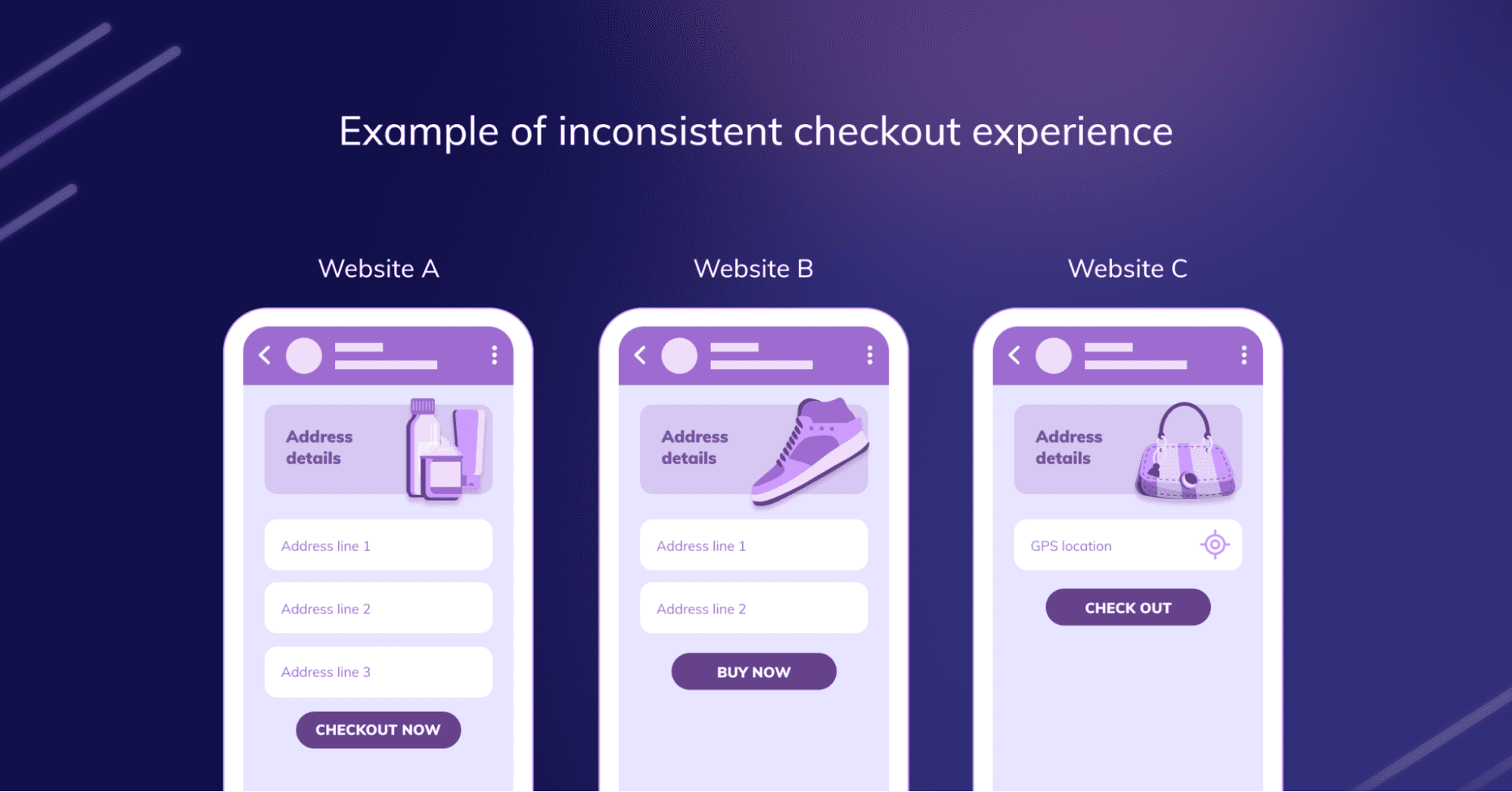
6. Managing Cross-Application Workflows
In enterprise environments, users often need to navigate multiple applications to complete tasks, leading to potential friction. A fundamental problem in UI/UX arises when business processes and workflows span multiple applications, leading to user confusion and inefficiency.
Common friction points for application owners that design cross-application workflows include:
- Inconsistent user experiences across different platforms.
- Manual data entry between applications increasing error rates.
- Difficulty remembering processes unique to each tool.
- Disrupting user productivity when having to switch between multiple applications, web browser, and workflow interfaces.
Whatfix offers cross-application guidance, ensuring users receive consistent support regardless of the platform. By streamlining workflows and providing contextual assistance, users can navigate complex processes more efficiently. By proactively identifying and addressing these friction points with Whatfix, organizations can enhance user satisfaction, reduce churn, and drive greater ROI from their digital initiatives.
What Are the Consequences of User Friction?
Digital friction is a tell-tell sign of poor user experience, leading to impacts that cascade through the user journey. Let’s break down the negative consequences of UX friction for both customer-facing apps and employee-facing applications.
User Friction’s Impact on Customer-Facing Applications
Poor UX and frequent areas of user friction can rippling consequences across customer-facing applications, including:
- Increased churn rates: When users encounter difficulties navigating or completing tasks, they are more likely to abandon the app, leading to higher churn rates as users seek out easier alternatives.
- Overall negative user experience (UX): Friction disrupts the flow and enjoyment of using the app, frustrating users. This can result in a negative perception of the brand, causing long-term damage to customer loyalty.
- Lower conversion rates: If friction exists in key stages such as onboarding or checkout, users may drop off before completing important actions, reducing sales or conversions.
- Higher support costs: Users experiencing friction are more likely to require customer support, increasing the demand for help desk services and escalating operational costs to resolve issues.
Digital Friction’s Impact on Employee-Facing Applications
Digital friction leads to a poor user experience, which ultimately leads to unproductive employees, failed technology investments, and missed business targets. When end-users cannot use an enterprise application or digital process to its full potential, it can have ongoing negative consequences, including:
- Productivity loss: Enterprise software is designed to enable employees to maximize efficiency and become more productive. When they encounter digital friction, the opposite happens – with end-users needing support at critical moments in their digital process that leads to applications being used improperly or not at all.
- Internal resistance to change: End-users become dissatisfied with digital transformation choices their leadership has made, and change fatigue sets in, which leads to internal resistance to change.
- Lower user adoption: Too much digital friction can prevent users from realizing the full value of a platform or app.
- Lost revenue: When end-users can’t use a digital application as intended, organizations fail to achieve their business outcomes.
Digital friction should be identified and eliminated as quickly as possible. Solving issues quickly can mitigate negative impacts and improve the end-user EX.
How to Identify User Friction
User friction is ultimately a discovery problem: it exists, but you need to understand which parts of your product are where it happens, why, and how to optimize the user experience to eliminate those rough edges.
Product teams can follow a few usability principles and product usage analysis strategies to identify areas of dropoff and friction with their product and its UI, including:
1. Conduct usability tests
Usability testing means asking users to complete specific actions in your product while product managers observe to:
- See if any issues, bugs, errors, or exceptions might have filtered through QA.
- Understand how users would typically navigate the product vs. their ideal journey maps.
- Track user satisfaction with specific features, UI elements, and the entire product generally.
- Collect qualitative and quantitative data using product and behavioral analytics tools (if you’re testing with a sufficiently large number of users).
2. Map your user flows and journeys
A user flow is a flowchart that shows all the possible actions users can take after they sign into your product; while a user journey map works similarly, but focuses on the steps users would take to complete a specific action within your product, with a detailed explanation of their motivations at each stage.
User flows and journey maps are tangential and can help you:
- Align your product team, designers, and engineers to identify and fix usability issues.
- Identify dropoff points in the user journey.
- Highlight redundant steps that can be eliminated or merged.
- Perform a user path analysis to optimize your flows and journeys.
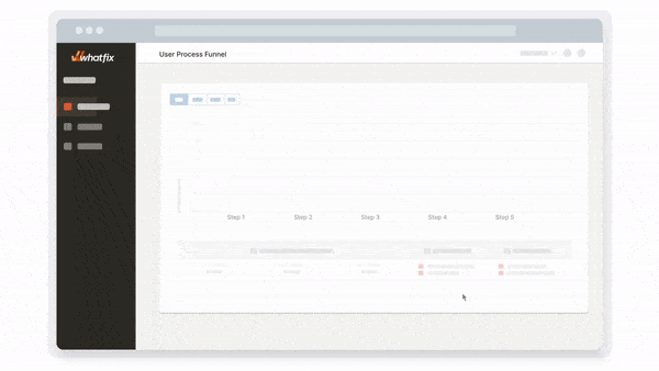
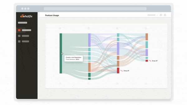
3. Perform a funnel analysis
A funnel analysis report maps your funnel step-by-step graphically and shows you how many users make it through each stage of your funnel so you can:
- Understand their user journey.
- Discover anomalies in your funnel (Why do 80% of visitors navigate to the signup page, but only 0.27% convert?).
- Identify redundant or unnecessary steps you can eliminate from your user journey without hurting the user experience.
4. Measure adoption of individual features and overall product usage
The most obvious evidence that users struggle with your product will come from your engagement metrics. New users will churn early into the user onboarding experience and you’ll notice a lower-than-average degree of active usage among your userbase.
Other product adoption metrics to benchmark and understand how much (or little) your users are embracing your product, include:
- Signups and registrations.
- Active users (monthly, i.e., MAUs, daily, i.e., DAUs, etc.)
- Frequency of use: How often do users check your product (application, website, etc.) or perform an action daily, or weekly?
- Product stickiness: What’s the ratio of your daily active users (i.e., DAUs) to your monthly active users (MAUs)? That is, for those who use your product, how consistently do they sign in, and complete specific actions.
- Time spent in product, etc.
- New feature adoption rate.
- User funnels to identify dropoff points.
5. Collect user feedback
You can use several channels and techniques to collect product feedback from your users. You can repurpose your existing feedback channels or sift through them carefully to understand what your users think about specific features, UI elements, and your product generally.
- 1:1 feedback and user interview sessions, esp. for usability testing.
- Customer support interactions. When you log new product bugs, reroute them to product or engineer to help your team gain better insights into the issue.
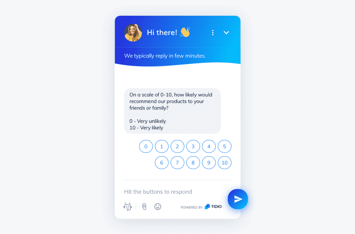
- NPS surveys that track customer satisfaction and how likely your users are to advocate for your brand.
- Product analytics tools can show usage patterns that indicate users might be encountering issues with certain parts of your product.
- Online reviews and ratings from crowdsourced platforms like G2, Capterra, or Saasworthy.
- User forums and community platforms.
How to Fix User Friction
If you’re working on identifying and fixing user friction points within your product, your goal should be to:
- Use product analytics tools to discover UI gaps that leave users confused.
- Add context to elements, journeys, and screens that might be hard to understand with in-app guidance and user nudges.
- Create a library of self-help resources to help users resolve issues independently without contacting support.
By analyzing your user experience and engagement, providing user guidance, and enabling end-user self support, products become more intuitive to use and inherently reduce areas of friction.
Here is a five-step process for product managers to address and resolve areas if user friction in their application or website:
1. Invest in user behavior and product analytics tools
While behavioral analytics focuses on understanding how users interact with your product, product analytics tries to find patterns in user behavior—patterns you can exploit to increase active usage and conversions, reduce churn, etc.
Behavioral and product analytics tools track user experience and engagement metrics and help you understand how to improve your product, smooth rough edges, and accommodate your users’ needs without overextending your engineering team.
With Whatfix’s product adoption and analytics platform, product teams are empowered with the tools to analyze in-app events and content, create and launch new in-app guidance and self-help, and test new user messages to deliver an engaging and intuitive user experience.
With Whatfix’s product adoption and analytics platform, product teams are empowered with the tools to analyze in-app events and content, create and launch new in-app guidance and self-help, and test new user messages to deliver an engaging and intuitive user experience.
With Whatfix’s create, analyze, and deliver framework, product management teams can use a single product experience platform to build the ultimate user experience and overcome user dropoff and friction areas inside their platform.
2. Use empty state screens with engaging content
Empty state screens fill UI gaps that might get users confused, especially during the user onboarding process initial setup when there’s not much data to be displayed on the screen; when a user navigates to a page or feature that’s been deleted or deprecated; or when a user tries out a feature for the first time.
![]()
Empty state screens use visual cues and design elements to keep your product’s UI on-brand and prevent users from getting frustrated.
3. Provide user with product tours, walkthroughs, and in-app checklists
In-app guidance, such as product tours and interactive walkthroughs, helps users navigate complex processes or applications that can’t be simplified. These on-screen experiences show users where to find key information or product features and encourage them to keep moving forward.
Some features of in-app guidance include:
- Contextual tips: Pop-ups, UI tooltips, and self-help widgets provide short explanations, tips, or links to detailed guides when the information is most relevant to the user.
- Personalized suggestions: Based on past behaviors or end-user type, offer contextual in-app support that builds on the knowledge your user already has, all in the flow of work.
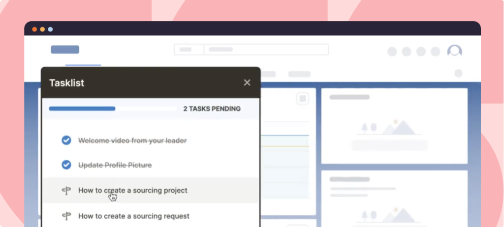
- Progress indicators: Let users know how far along they are in the process to encourage them to complete each step.
- Task checklists: A user onboarding task list gives an overview of each step a user should take to get familiar with a product and its features. These can also be deployed when processes are changed or new features are released.
- Alerts: An on-screen alert can notify users if they’re not using a feature correctly or point them to new product features or changed navigation sites.
- Self-service help: Quick in-app access to knowledge bases, SOPs, and other process-related support resources makes it easy for users to find additional information, at the moment of need.
Implement a digital adoption platform (DAP) such as Whatfix, to enable your customer-facing and internal end-users with in-app guidance and self-help support experiences.
With a digital adoption platform like Whatfix, product managers and application owners are empowered with a no-code editor to create on-brand, contextual in-app content for various types of end-users, including:
- Contextual Tours, Task Lists, and Flows to guide end-users through new software and complex processes to drive adoption and provide guided support.
- Make announcements, drive awareness of new features, and alert end-users to change with Pop-Ups and Beacons.
- Overcome digital friction and enable end-users at the moment of need with Self Help. Self Help aggregates all your knowledge base articles, SOPs, training resources, and more into one searchable in-app support center.
- Nudge end-users and provide additional context at critical moments in your digital processes with Smart Tips.
- Field Validation provides real-time support to end-users who enter data into text fields and forms, validating that your data remains clean and in the right format.
4. Create tooltips to nudge users in the right direction
A tooltip is an in-app UX microinteraction that offers contextual information when users click or hover over it. Tooltips (we call them Smart Tips here at Whatfix) can explain unfamiliar terms or concepts, display error messages and warnings, highlight tips and best practices, or clarify complicated information or procedures.
A tooltip helps users understand your product contextually—it adds meaning without distracting from the product UI (by redirecting to another page) or overwhelming users with unnecessary details.
With Whatfix’s digital adoption platform, product managers can create in-app, on-brand tooltips that deliver contextual guidance and help, at the moment of need, for your users.
![]()
5. Enable users with self-help support
Self-help customer resources include chatbots, FAQs video tutorials, community boards and (searchable) user forums, interactive walkthroughs, product tours, and knowledge bases—resources and help channels customers can access on-demand instead of going through a human intermediary.
With an end-user support strategy focusing on self-help support, product teams can create better user experiences, deflect repetitive tickets, reduce your support pipeline, and reserve bandwidth for disruptive customer issues.
A digital adoption platform (DAP) like Whatfix enables end-users to overcome friction areas with Self Help. Self Help automatically crawls your end-user support resources, from videos, knowledge articles, service desk, SOPs, and more – and aggregates them into one, searchable in-app support center. End-users are presented with contextual support entries depending on their end-user type, previous in-app behavior, and where they are in an application.
Eliminate User Friction and Maximize ROI With Whatfix
Creating a user-centric, frictionless experience is no longer optional, it’s a competitive necessity. Whether you’re launching a new feature, redesigning an interface, or driving adoption of an enterprise application, eliminating friction is critical to accelerating time-to-value and achieving your intended business outcomes.
Whatfix empowers product and application owners to take a data-driven, proactive approach to managing user friction. With Whatfix, teams can:
- Conduct user acceptance testing to identify friction in key workflows before launch
- Analyze user behavior to uncover drop-offs, errors, and usage gaps
- Benchmark time-to-value and track engagement across the user journey
- Deploy targeted in-app guidance to assist users in real time
- Deliver contextual, always-available self-service support
- Collect qualitative feedback to close the user feedback loop
- Continuously optimize onboarding, task flows, and process adherence with actionable insights
From SaaS product teams to enterprise application owners, Whatfix empowers organizations of all sizes identify, target, and overcome key areas of user friction to create seamless, user-centric experiences.
Whether you’re enabling customers in a patient portal, online banking app, or eCommerce marketplace—or empowering employees on CRMs, ERPs, HCMs, or ATS platforms—Whatfix ensures users are guided, supported, and productive every step of the way.
With Whatfix, your users reach value faster, your business hits its goals, and your technology investments deliver the ROI they were meant to.
Eliminate friction. Empower users. Accelerate outcomes. Learn more about Whatfix today.