Product and website quantitative metrics like page visits, click-through rates, conversions, bounce rates, and on-page browse times offer a limited, one-dimensional view of your users’ interactions with your product or website. They distill user actions into numbers that say nothing about the quality of product experience your users encounter.
In contrast, behavioral analytics tools like heatmaps, retention analysis, session recordings, cohort analysis, and user segmentation break down user behavior into metrics and plot them in 2D so you can get an over-the-shoulder view of how your users interact with your product vs. having to rely on sterilized numbers.
In this article, we’ll explore the concept of heatmaps and explain how they can be used to tell a longer, more engaging story about users’ interactions with your product and website. We’ll also break down the nine best heatmap software for product teams.
What Is a Heatmap?
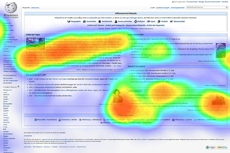
A heatmap represents data in 2D (or graphically) by depicting different values on a color scale. Within a marketing or product analytics context, heatmaps are used to render the volume or depth of user interactions on different parts of your digital resources (e.g., landing pages, product dashboards, application UIs, etc.) using various shades of color, ranging from blue (light) to green (heavy).
How Does A Heatmap Work?
Heatmap software visualizes data in a two-dimensional matrix or grid format by using different colors to represent the values of the data points within the grid. Heatmaps are often used to visualize data that can be organized into rows and columns on a flat surface (i.e., your website/application’s UI).
Heatmaps can take various forms and are used in diverse fields, depending on the type of data you’re trying to track and visualize and your specific goals, although we’ll be focusing on marketing, product, and growth use cases for digital products.
They are a valuable tool for gaining insights from data in a visual and intuitive way, allowing product teams to make data-driven decisions and identify patterns or areas of interest within the data.
Benefits of Using Heatmaps
Most of the metrics and data points (clicks, mouse hovers, etc.) heatmaps are used to track can’t be understood intuitively without that overlay interface that shows where an action occurred on your product’s UI. Heatmaps create a relationship between your users’ actions and your product and website’s UI and convert metrics from thousands (or even millions) of users into accumulated human-readable patterns.
Identify trends in website engagement
Heatmaps condense the behaviors of your entire user base into single mosaics that:
- Shows popular links, buttons, and CTAs and vice versa.
- Measures how deep into your web pages your users scroll and what percentages reach each level.
- Highlights UI elements that often generate errors and shows which parts of your UI users focus on the most.
That data can be used to reorder critical CTAs, buttons, and elements to UI spots where they’ll get more visibility and uncover faulty elements that need fixing.
Optimize for conversions
Heatmaps highlight the parts of your user interface that attract the most clicks, mouse hovers, and eye-level gaze—those attention hotspots where you can boost your conversions and click-throughs by placing your CTAs, headlines, and form fields within.
Challenges of Heatmaps
Heatmap analytics is highly sensitive by default, and it’s impossible to filter out false positives. As a result, any imprecision can contaminate your data and paint a different picture from your users’ actual interaction with your product.
1. Variable device sizes can skew heatmap data
Basically, heatmaps work by plotting the distribution of user interactions and attention on a webpage or application so when users access a website or application from devices with different screen sizes, it can lead to the following issues that affect the accuracy and interpretation of heatmap data:
- Heatmap scaling: Heatmaps typically represent data in a pixel-based grid. Consequently, as content gets scaled to fit various screen sizes, that data might be distorted and may not accurately reflect user interactions with specific page elements due to these differences in content positioning. This can lead to a misalignment between the heatmap data and the actual user interactions, making it challenging to draw meaningful insights.
- Heatmap granularity: The granularity of heatmap data may vary depending on the screen size. On larger screens, users may have more visible content and interaction points, while on smaller screens, interactions might be clustered differently. For instance, tapping a button with your thumb (on mobile) will leave a larger impression vs. clicking with a mouse cursor simply because you’re working with widely different UI canvases, and this can result in inconsistent heatmap patterns.
- Interaction density: The density of user interactions may differ across devices. For example, on larger screens, users might be more likely to engage with content that is more spread out, while on smaller screens, interactions may be concentrated on specific areas due to limited space. This can lead to skewed heatmap data, especially if the content layout is responsive and adapts to different screen sizes.
- Scrolling behavior: Users on smaller devices may scroll more frequently to access content that doesn’t fit on the screen, while users on larger devices may not need to scroll as much. This can affect the heatmap data related to content visibility and interaction patterns.
- Touch targets: For touch-based devices (e.g., smartphones, tablets, etc.), the size of touch targets can affect user interactions. Smaller touch targets on smaller screens may result in unintentional clicks or taps or impact a larger footprint of your UI canvas, thereby skewing your heatmap’s accuracy.
- Mobile vs. desktop behaviors: Users may exhibit different behaviors and interaction patterns when switching between mobile and desktop devices. Analyzing heatmap data without considering these behavioral differences can lead to misinterpretations. For example, mobile users rely on on-screen keyboards, which are less convenient for lengthy text entries, while desktop users have a more efficient and precise typing experience; likewise, since mobile users are often on the go, using their devices in various environments, you might notice their behavior skewed towards shorter, task-focused interactions while desktop users might have longer sessions that include a lot more browsing and on-screen interactions.
2. Heatmap tools can be pricey
Product analytics tools usually bundle heatmaps along with other features you might not need, which might significantly bump up pricing, while smaller SaaS providers who charge less are usually less reliable. In other words, if a product analytics platform charges $15k per year for its lowest tier that offers heatmaps, cohort analytics, session recordings, surveys, polls, etc., you can’t pick and choose which features you want.
Likewise, as your product’s usage scales, your heatmap usage and pricing will creep up exponentially, especially when you start processing larger datasets, using up more storage and processing resources.
3. Lack of precision
Imprecision can corrupt your heatmap data by:
- Recording accidental interactions, such as unintentional scrolling, zooming, duplications, bot activity (from installed extensions, etc.), or even network issues, as intentional.
- Overstating UI footprints, e.g., a thumb click on a mobile app’s UI will leave a larger footprint compared to a desktop click, although both have an identical function/aim.
- Misattributing user interactions or not registering them completely.
4. Heatmaps lack precision and are a form of “analytics theatre”
Heatmaps do provide a footprint map of user interactions – but it lacks the “why” behind this, which is ultimately what you want to know. Heatmaps provide a form of “analytics theatre”, ie. they provide colorful charts that engage those looking at charts.
However, they provide no meaningful reasons why users aggregated to these areas of an application and provide no quantifiable, tangible data. This means that heatmaps are often just noise for product managers and can provide more distractions than support for teams looking to improve product experiences.
7 Common Types of Heatmaps
The main factor that differentiates different types of heatmaps within a product or growth context is the interactions they measure.
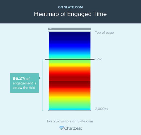
1. Scroll heatmaps
Scroll maps track the depth (of your webpages/application UIs) to which your users navigate and show you what percentage of users (who viewed a resource) scrolled down to which specific parts. Scroll heatmaps help product teams determine whether to:
- Move critical resources/product messaging above the fold to attract more attention.
- Understand if users encounter a false floor that implies they’ve reached a page’s end when they haven’t.
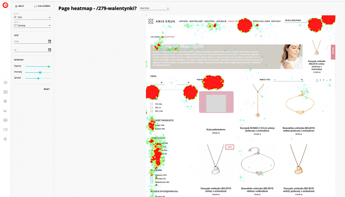
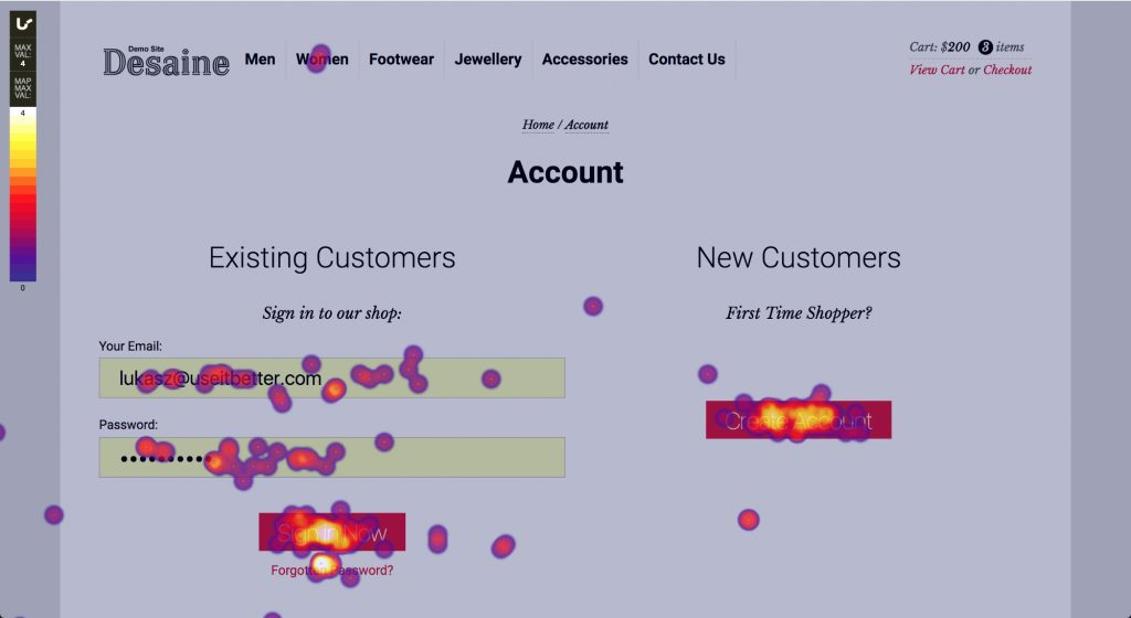
2. Click heatmaps
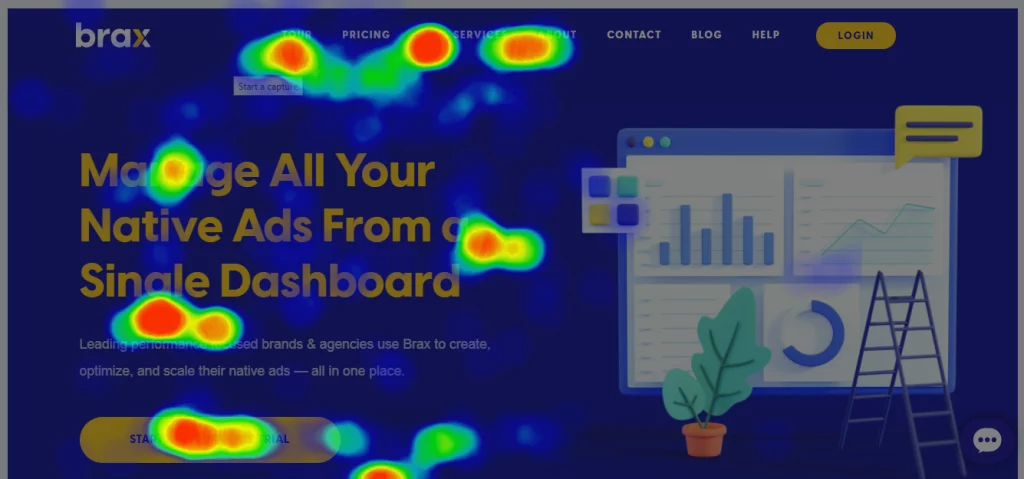
Click maps highlight the parts of your product/website’s UI that are clicked most/least often. They’re an effective tool for tracking the effectiveness/visibility of your CTAs, buttons, links, and interactive elements like sign-up forms and checkout process, as well as unpopular/unused widgets and options that can be safely removed without impacting user retention or user engagement.
Click maps also help product teams understand how users navigate between linked pages, identify problem areas with navigation issues, and understand which segments of their users (by filtering by demographics, device types, etc.) interact with specific features more.
3. Rage click heatmaps
Rage click maps capture and visualize rage clicks which often signal user frustration. They track rapid, repetitive clicks that often show a user’s patience is running out because they’re interacting with an unresponsive element, say, a link, button, forms, dropdown menu, widget, etc.
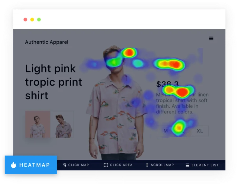
4. Mouse heatmaps
Mouse heatmaps track every UI interaction your desktop users’ cursors make on your web pages, including clicks, scrolls, pinches, zooming in/out, dragging, hovering, etc. They observe your users’ navigation speeds, browsing paths, and on-screen interactions and render them in different color schemes to highlight parts of your web UI that saw more/less/average interactions.
5. Engagement heatmaps
Also known as attention heatmaps, engagement heatmaps provide insights into user engagement and attention on a webpage or within an application. They grade your website/application’s UI canvas with shades of blue/green/red based on the volume of interactions it attracts. Engagement heatmaps are very helpful for determining where to insert headlines, images, videos, or calls to action to attract maximum user attention.
6. Error click heatmaps
Error click maps identify and visualize instances where users encounter errors, issues, or difficulties while interacting with a website or application. These heatmaps overlay the webpage or application interface with areas that frequently lead to errors displayed in distinctive colors (e.g., red or orange).
7. AI-generated heatmaps
While standard heatmaps measure interaction density after the fact, AI-generated heatmaps use algorithms to speculate which parts of your product/website’s UI your users are likely to interact with, often by extrapolating historical heatmap trends. If they’re trained on a sufficient corpus of existing heatmaps, AI-generated heatmaps can reach 95% accuracy.
What Is Heatmapping Software?
Heatmapping software is a type of UX tool that enables companies to analyze application and web page screens using color-coded data visualizations. Each color variation represents a cluster of data that signals an action, pattern, or behavior.
Heatmaps are typically used by teams that oversee digital products, user experiences, technical performance, and revenue generation. With heatmaps, you can easily visualize how visitors on websites and mobile apps interact with on-screen elements, navigate pages, user friction points, and conversion triggers.
Heatmap tools have different implementation cycles, movement tracking features, data analysis capabilities, and customizable configurations. Depending on the use case, some software is also more complex than others to install. If you’re evaluating a heatmapping software, consider its ability to provide you with data you can act on immediately.
The core features of all heatmap software include:
- Create heatmaps that overlay mobile apps, web apps, and web pages that visualize user experience and engagement.
- Tracking user behavior analytics such as clicks and dropoffs.
- Session recording to see what users are doing.
- Data collection and reporting.
9 Best Heatmap Software in 2024
Here are nine of the best heatmapping software platforms that enable product teams and UX teams to analyze app and web user behavior:
1. Hotjar
- Review Rating: 4.3 out of 5
- Price: Get started for free
Hotjar is a popular tool for optimizing websites, analyzing new feature releases, and collecting user feedback. It’s easy to set up on websites and e-commerce platforms like Shopify, Wix, Unbounce, and WordPress.
In addition to their heatmap feature, Hotjar users can record user sessions to dive deeper into on-page actions like clicks, mouse movements, and rage clicks. These session playbacks and user actions help product managers, designers, and business owners map user journeys, deduce friction points in the user experience, and identify errors and bugs.
Another value-add of the tool is its data dashboard that centralizes user insights and session metrics. This gives users an easy way to monitor product usage. Hotjar also lets teams slice product analytics down further using custom filters or integrations with analytics and segmentation tools such as Google Analytics, Segment, and ClickFunnels.
The core Hotjar features include:
- Heatmap for websites
- Session recordings
- Click tracking
- Mouse movements
- In-app feedback surveys
- Data dashboard
- No-code integrations
2. Smartlook
- Review Rating: 4.6 out of 5
- Price: Starts at $39 a month
Smartlook helps digital marketers, customer support representatives, and product teams understand user behavior on websites and mobile apps. It’s a suitable tool for companies with a multi-platform experience, which makes it different from solutions like Hotjar. Teams can use Smartlook to map user journeys between a website and a mobile app to test the effectiveness of UX triggers, user flows, and routes between screens.
Smartlook integrates with Google Analytics, but it also offers its own advanced analysis features within the platform. Users enjoy using these features for a more straightforward way to study events and conversions within each session recording. Some popular event-tracking use cases include pasting URLs to study page visits, tracking click user text inputs, and labeling specific user actions as a new event right within a session recording that’s being played.
Teams can also use Smartlook to visualize event-tracking data as funnels. Funnel analysis charts can be personalized with each company’s unique properties to define core user groups.
The core features of Smartlook include:
- Heatmap for websites and mobile apps
- Session recordings
- Click, tap, and scroll tracking
- Event tracking
- Funnel analysis
- Cross-platform analysis
3. Glassbox
- Review Rating: 4.8 out of 5
- Price: Contact for more information
Glassbox is a digital insights platform that helps customers explore everything related to the customer experience. Teams can capture everything from lifetime user behavior, session replays, event tracking, and performance analytics.
Product, marketing, and customer experience teams use Glassbox to automatically track user interactions and convert them into journey maps and funnels. The platform’s interaction maps allow teams to analyze pages in more detail than typical heatmaps. For example, product designers use Glassbox to view product usage metrics for each element on a page, like product titles, calls-to-action, and images.
Engineering teams also use Glassbox to record technical events, detect unusual product behavior, and set up bug alerts. In addition to digital analytics and product development tools, companies can leverage Glassbox’s native integrations to monitor technical events with application performance management software.
Core features of Glassbox include:
- Heatmap for websites and mobile apps
- Session recordings
- Click and scroll tracking
- Event tracking
- User segmentation
- User journey maps and funnels
- Automatic bug alerts
- Data dashboard
- Integrations
4. Contentsquare
- Review Rating: 4.6 out of 5
- Price: Contact for more information
Contentsquare’s digital experience suite helps product and marketing teams conduct deep research on on-page elements with zone-based heatmaps.
The platform’s Live Zoning feature helps companies view their website page as a dashboard of elements with each element’s respective user metrics — like click rates, engagement rates, and hesitation points. Companies also enjoy using their zoning features and session replays to quickly execute website optimizations, conduct A/B tests, and pull up data for customer experience analysis.
In addition to heatmaps, teams use Contentsquare to segment user journey data into channels and campaigns. Unlike user journey maps in other tools, the platform visualizes user behavior and interactions as a color-coded sunburst diagram. This format gives you a transparent and condensed view of page-by-page journeys and drop-off rates within a single webpage. Teams can also backtrack digital journeys by viewing previously visited pages.
Features of Contentsquare include:
- Heatmap on website and mobile apps
- Session recordings
- Click and scroll tracking
- User journey mapping
- Form analysis
5. Fullstory
- Review Rating: 4.5 out of 5
- Price: Contact for more information
Fullstory’s suite of features makes data analytics an accessible tool for optimizing digital experiences. Product, marketing, and customer experience teams that use Fullstory prioritize easy implementation and ease of use for both technical and non-technical teams.
The platform has a comprehensive heat map tool that covers basic functionalities like tracking clicks and scrolls. It allows teams to capture and inspect rich data sets using segments and filters. It also allows companies to introduce more privacy for users and employees with compliance-friendly data tracking features.
Another strong point of the platform is its conversion funnels. Revenue-facing teams and product researchers use it to capture pinpoint data about conversion rates, friction points, and technical bugs. Fullstory also gives companies a detailed analysis of how user signals may translate into revenue gains and losses.
Features of Fullstory include:
- Website heatmaps
- Session recordings
- Click and scroll tracking
- Event-tracking
- Journey maps
- Conversion funnels
- Data privacy customizations
6. Mouseflow
- Review Rating: 4.6 out of 5
- Price: Get started for free
Mouseflow enables product teams to use heat maps with six mouse tracking capabilities: click, scroll, attention, movement, geo, and live. Companies can insert a code into their website without any manual setup to start recording heat maps for dynamic on-page content, top geographic locations, and user engagement analytics.
Supplement your heatmap analysis with an easy tagging system called Friction Scores to flag user satisfaction levels. The platform automatically looks for abnormal metrics in your session recordings and provides a score so you can spot high-priority product pain points and optimizations to make.
Mouseflow’s analytics capabilities suit marketing, product, research, and revenue teams. Like other heatmap tools, you can use built-in filters to analyze session recordings by pages, tags, and friction scores. Teams also like how Mouseflow lets them watch recordings of dropped and converted users directly within conversion funnels. This makes it a seamless user experience for side-by-side comparison of product paths and channels.
Moustflow features include:
- Website heatmaps
- Session recordings
- Advanced on-screen movement tracking
- Conversion funnels
- Form analysis
- Interactive customer surveys
7. Plerdy
- Review Rating: 4.7 out of 5
- Price: Get started for free
Plerdy’s suite of conversion and optimization products empowers marketing teams, revenue-facing departments, and product designers to make the most of visitor data. The platform has tools built for SEO and e-commerce use cases (think Shopify and BigCommerce online stores) that can be used alongside user experience staples like heatmaps, session recordings, and customer feedback solution forms.
Companies use Plerdy’s heatmaps because of the feature’s simplicity — which for some, leads to a less buggy product. It’s a lightweight feature that’s quick to set up and can be used immediately. Teams have the option of purchasing an all-one-package of products or selecting their UX tool specifically. With the free trial, you can try a little bit of everything until your daily limit runs out.
Plerdy’s website heatmap has a standard list of capabilities, like click tracking, event tracking, and user segmentation. What makes this tool stand out is its robust analytics on first clicks and click sequences. This is especially beneficial for e-commerce businesses and marketing teams who lean heavily on a visitor’s first arrival to a website. Plerdy customers can generate a summary of each user segment’s first clicks within a simple and scrollable UI.
Plerdy features include:
- Website heatmaps
- Session recordings
- Click, scroll, and movement tracking
- First-click analysis
- Pop-up surveys
8. UXCam
- Review Rating: 4.7 out of 5
- Price: Get started for free
Unlike other tools on this list, UXCam is a heatmap tool made for mobile apps. This means it prioritizes a different set of features to accommodate smartphone user behavior and privacy standards. The platform’s mobile SDK is live in over 37,000 apps. Developers can rest assured that the SDK is easy to integrate with and has full security compliance.
The most significant difference with this heatmap is the types of movements that are tracked. Engineering, product, growth, and customer support teams can analyze different points of the user journey using micro gestures — like taps, swipes, and zooms — or key gestures — like rage gestures or first and last touches. Compare heatmaps for screens in your app versions, screen specifications, and mobile operating systems.
UX Cam has a built-in feature that allows you to comment directly in session replays and tag team members to communicate UX feedback. Sessions with comments are labeled so teams can quickly revisit them later.
UXCam features include:
- Heatmaps for mobile apps
- Movement tracking
- Session recordings
- Event-tracking
- Mobile SDK
- Security compliance
- Cross-platform analysis
- User journeys and funnel conversions
- Bug reporting
- Integrations
9. Quantum Metric
- Review Rating: 4.7 out of 5
- Price: Contact for more information
Quantum Metric’s platform is made for product design teams, from revenue-facing departments to engineers and DevOps. It defines its approach as Continuous Product Design, which means companies can use it to define, analyze, and iterate on every stage of the digital product journey.
A unique feature of its heatmap tool is that it includes element-level business metrics within the page analysis. In addition to click and scroll tracking, you can customize your heatmap view to include metrics like abandoned cart and conversion values. A summary of these insights can also be easily pulled up with a single click to glance at heatmaps, conversions, and engagement metrics quickly.
Advanced analytics is also another value-add for Quantum Metric. Customers enjoy using the tool’s aggregate analytics to see how many share a specific friction or conversion point. This makes it easier for companies to detect errors and opportunities at scale without watching multiple session replays.
Quantum Metric’s features include:
- Heatmaps for websites and mobile apps
- Click and scroll tracking
- Mobile SDK
- Session recordings
- Bug alerts
- Customer journeys
- Data dashboards
Analyze user experiences and product flows with Whatfix’s Product Analytics and User Actions
Heatmaps turn your users’ actions from mere figures and metrics into detailed stories: they weave together the experiences of thousands of users into one cohesive, high-fidelity map.
However, to provide actionable, quantifiable insights, product teams should invest in product analytics and user behavior analysis tools.
That’s where we come in: Whatfix helps product teams capture on-screen user actions with our powerful behavioral analytics platform designed for any use case, from understanding customer engagement and pain points to product managers building better products through UX optimization.
With Whatfix, analyze your product and user experiences to identify friction points, map user journeys, track customer user events, and build optimal user experiences. With Whatfix, quickly create in-app guided and overlay elements like Flows, Task Lists, Pop-Ups, Smart Tips, and more to provide interactive walkthroughs for contextual user onboarding. With Self Help, provide real-time support to end-users when they need it, right inside your product.


")
")
")
")
")
")