")
")
")
The Importance of a Product Tour
The common misconception is that product tours are simply automated versions of traditional user onboarding. But product tours are more than just pop-ups that provide feature overviews—they’re integral parts of an app, tool, or website’s user experience that combine different design elements to make onboarding more efficient.
A modern product tour combines different UI patterns such as pop-ups, interactive walkthroughs, beacons, tooltips, and explainer videos to allow new users to learn in the flow of work. These UX patterns offer more contextual guidance, creating a stronger first impression for new users. That solid first impression improves product adoption rates compared to traditional user onboarding, as a product tour guides users through the onboarding experience to help reach the aha moment.
First finding traction with web and mobile apps, product tours are now commonplace when using any new UX/UI. From online marketplaces, customer portals, e-commerce websites, and smart devices – even IT teams tasked with deploying new enterprise software for workfroces – product tours as a staple when using new technology.
A well-designed product tour streamlines the user onboarding process. It helps new users understand features and UI elements faster than if they had to learn independently. The more sophisticated your product, the more critical it is to have a product tour that guides users through the learning curve.
The main goal of user onboarding is to get users to recognize the value of your product as quickly as possible. This recognition of value is also called the aha moment, and it propels your users toward activation and full product adoption.
Effective product tours guide new users to their “aha” moment through these key ways:
Simplify the new user experience
Product tours simplify enterprise SaaS learning curves by teaching users how to use key features relevant to their roles. They provide guided in-app tutorials using a mix of onboarding UX elements like interactive walkthroughs, pop-ups, tooltips, and checklists to nudge users on certain paths and help them realize value in a product quickly.
Drive meaningful action
Effective product tours guide users to take meaningful action instead of providing passive overviews of key features. This “learning by doing” maximizes knowledge retention so users can master your product faster.
Accelerate time-to-value
Product tours help users quickly learn how to use a product, reducing the time it takes them to become proficient and get value from it. By guiding users through the most important features and functions, product tours help them get up to speed faster than they would on their own.
Improve new user engagement
Well-designed product tours reduce friction in the user onboarding process. When the first experience with your product goes smoothly, users are more likely to remain engaged and recognize the value of your tool, improving the rate of user retention. Product tours are core components of self-serve user onboarding. And when done well, they increase product adoption and retention while reducing inbound support requests and the need for additional user training.
Reduce reliance on user support
Product tours can help reduce the number of support requests by providing users with a guided tour of a product. This is largely because users are more likely to understand how to use a product and are less likely to encounter issues that require support.
Related resources:
- 17 Best User Onboarding Flow Examples in 2025
- Product-Led Onboarding: Best Practices + Examples
- In-App Training: The Key to User Enablement
The Evolution of the Product Tour: From Inception to Today
The origin of the product tour dates back to early 90s, when Apple provided its customers with a video demos featuring detailed tutorials on how to use their new Macintosh computer.
Its rival Microsoft revolutionized this concept when they launched Windows 98, which features a desktop launcher that triggered a welcome tour experience for first time users. This experience included a welcome video and was personalized with data the end-user submitted during setup, allowing it to refer to the user by name. After watching the demo video, users were encouraged to use desktop shortcuts to trigger similar tutorials including various walkthrough wizards and user guides.
As personal computers and the Internet disrupted the way of life in the 21st century, hundreds of new digital products and services flourished. Companies and software providers began to focus more on user experience as a key way to reduce the learning curve associated with new technologies and to retain more users, leading to the mass adoption of product tours to drive new user onboarding.
Early software development teams built these experiences in-house, but as resources became thin, no-code digital adoption platforms like Whatfix DAP emerged that could enable product managers and web experience designers to create and launch their own guided onboarding experiences without requiring technical resources. Utilizing a variety of UX onboarding elements, product teams could be agile in their product tour development, quickly launching segmented onboarding experiences that could be analyzed and improved on.
Emerging technologies like AI and AR/VR again look to disrupt the product tour. AI can provide more contextual, adaptive experiences that learn based on the actions and needs of specific end-users, and improve themselves without intervention. AR/VR advancements like the Metaverse challenge the entire way of interacting and using technology interfaces, presenting new opportunities for onboarding new customers and end-users.
Key UX Components of a Product Tour
A product tour is a combination of UX/UI elements that together make a holistic new user onboarding experience, guiding new users through a product’s GUI, its core features, and ultimately driving user adoption and retention. Here are the core components that make up a product tour experience:
1. Welcome screen overlay
Product tours are triggered upon first app use or website visit by a new user. This includes an onscreen overlay that forces a new user take a specific action or follow a path, including a few core compontents, including:
Pop-Up Screen
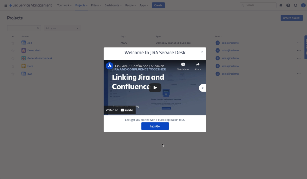
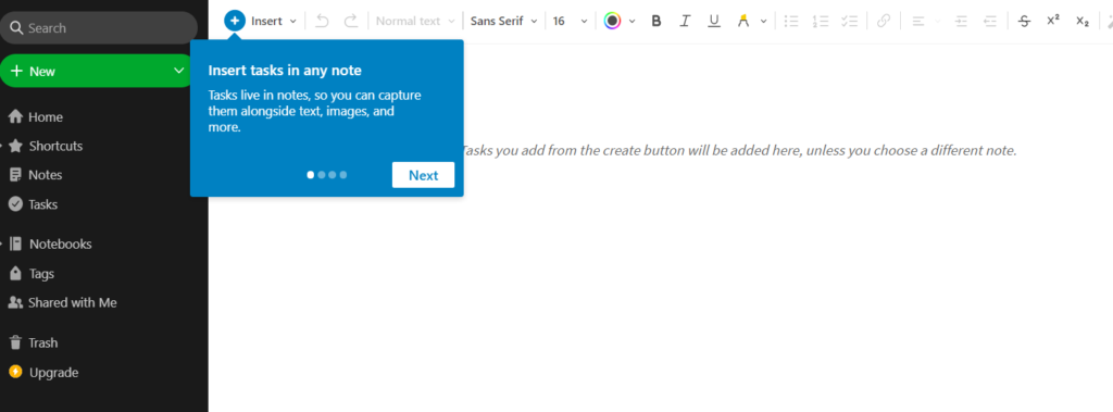
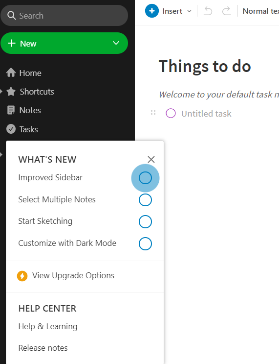
As previously mentioned, the first step in a product tour experience is the onscreen overlay, also known as pop-up or modal window. This pop-up overlay can be simple splash screen graphics that welcome new users, prompt users to take a specific action that triggers a guided experience, or embed video tutorials for additional new user support or welcoming a new customer to an application. Below, you can see how a company introducing Jira to their workforce creates a pop-up with Whatfix DAP and embeds a video on how to get started using Jira and Confluence.
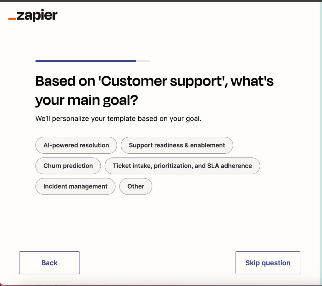
Welcome Survey
Many product tours included embeded welcome surveys that help tailored product tours to specific user personas – helping to personalize the new user onboarding experience and deliver contextual value to users faster. For example, below you can see how Zapier first asks new users to describe their job function. From there, it further breaks down each function with a few ways Zapier can provide value to their day-to-day.
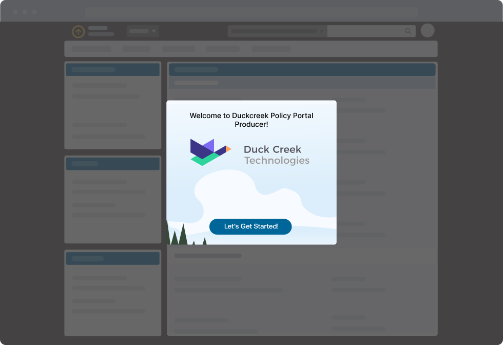
Launcher
A launcher is an embedded CTA button that can be used to trigger in-app guidance and facilitate product tour experiences. Launchers can be used inside a pop-up overlay that launches an entirely guided experience, or can be embedded into your UI that allows users to re-launch a product tour experience after closing it out.
Below you can see an example of a “Let’s Get Started” launcher CTA button on a pop-up overlay on Duck Creek’s claim management software, prompting users to go on a guided tour of the product.
2. In-app guided tutorials
Once users enter a product tour experience, they’re enabled with a variety of guided UX elements to help them understand how to use a new tool, reducing the learning curve and helping them to experience their “aha!” moment faster. Here are a few commonly used onboarding UI elements that drive new user adoption:
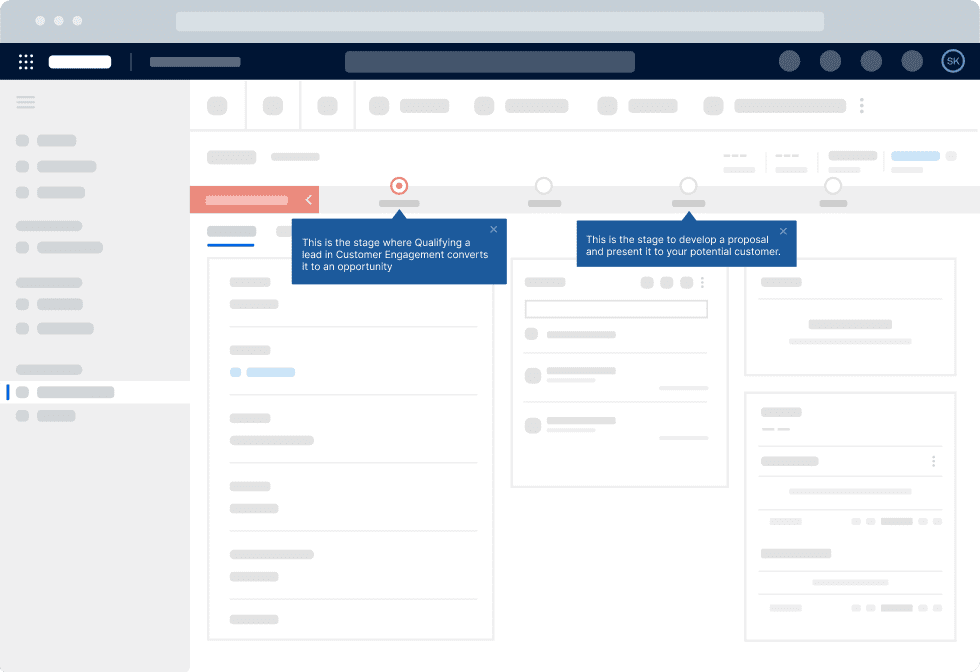
Interactive walkthroughs
Interactive walkthroughs are guided instructions on key product features, tasks, use cases, and workflows. Users see these step-by-step instructions as they follow the steps of your product tour, learning about processes as they work.
Product walkthroughs are especially useful for simplifying the training processes for complex enterprise applications or familiarizing users with a new interface. You can use them to engage users during initial onboarding, when rolling out new features, or to drive adoption of complex workflows or advanced features.
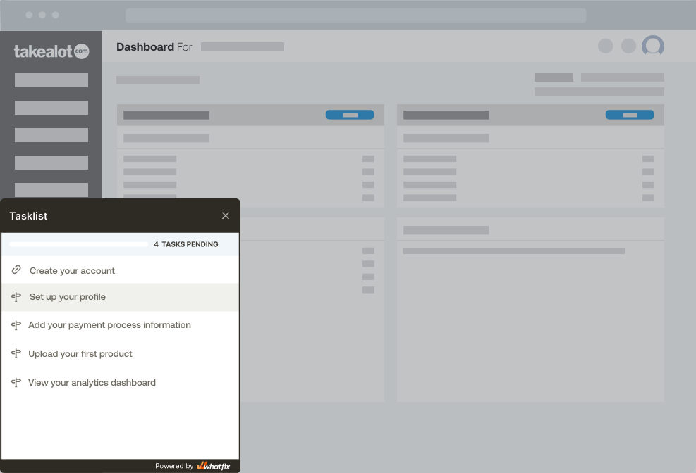
E-commerce retailer (and Amazon rival) Takealot.com uses Whatfix DAP to create interactive walkthroughs for its sellers to set up their marketplace profile, add their first products, and keep up with advanced seller portal features and selling techniques – like how to create promotions or track their selling analytics. This reduced time-to-onboarding completion time for new sellers by 83% and deflected over 130,000 support tickets from sellers on how to set up and use its marketplace portal.
“With Whatfix, Takealot has enabled its sellers to make their first sale with frictionless product-led portal onboarding, keep up with advanced seller portal features and selling techniques with in-app communication, and overcome support issues with self-guided experiences. We’re not just enhancing efficiency, but fostering a culture of growth and success together,” said Louanne Reynolds, Product Manager at Takealot.
Task lists
Another staple of product tour experiences is an embedded user onboarding checklist, which we call Task Lists. With a Task List, product teams can include multiple tasks that must be completed in order to finish a product tour experience. As a user completes these actions, a progress bar showcases how many additional tasks they must complete to finish the experience.
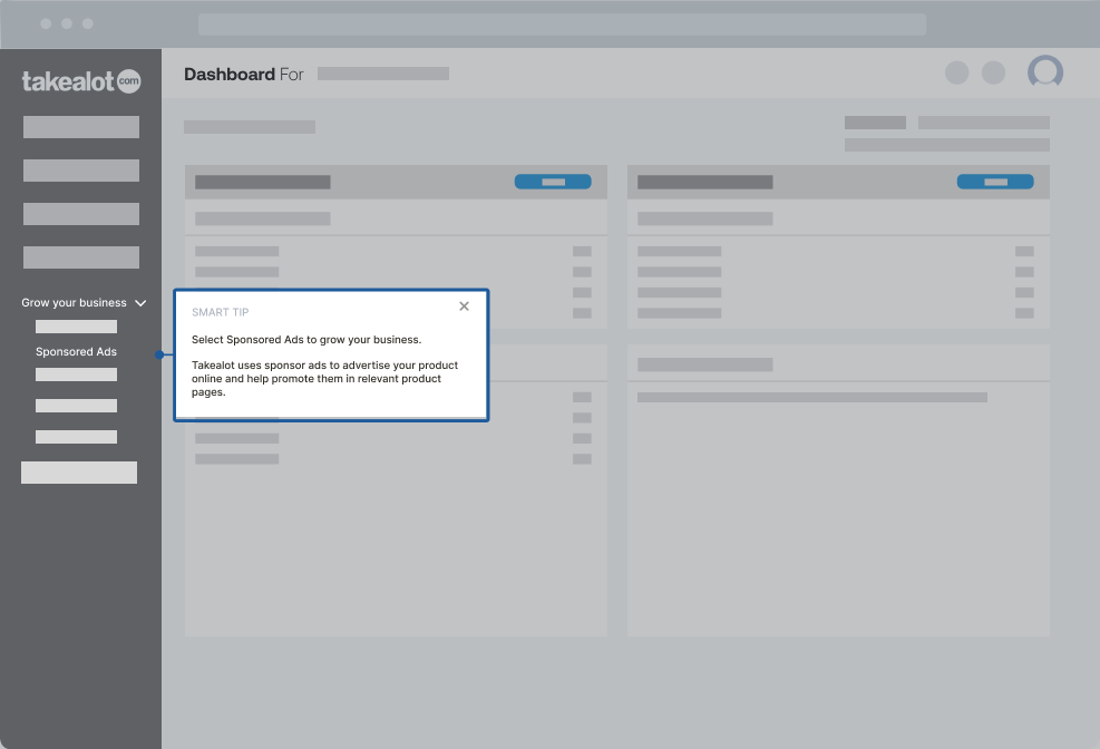
Tooltips
Tooltips (we call them Smart Tips) give users a quick overview of what a feature or UI element can do. Tooltips don’t prompt action from users. Instead, they convey key information in a way that’s less intrusive than guided product walkthroughs.
Hotspots
UX hotspots (we call them Beacons) are small icons or alerts that draw user attention to certain application elements. With these UI patterns, you can deliver crucial information about feature updates, workflow changes, and advanced use cases. Beacons allow users to interact with training material when they’re ready, which is key to a self-serve onboarding process.
Progress bar
Progress bars show users where they are in the tour and how much progress they’ve made. They typically appear at the top or bottom of the screen and provide a visual indication of how many steps are in the tour, how far along the user is, and how much longer the tour will take to complete.
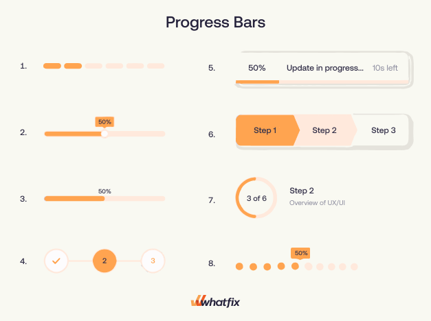
Progress bars are effective because they give users a sense of control and progress, which can help increase engagement and reduce frustration. By clearly indicating where they are in the tour, users can see how much progress they’ve made and how much they have left to go. This can help motivate them to complete the tour and feel a sense of accomplishment when they finish.
Progress bars can also help users understand the scope of the tour and what to expect. If they see that the tour has a lot of steps, they may be more prepared for a longer onboarding experience. Conversely, if the tour has only a few steps, they may feel more confident that they can complete it quickly.
No matter how you combine your product tour UI patterns, the goal remains the same—give users prompts to learn your application interactively. The most well-designed product tours engage people at all stages of the technology adoption curve without frustrating tech-savvy users or overwhelming slower adopters.
3. User support
Throughout a product tour experience, or after completion, users will still have questions about how to use your product and doubts on their ability to correctly utilize it. To overcome these challenges, new user experiences include user support elements embedded throughout (and after) a product tour to help new users overcome friction points and submit support requests.
Help center
Embedded help centers provide end-users with an in-app resource center to resolve product-related questions on set-up, feature usage, use cases, FAQs, account issues, and more. Organizations can use a tool like Whatfix DAP to create an in-app help center (we call it Self Help), which integrates with your knowledge base, end-user training, FAQs, company policies, release notes, webinars, and other knowledge repositories and user documentation.

Self Help can be opened from an embedded launcher in your product’s UI, and provides contextual knowledge entries and support articles based on where an end-users or new customers is at in an application, their recent behavior, or their product use case, end-user role type, or level of adoption.
At Whatfix, we use GenAI in Self Help, allowing end-users to ask open-ended questions to an AI-powered help assistant that provides contextual answers and help based upon the support documentation and knowledge repositories its been trained on. Organizations can analyze common Self Help queries and usage to improve their product tour, new user training, and application UI.
When to Use a Product Tour
Key moments in the user lifecycle to use a product tour include:
- First time users: Product tours are primarily utilized for new user onboarding to provide a basic overview of a product, it’s UI, and its core features.
- Launching new features: Product tours can highlight recently launched features, guiding them through its value and ultimately being a catalyst for new feature adoption.
- Explaining complex workflows: For complex applications or internally used enterprise software, product tours can provide step-by-step instructions that guide users through difficult to understand processes.
- Highlighting value of underutilized features: Product managers know which features are the most sticky and provide the most value to users. If data shows that certain users have failed to adopt or have low engagement with these features, product tours can re-familarize users with these critical features and showcase how to drive value from them.
- Showcasing UI redesigns or product updates: A key outcome of product tours are to familize new users with a product UI. When products launch significant product redesigns or new UI elements, product tours can be implemented to showcase the differences and help overcome resistance to change that users often experience after signifcant change.
Best Practices for Creating a Product Tour
Research has found that the average complete rate for product tours across 15M end-user experiences is 61%. That’s not terrible, but it also leaves room for improvement. The most effective product tours adhere to a few key guidelines – all based on contextualizing experiences and following UX best practices.
There’s no one-size-fits-all approach to designing product tours. But focusing on these basic principles will help minimize time-to-value for new users:
1. Personalize as much as possible
Don’t create one generic product tour for all new users. Research shows that users are 123% more likely to complete it when in-app tours are contextually tailored to different end-users based on engagement patterns and personas.
Segment product tours according to user roles to create a more personalized experience. Create various guided tours based on different user actions and app engagement.
2. Let user actions trigger in-app experiences
Not all product tours should initiate right when a user logs into your product. Triggering product tours based on specific user actions ensures tutorials appear seamlessly in the proper context. If users engage with a specific feature or workflow, have that trigger a specific mini-guided tour that walks them through related features or use cases of how other users are taking advantage of it.
3. Use a variety of UX elements in your product tours
Choose the right product tour UI pattern to keep tutorials from becoming disruptive. For example, a pop-up modal window might make sense for an initial welcome message, but subtle tooltips might be more appropriate for quickly explaining a feature or button.
4. Maintain brand and design consistency
Focus on design consistency when adding product tour UI patterns to your SaaS tool to maintain a seamless experience. Mismatches between colors and styles can lead to disruptive experiences for users, hurting engagement and overall adoption.
5. Break up your product tour
Avoid creating product tours that give users a long list of steps to walk through. Your goal is to demonstrate the value of your product quickly. If they abandon the product tour, you risk missing out on a critical piece of activation and adoption.
Focus on the “why.” Motivate users to take action by focusing on the “why” of your tips, prompts, and tutorials. Don’t just provide generic steps that tell users how to do something. When you convey the value of their actions, they’ll be more motivated to engage with your product and continue the adoption process.
Product tours can be used across the new user lifecycle. Use tours to introduce advanced features after a certain amount of time has passed. Analyze if certain features or workflows are underadopted and provide additional guided experiences to drive adoption.
6. Allow users to skip or re-launch your product tour
Not all users need a product tour. Some users may already be familiar with your product or may not need a guided tour to understand how to use it. Forcing them to go through a tour can be frustrating and may result in a negative user experience. Allowing users to skip the tour gives them the flexibility to choose the path that’s best for them.
Another consideration is that users may have limited time and attention spans and may prefer to dive right into using your product. By providing a way to skip the tour, you respect their time and make it easier for them to use your product quickly.
Those who need the tour can take it, while those who don’t can skip it and get to the product more quickly. This helps ensure that users have a positive experience with your product and are more likely to continue using it in the future.
On the other hand, some users may rush through the product tour on their first visit or need reinforcement training on a product’s core features. Provide your users a way to relaunch your new user onboarding experiences like your product tour and task list. Embed a button in your UI that triggers and launches your new user onboarding experience.
7. Track, analyze, and benchmark product tour performance metrics
Use product analytics to set up custom user events to track how users interact with your product tour. Pinpoint what actions result in new users experiencing their “aha!” moment and conduct a funnel analysis to understand where new users are experiencing friction in your product tour.
Are users abandoning them halfway through? Are they working better for one segment of users than for others? Study the data from your product tours, and update the steps for more efficient onboarding.
8. Take a data-driven testing approach to improving your product tour
Benchmark your time-to-value across different user cohorts and map the journey to user adoption. Use these metrics as a baseline control for running product tour A/B experiments and improvement tests.
Product managers should take an iterative approach to product tour A/B testing, creating a backlog of user onboarding experiments and continuously testing one variable at a time against your control. Remember, small improvements cascade over time.
A digital adoption platform like Whatfix DAP enables customer success and product teams with a no-code tool to take an agile approach to building the most effective new user product tours. Analyze new user behavior, identify areas of improvement, and create on-brand in-app tours and task lists with a no-code editor, removing technical dependencies and allowing fast-paced testing.
Examples of Effective Product Tours
We’ve all come to expect new user onboarding experiences and guided tours upon first using a new product to help familarize us with how it works. From workplace web applications, mobile apps, and website portals, here are a few of our favorite examples of effective product tours:
1. Evernote
Evernote is a note-taking tool for business and personal use. Its product tour shows users how to create their first note and then goes through a series of feature walkthroughs for more advanced organization and note editing use cases.
It also includes a task list that allows users to complete individual tasks to invoke a sense of accomplishment.
2. Asana
Asana is a project management tool that features. After signing up for an account, new users are prompted to create their first project – which starts its product tour.
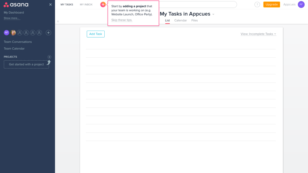
It prominently displays to users how to minimize the pop-ups while also making the flow pop with Asana’s bright, branded color palette. Once a new user minimizes the product tour or exits the page, they’re alerted to how to re-enter the product tour with a hotspot.
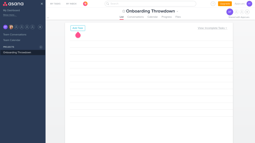
It’s one of our favorites because creating a new project is the key action that shows value to new users the most. Those new users that complete Asana’s product tour will be provided personalized guidance to their aha moment.
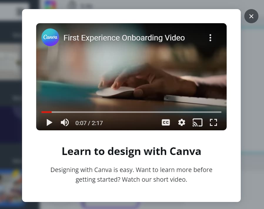
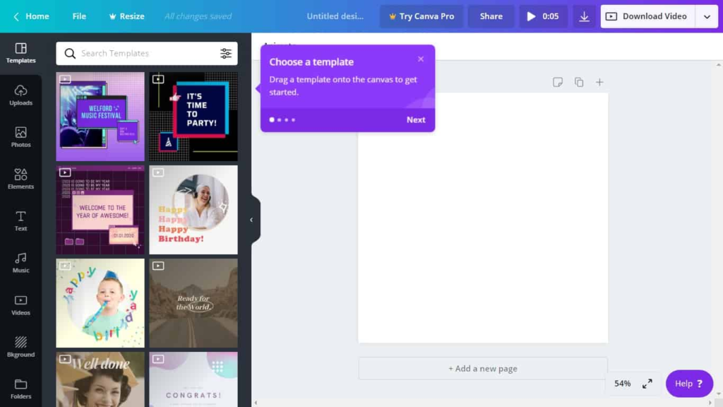
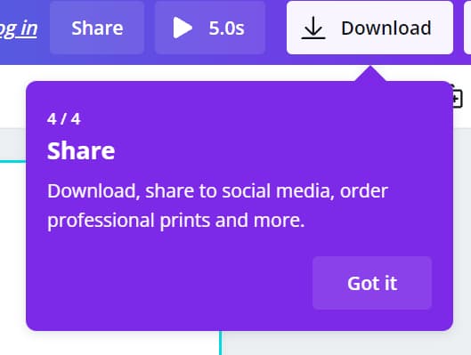
3. Canva
Canva is a graphic design and image editor for non-design professionals. The tool starts its product tour with a short, 2-minute user onboarding video.
After the introductions, users are placed in a new blank canvas with a product tour prompt to choose a template to drag into the canvas.
After a user finishes their first design, the product tour finishes the user journey by presenting a “share” button that demonstrates how to download or share the new design.
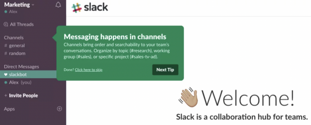
4. Slack
Slack’s product tour is highly interactive and personalized, with a chatbot named Slackbot guiding users through the onboarding process. The chatbot asks users questions about their interests and preferences, and then tailors the tour based on their responses. This makes the tour feel more like a conversation than a one-way presentation.
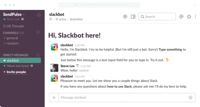
Slack’s product tour also emphasizes the collaborative nature of the platform, showing users how they can communicate and collaborate with their team members. This helps users understand the value of the product and how it can improve their work.
5. Dropbox
Dropbox product tours focus on the core features of the product and don’t overwhelm users with unnecessary information. Dropbox’s product tour provides step-by-step guidance, walking users through each feature and function in a clear and concise manner. This helps users understand how to use the product and what it can do for them.
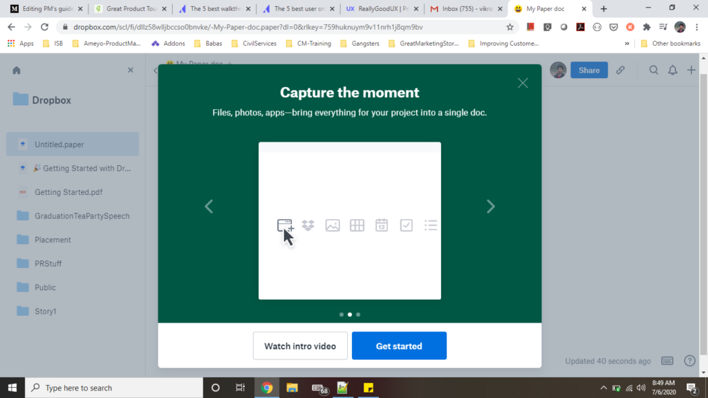
Dropbox also provides hands-on practice, allowing users to try out features and functions as they learn about them, which helps users retain the information and feel more confident using the product.
6. Miro
Miro uses product tours as a key method to launch new features. In the example below, you can see how Miro creates a carousel pop-up overlay that includes five different features powered by its new GenAI capabilities.
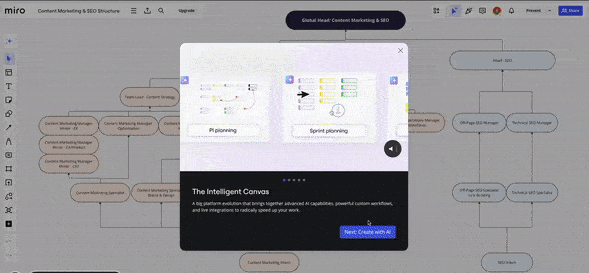
Each carousel item has a corresponding GIF that showcases the feature in action. It provides a short description for each workflow, “next” and “previous” buttons to jump back-and-forth between experiences, a way to close out of the guided tour experience, a “try it now” launcher, and a progress icon that let’s end-users know how much longer the product tour experience will last.
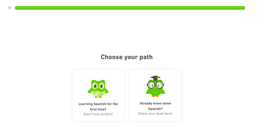
7. Duolingo
Language learning app Duolingo has a fun and engaging product tour experience that begins with a welcome survey that helps personalize its new user experience. It’s encouraging tone and engaging product UI make its product tour enjoyable – often being accompanied by its endearing mascot, Duo, the Owl. It starts its product tour with a survey on why you’re learning a language:
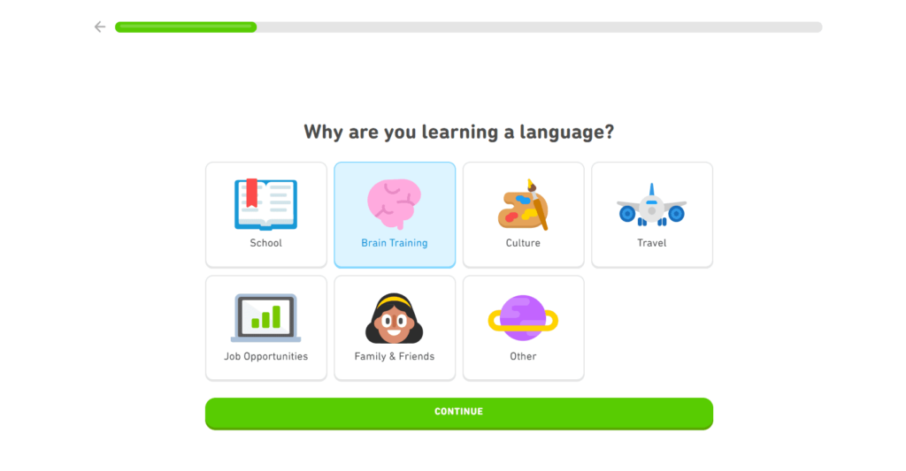
The pop-up overlay includes a progress bar at the top of the window to set user expectations, increasing the onboarding completion rate. It further personalizes the product tour experience by asking users about their current language proficiency to personalize the experience further:
Product Tours Click Better With Whatfix
See how these companies accelerated time-to-value and increased user adoption by creating no-code product tours, task lists, welcome surveys, and other new user in-app guidance with Whatfix:
- Takealot enables its new online marketplace sellers to make their first sale quickly and drives advanced feature adoption, shortening time-to-value by 600%.
- Sophos provides technical onboarding and support for its Firewall customers via in-app tutorials and an in-app resource center, saving $390,000 in customer onboarding and support costs.
- Dimensions UK increased three-month user adoption for its product from 10% to 50% after implementing comprehensive digital guidance for users.
What Is Product Tour Software?
Product tour software is a type of user onboarding tool that allows product teams to quickly build a contextual, interactive onboarding UX with guided user experiences for your SaaS product or web app, without the need for coding knowledge or development support.
Product tour software provides teams with a no-code content editor to create, launch, and test interactive, guided product tours, interactive walkthroughs, new user task lists, and other user onboarding experiences.
These tools enable non-technical team members like CSMs and product managers to take an agile approach to product tour experiences with the need for engineering support. These platforms provide segmentation features to target specific types of users, craft on-brand in-app experiences, and analyze effectiveness.
For most product teams, buying a third-party product tour software significantly outweighs the benefits of building internally. While we go into detail on the user onboarding builds vs buy debate here, the key things to consider are:
- Build your product tour in horus if you have a large engineering team and have large user base with highly-contextual needs.
- Buy a product tour software if you need to be agile with your user onboarding experience, your userbase is growing, your a growth company, you have little engineering bandwidth, you have product managers or CSMs owning your product tour experience, etc.
Features of product tour software include:
- No-code content editor: Product tour software provide a simple content creation experience with a no-code editor. This enables non-technical team members to create, manage, and test guided new user tours without requiring engineering support. Customization features allow content creators to style in-app content to match your company’s or product’s branding.
- In-app guidance: Utilize a library of in-app guided elements including product tours, interactive walkthroughs, tooltips, hotspots, field validations, pop-ups, and launchers. Advanced product tour software provide if/then workflow builders and segmentation features to target specific types of users based on role, experience level, end-user type, etc.
- Help center: Integrate your knowledge base, FAQs, customer training, release notes, and other knowledge repositories within an in-app help center to provide self-service support to end-users that deflects support tickets.
- In-app surveys: Product tour software enables teams to create in-app surveys to collect user feedback on new feature requests, product bugs, or NPS and to segment product tour experiences via welcome surveys.
- Guidance analytics: Understand how end-users engage with and use your product tour and new user experience, like “what’s the average completion rate of my product tour?”, “where are users dropping off in my product tour?”, “how many times did a user launch a guided tour?”, and more.
- GenAI: Advanced product tour software integrated GenAI into your new user flows to adapt experiences based on user types and actions taken. Organizations can train their GenAI with their knowledge repositories, turning your in-app content. AI-powered DAPs assist in creating new in-app content, analyzing analytics to identify trends, and supporting end-users in completing routine tasks.
Best Tools for Creating Product Tours
Creating product tours that guide users to value takes more than just a tooltip builder. The best product tour software enables teams to design interactive, data-driven onboarding experiences, personalize them for different user segments, and measure the effectiveness of each step in driving adoption. Below are the leading tools for creating and analyzing product tours, ranging from enterprise-grade digital adoption platforms to lightweight onboarding builders, each suited for different levels of product complexity, team maturity, and business goals.
1. Whatfix
- Review Rating: 4.6 out of 5 stars across 481 reviews
- Best For: Large enterprises building scalable, data-driven product tours to accelerate time-to-value, drive feature adoption, and measure onboarding success.
Whatfix is a comprehensive digital adoption platform that enables teams to create interactive, no-code product tours and in-app walkthroughs, guiding users to their ‘aha’ moment more quickly. Product managers and enablement teams can use the visual editor to design Flows, Smart Tips, Pop-Ups, and Task Lists directly within the application, with no engineering effort required. Each tour can be personalized by user role, behavior, or lifecycle stage using advanced segmentation rules.
Beyond onboarding, Whatfix connects guidance with measurable impact. Teams can use Whatfix Analytics to track tour completion, engagement rates, and feature adoption metrics to see where users drop off or succeed. Self Help and QuickRead AI provide just-in-time answers in context, reducing friction when users encounter difficulties. The platform’s AI suite (Authoring Agent, Insights Agent, and Guidance Agent) makes it easy to identify friction points, auto-generate walkthroughs, and continuously optimize user experiences across enterprise applications.
2. Appcues
- Review Rating: 4.6 out of 5 stars across 339 reviews.
- Best For: Product-led teams that need quick, code-free onboarding tours and checklists to guide new users toward activation.
Appcues focuses on helping users discover product value with targeted, engaging tours. Its drag-and-drop builder lets teams create step-by-step onboarding flows, NPS surveys, and announcement modals that push users to key activation milestones. With customizable themes and templates, teams can launch tours without waiting on design or development cycles.
Appcues tracks completion and engagement metrics for each flow, giving PMs insight into where users succeed or stall during onboarding. It’s best for SaaS products focused on self-serve growth, where the goal is to shorten the path between sign-up and first success inside the product.
3. Pendo
- Review Rating: 4.4 out of 5 stars across 1,533 reviews.
- Best For: Product teams that want unified analytics and in-app tours to measure feature adoption and guide users through complex workflows.
Pendo helps teams connect in-app guidance to product performance. You can design product tours that explain new features or workflows while tracking how users move through each step. Its analytics layer reveals which features are driving retention and which need additional onboarding support.
Teams can also deploy NPS and feedback polls directly inside the product to collect context-specific sentiment data. That combination of analytics and in-app messaging helps teams iterate tours and understand their effectiveness over time.
4. Hopscotch
- Review Rating: 4.9 out of 5 stars across 52 reviews.
- Best for: Startups and small teams that need lightweight, clean product tours to accelerate onboarding without complex setup.
Hopscotch is a lean option for creating in-app tours that guide users to their first “aha” moment. Its visual builder helps you build and launch walkthroughs in minutes, making it ideal for new products testing onboarding hypotheses quickly.
It includes event tracking for basic completion and engagement metrics, so teams can gauge whether new tours are helping users reach value faster. Hopscotch is perfect for early-stage teams focused on validating onboarding flows before scaling to a full DAP.
5. Intercom
- Review Rating: 4.5 out of 5 stars across 3,360 reviews.
- Best For: SaaS teams already using Intercom that want to create guided tours within their existing support and messaging ecosystem.
Intercom Product Tours extend the platform’s conversational layer into onboarding. Teams can design walkthroughs that trigger automatically when users reach specific pages or milestones, nudging them toward activation. Tours integrate with chat, emails, and Series campaigns—allowing for consistent onboarding across touchpoints.
It’s ideal for smaller SaaS teams that want tours tied directly to customer communication, rather than a standalone onboarding tool. While customization and analytics are lighter than enterprise-grade DAPs, it provides a cohesive onboarding experience within the broader Intercom ecosystem.
6. Chameleon
- Review Rating: 4.4 out of 5 stars across 316 reviews.
- Best For: Product-led teams that need highly customizable onboarding tours and UI elements to match their product experience.
Chameleon enables product managers and designers to create on-brand, interactive tours, tooltips, and microsurveys that guide users to new features and actions. It supports advanced targeting, so onboarding content appears when users are ready—not at sign-up.
Its strength lies in flexibility and user experience design. Chameleon helps teams test, personalize, and iterate onboarding flows using event data and integrations with tools like Segment or Mixpanel. The result is a smoother journey that turns complex product moments into clear, guided paths.
7. UserGuiding
- Review Rating: 4.7 out of 5 stars across 714 reviews.
- Best For: SMBs and startups creating no-code product tours and onboarding checklists to increase activation and reduce time-to-value.
UserGuiding lets teams build interactive walkthroughs, checklists, and hotspots that help users understand features quickly. The builder is simple and intuitive, allowing non-technical teams to create and publish onboarding tours with ease.
Its analytics dashboard shows how users interact with each tour, helping teams measure onboarding success and refine guidance over time. It’s well-suited for SaaS teams with smaller budgets that still need structured, measurable onboarding experiences.
Related product tour buying resources:
- How to Quantify the ROI of a DAP Investment
- How to Choose the Right DAP Partner
- Best Digital Adoption Platforms in 2025
- Compare Whatfix vs. the Leading DAP Competitors
Why Whatfix is the “all-in-one” tool for user adoption
The Whatfix Digital Adoption Platform empowers product teams with an “all-in-one” platform to create, analyze, and improve product tours and new user experiences that reduce time-to-value, drive adoption, and build power users – all without engineering support.
1. No-code editor for creating segmented in-app guided tours
Whatfix empowers product managers to create on-brand product tours without technical expertise or engineering resources with its powerful no-code editor. Use Whatfix’s IF/THEN branching, user cohort segmented targeting, and Auto-Translation features to personalize your product tour experience to your users’ use cases, actions, and language preference all with a few simple clicks.
2. Variety of in-app guided elements that drive new user adoption
Whatfix provides product teams with a variety of in-app elements to drive user adoption outside of basic product tours. With Whatfix, create:
- Task Lists provide new users a checklist of items to complete, videos to watch, or in-app Flows to finish before completing their onboarding.
- Welcome Surveys that help personalize your new user onboarding experience to the use cases of each individual user.
- Flows walk users step-by-step through your product’s core features or workflows (like setting up a new account or completing your first action.)
- Smart Tips deliver timely or action-triggered tooltips to users to provide additional context or drive specific actions.
- Pop-Ups communicate product news, new features, marketing messages, and more to users.
- Self Help provides users an in-app resource center that integrates with your knowledge base, FAQs, in-app Flows, video tutorials, and more.
Whatfix also provides Beacons, Field Validations, Surveys, (and more) that empower product teams to build any custom product tour and solve any new user onboarding experience challenge you’re facing.
3. Use analytics to measure product tour effectiveness and take a data-driven approach to reducing dropoffs
Whatfix DAP provides product teams with Guidance Analytics to analyze and understand how new users are consuming and engaging with product tours and other in-app guided experiences during and beyond onboarding. Track the number of users who complete a Task List, understand where dropoff is occurring, and take a data-driven approach to optimizing and testing your product tours.

While this data is helpful, it’s also reactive. Your content creators design in-app guidance and support experiences, and then it provides insights into how it’s being used. Advanced digital adoption providers like Whatfix offer more robust, comprehensive product analytics coverage.
Whatfix Product Analytics enables comprehensive, codeless event tracking in your desktop or web applications. It allows you to set up, track, and analyze any in-app custom event—from sign-ins, pageviews, video plays, form engagements, and more—all without the need for engineering dependencies or additional analytics tools.
Whatfix Product Analytics comes out of the box with core analytics features and data reporting capabilities like:
- Cohorts: Build user segments based on specific actions, attributes, or criteria to run a cohort analysis. Compare these cohorts against one another, and use the data to create contextual experiences built to improve the experience for specific user segments.
- Funnels: Understand how users navigate defined paths and business processes, identify areas of user friction where users drop off, and launch experiments to improve funnel performance.
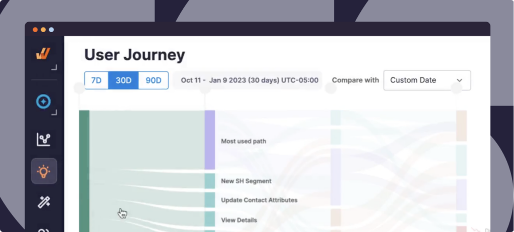
- User Journeys: Analyze the most common user paths users take while navigating through an application or process to help you optimize the parts of the user experience that matter the most.
- AI Trend Insights: Ask Whatfix AI any questions and it auto-generates insights and reports based on your user events and guidance analytics to uncover potential patterns and influencing factors.
- Surveys: Create in-app surveys to collect user feedback on user sentiment, CSAT, eNPS/NPS, and more. Gather insights from qualitative responses with ease through AI-powered survey analysis and blend it with your quantitative data to understand the entire picture.
These insights enable organizations to take a continuous approach to application development, process optimization, user experience, and overall technology adoption. Identify areas of friction in your funnels that result in high dropoff, and test new in-app content to improve conversions.
4. Drive advanced feature adoption with contextual in-app tutorials
Go beyond product tours and user onboarding flows with Whatfix and enable users to maximize your product’s potential. With Whatfix:
- Create powers users with in-app tutorials on underutilized and advanced features.
- Use in-app guidance to drive new feature adoption and awareness – from Pop-Ups and Smart Tips announcing new features, Task Lists that provide a checklist for how to use a new feature, Flows to guide users through the process, and adding release notes and new feature help into your in-app Self Help center.
- Announce product updates, company news, marketing messages, and more with Pop-Ups.
5. Customer enablement and success services
Often, technology providers offer similar capabilities. When it comes down to make a final decision, the add-on product services can be the deal maker or breaker.
Ask the product tour providers on your shortlist questions like:
- “How do you enable new customers to realize value quickly?”
- “Do you offer migration services?”
- “What does technical setup and content creator training look like?”
- “Do you have a network of product tour content creators to leverage?”
- “Do you have a in-app content library or out-of-the-box templates?”
- “How do you connect like-minded product manager and user adoption professionals and content creators?”
Whatfix has heavily invested in its customer value add-ons, offering a variety of additional learning opportunities and customer success initiatives, including:
- DAP Migration Services: From organizations switching from another DAP, Whatfix offers a no-cost, specialized DAP migration team that transfers your existing DAP content to Whatfix, replicating your in-app content experiences and ensuring your end-user experience remains uninterrupted.
- White-Glove Onboarding: Whatfix provides comprehensive, white-glove customer onboarding and success services for every customer. This includes a dedicated customer success manager, a DAP program manager, content authoring support, Whatfix University, and certification programs.
- Digital Adoption Center of Excellence: The Whatfix COE enables customers with everything they need to create a digital adoption program from scratch that drives business outcomes. It includes resources and professional services on software governance, admin training, end-user adoption, co-innovation, partnership opportunities, and more.
- Whatfix Use Case Marketplace: Our use case marketplace is an always-growing library of DAP use cases across application types and industry verticals. Learn how other organizations are driving business outcomes with Whatfix and draw inspiration to maximize your technology ROI.
- Digital Adoption Blog: The leading digital adoption blog is an educational space with over 600 learning articles that educate 400,000+ professionals monthly. It covers a variety of topics, ranging from employee and customer experiences like change management, digital adoption, digital transformation, product-led growth, CX transformation, employee training and upskilling, and more.
- Digital Adoption Customer Club: Our customer club provides a space for customers to share their stories, opportunities to sign up for upcoming webinars, earn Whatfix swag, and more. It also includes private in-person meet-ups that travel from city to city, helping to educate organizations on digital adoption best practices and DAP use cases and facilitating customer conversations.
- Digital Adoption Community: A closed community center that brings together our customers to learn from one another and share best practices.