What Is a User Flow in UX Design? +Benefits, Types (2024)
- Published:
- Last Updated: March 25, 2024

If you work on a product team, you’re all too familiar with receiving a vague project request that doesn’t consider the holistic UX (user experience). The project outline shares a goal but fails to consider how users interact with the product.
Situations such as this are the reason UX teams create user flows – and why they’ve become essential to the development and design process. They allow designers to thoughtfully plan the user journey and streamline communication throughout the UX team.
What Is a User Flow?
User flows are diagrams used by UX and product designers to help understand patterns users will take within a product. This helps create a more intuitive product in which users can easily accomplish the designed goals.
Typically, user flows include:
- A starting point
- The content that is shown to users
- The actions offered
- The button users need to push to proceed to the next stage
- An ending point
User flows can also be analyzed and mapped using product analytics software to better understand time-to-value, create more effective user onboarding experiences, identify user dropoff and friction points, and drive overall product adoption.
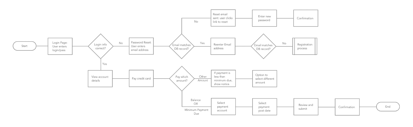
In the example below, you can see a user’s process to pay their account balance. A user could take many other actions after logging in, so the diagram branches off to represent different action paths.
User Flow vs. User Journey
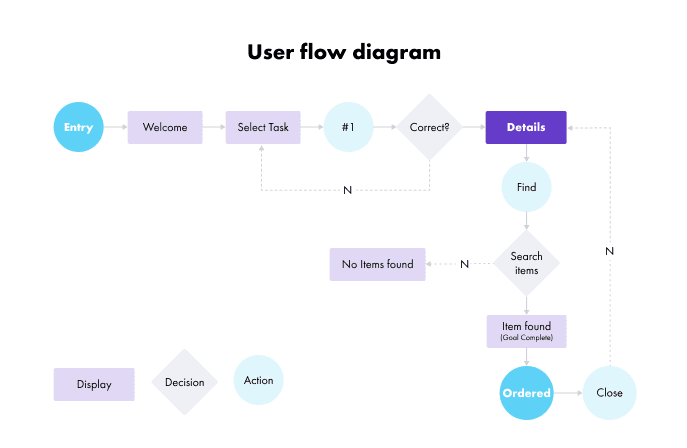
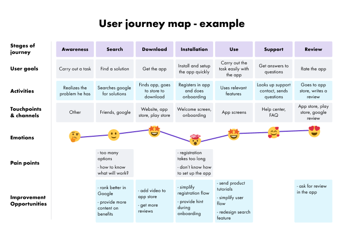
While user flows and journeys both illustrate and plan a user’s interaction within a product, they have different functions. A user journey map considers the customer’s motivations and feelings, and a user flow focuses more on the technical steps from a specific entry point – as seen in the examples below:
Analyze user behavior and track product usage with Whatfix Analytics
Enable your product managers to easily track and analyze user behavior and product usage with Whatfix Analytics, a no-code event tracking solution. With Whatfix Analytics, capture all user actions without engineering support, understand product usage, identify dropoff areas, understand feature adoption, map user journeys, build user cohorts, and make data-driven product decisions.
Benefits of Building User Flows
Visualizing the interaction between your users and your product allows you to design better solutions and improve user experience by anticipating the different patterns and ways users will (and are) using your application. Here are a few of the most impactful benefits of user flows:
1. Fosters collaboration between product managers, designers, and developers
With all the team members working on a UX design, everyone from creatives to engineering must understand the flow. User flows provide a clear visual of pages, buttons, and movements – reducing design and product development mistakes and oversights.
2. Allows for product teams to identify and fix user issues ahead of time
Creating user flow chats before pushing product features live allows product and design teams to catch and troubleshoot issues ahead of time – allowing teams to gather feedback, make adjustments, and change flows much quicker. For example, writing out a user flow and changing a step in that flow chart may only take a few minutes, but having to develop new code in the development phase could take days or weeks.
3. Highlights user journey inefficiencies and improves overall UX
Visualizing the user’s process in a simple flowchart allows you to find unnecessary steps and declutter the flow so users can perform their desired action faster from the very first moments of your user onboarding experience. You can use process mapping tools to visualize the user’s process in an easy-to-understand way and perform a user path analysis to identify friction points.
Consider confusing and inefficient user flows you’ve encountered. Let’s look at an example of an e-commerce store check-out experience.
In our first product flow iteration, your users add items to their cart and click ‘check out’ – but are then presented with a screen for recommended products, another that prompts users to spend more to get free shipping, and then another asking for free shipping. You would expect these extra screens to have a negative effect on shopping cart checkout conversion – as users want to check out but must go through three additional screens. This would be caught and improved upon in a user flow.
By outlining the user journey, you can find unnecessary steps and create seamless movement within your product. This promotes more satisfied customers with a higher probability of conversion, customer retention, and overall digital adoption of your product.
4. Promotes user-centric design
UX and product design require a cross-functional team, all with opinions about the best way to optimize your product. It’s easy to get lost in the design process and forget about the most important part: the user.
User flows ground your project, ensuring it doesn’t go off the rails and lose track of the user. By getting the team’s feedback and approval on your user flow from the beginning of the process, everyone is committed to a design that keeps the user’s best interest and goals in mind – improving overall product adoption.
Types of User Flow Charts
There are a few different types of user flow charts, with the main difference being how you choose to visualize the user journey in your product. Most notably, there are task flows, wire flows, and user flows.
1. Task Flow
Task flows focus on one single feature or task a user can perform without showing other pathways or variations. They’re typically created when users enter at the same point and accomplish a task in the same way. They’re usually linear charts used for tasks where users aren’t given options for variability.
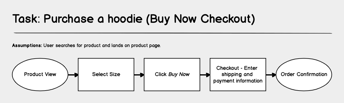
In the task flow example below, we follow a user as they purchase a hoodie on an online store:
2. Wire Flow
As the name suggests, wire flows combine wireframes and flowcharts, and instead of using shapes to convey movement, they use wireframes of each page. Wire flows add page context to UX flows since what users see on each screen significantly impacts their experience through the product.
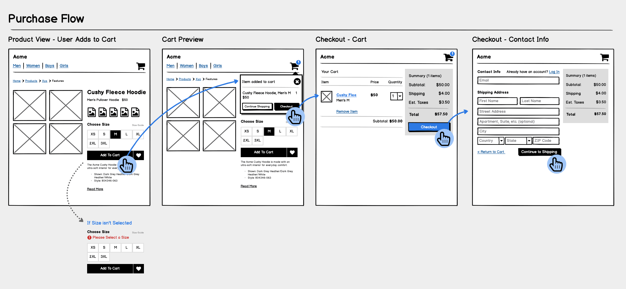
In the example below, you can see how the wire flow expands on the previous task flow chart with contextual wireframes of the specific pages and highlights the areas on the page the user will need to interact with:
3. User Flow
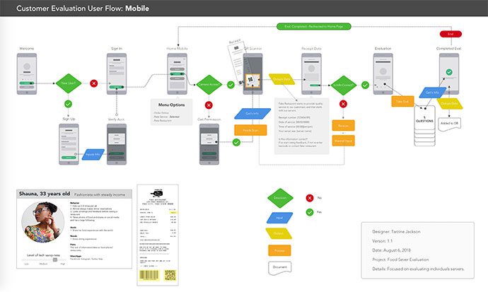
User flow charts expand on both of the previous two types of flow exercises. User flows analyze and map how users will interact with your product as a whole. There are the same end goal(s), but user flows create different paths and journeys to accomplish these goals and help identify different ways of journey competition. This is typically done alongside user persona creation.
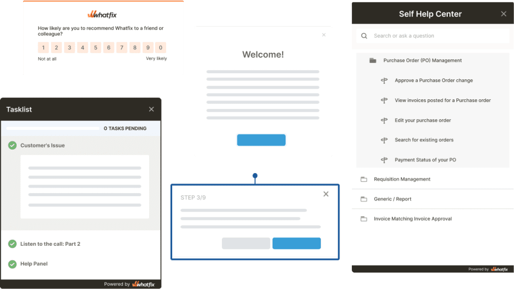
Build and analyze your users flows with Whatfix
Whatfix empowers your users with contextual flows, interactive beacons & tooltips, and self-help widgets – improving your product’s UX by guiding users to their goal.
Examples of Common User Flows
There are many different types of user flows and various forms they can take in a variety of situations. To further understand user flows and help you assess which types of user flows you need for your business, we can look at some common examples.
Here are some examples of user flows you could leverage:
- Registration: Designed to help new users sign up for an account.
- Account login: Simple flow to help new users log in for the first time or after an extended period away.
- Onboarding: Flows that help new users, customers, or employees onboard to your product or team.
- Password recovery: Assist users with step-by-step password recovery.
- Checkout: Help potential customers check out successfully.
- Feedback submission: Help users find the appropriate channel or form to submit feedback and report issues.
These are some common ways businesses implement user flows to improve the experience of their apps and websites.
How to Create a User Flow Chart in 2024
Designing an optimized user flow chart requires intimate product knowledge, a well-definined understanding of your user, and clear communication with your product and design team(s). Here are is a five-step process for creating your first user flow:
1. Identify Your Users and Determine Their Goals
Understanding why someone is using your app, product, or website is key to helping them easily use your platform to accomplish their goals and achieve their aha moment. Determine what your users want to accomplish when they land on a page, what information they need to gather there, and how to get them there the fastest. Here are some helpful tips for tackling this:
- Document all the ways someone can get to your product or site. It could be anything from a login portal to paid traffic.
- Once you have all your traffic sources, consider what users want to accomplish on that page and what barriers they may face.
- If you also pinpoint your user’s pain points and knowledge levels, you can create flows they’re more likely to follow.
2. Standardize Design Elements
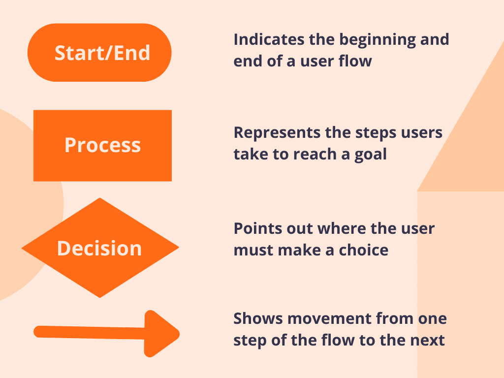
User flows typically take the form of a flowchart using shapes that have universal meanings. This helps everyone easily digest the user’s journey and see where important actions should be taken.
Shapes represent screens and actions such as decision points, entry points, and movement. As indicated in the image below, ovals, rectangles, diamonds, and arrows are most commonly used. While they are common, they’re not universal, so include a legend specifying the shape meanings.
3. Determine User Entry Points
At the start of your flow, an entry point promotes a linear user journey and can determine whether a user will interact with your flow or leave right after entry.
If you compiled your traffic sources in step one, you already have a good idea about your entry points. Common entry points include a login screen, the homepage, a landing page, or a pricing plan. Your entry point should determine how the information is presented on that screen. For example, users accessing your product from a login page should see a different page with different content than users who arrive from an ad.
4. Map Out the Ideal User Path
Once you’ve chosen your entry point and understand why the user is there, you can create your flow with an oval start shape.
From there, you can:
- Show process or actions such as ‘login’ or ‘access account information’ with the process rectangle
- Indicate decisions with a diamond
- Illustrate where the user is headed based on decisions made with arrows
It’s important to limit each diagram to one desired action. Adding too many places to branch off will distract users and the project. Using software to streamline the user flow creation process is highly recommended since manual options are tedious and time-consuming. Check out some of our favorite flowchart creators such as Lucidchart, JustInMind, and Figma.
5. Analyze User Behavior to Optimize Your Flow
Just as user flows can help identify barriers in the early stages, they can also give you critical insight on user preferences once implemented.
For example, if you notice users aren’t completing the path, you can turn to your user flow and determine where you are seeing drop-offs or user challenges. Or, if users are making it to the end of one flow and not another, you can compare the user flows to see potential opportunities for improvement.
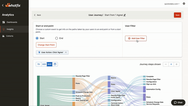
If you’re using software to help implement your user flows, these will often show user behavior and insights about their challenges. Whatfix’s analytics can show precisely when users drop off during their path.
Fix User Flows Issues and Create a More Intuitive UX with a Digital Adoption Platform
If you’re looking for a way to encourage users to complete your user flows and achieve their in-app goals, a digital adoption platform (DAP) can help. Not only can you track user behavior as shown above, but you can also use tools to identify problem areas and create better, more intuitive user flows within your products – allowing for better digital adoption and higher goal completion.
For example, Whatfix’s Flow feature provides in-app messaging and guidance to show users where to click next or find needed information.
Whatfix also allows teams to create in-app content such as beacons, tooltips, feedback surveys, knowledge base, onboarding flows, product tours, walkthroughs – all with the ability to be customized to your branding, without the need for development or coding knowledge.
With Whatfix Analytics, enable product managers with no-code, event-based tracking to identify user drop off points, map user flows and journeys, segment your users, improve conversions, drive adoption, and more.
Learn more on how you can use Whatfix to drive user adoption now!

Levi Olmstead
Levi is the Director of Content at Whatfix and his writing expertise is in digital adoption, user onboarding, UX, and enterprise transformation. You can follow Levi on LinkedIn.
Table of Contents


Subscribe to get new content delivered directly to your inbox.