


For enterprise leaders, software value is realized when people can use it to complete critical workflows correctly in production. That is where many organizations struggle. Training, documentation, and support often fall behind when workflows are complex, releases are frequent, users are distributed, and work spans multiple business-critical applications.
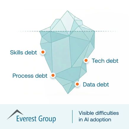
In these environments, digital adoption becomes an operational problem, not just a training challenge. Users struggle to complete tasks consistently, support teams absorb repeated questions, and organizations fail to realize the full value of their software investments. According to the Driving Digital Adoption For Impactful Transformation report, poor digital adoption costs mid-sized firms an average of $10.9 million each year.
Guided workflows help close that execution gap by supporting users inside the application, at the moment of need, as they complete critical tasks. This goes beyond product tours and tooltip overlays. It helps organizations improve workflow completion, reduce errors, lower support burden, and increase software ROI.
In this article, we’ll explain what guided workflows are, how they have evolved beyond basic in-app guidance, and what enterprise teams should look for in a digital adoption platform to create and manage in-app content.
What Is an In-App Guided Workflow?
A guided workflow is in-app, contextual guidance that helps users complete a task or process inside the software itself. It appears in the flow of work, so users can move through each step without leaving the application to search for documentation, ask a colleague, or open a support ticket.
In enterprise software, guided workflows support execution in real time. They help users follow the intended process, complete tasks accurately, and stay aligned with required steps as work happens. This is what makes them especially useful in complex applications where consistency and accuracy matter.
From Product Tours and Interactive Walkthrough to Workflow Execution
Guided workflows have evolved beyond onboarding support. What began as static help content and basic in-app prompts has developed into a more strategic layer for workflow execution, user support, and continuous improvement.
| Model | What It Looks Like | Why It Falls Short for Enterprise Teams |
| Old model | PDFs, static help docs, one-time onboarding tours | Useful for initial orientation, but disconnected from real work and difficult to keep current |
| Newer model | Walkthroughs, tooltips, task lists, field validation, self-help | More contextual and helpful in the moment, but often still limited to onboarding, feature discovery, or isolated tasks |
| Modern enterprise model | A continuous enablement layer across readiness, in-app execution, support, and optimization | Designed to improve workflow completion, reduce errors, lower support burden, and drive measurable business outcomes over time |
Why enterprise guided workflows are different than traditional in-app guidance
Traditional in-app guidance is typically designed to help users get started. Enterprise guided workflows are designed to help organizations run critical processes with greater consistency. They support users inside complex, high-impact workflows where errors, delays, and inconsistent execution create operational cost, compliance risk, and support overhead.
For application owners, enablement leaders, and transformation teams, that difference matters because the goal is not just product adoption. It is stronger workflow performance, better process adherence, smoother release readiness, more efficient support, and higher return from enterprise software investments.
Enterprise guided workflows are built for environments with:
- mission-critical applications where workflow errors create operational risk
- complex processes with dependencies, approvals, and required fields
- compliance-sensitive tasks where users must follow the approved path
- multi-role and multi-region workflows with different needs across teams and geographies
- frequent release cycles that change workflows faster than traditional training can keep up
- measurable business goals such as faster proficiency, lower ticket volume, fewer errors, and better process adherence
Why Enterprises Use In-App Guidance Instead of Relying on Traditional Training and Support
Traditional training and support models were not built for fast-changing enterprise software environments. When processes are complex and releases happen often, these models struggle to keep users productive and confident in live systems.
1. Traditional classroom-style training breaks down
Classroom sessions, onboarding programs, and static documentation can introduce a workflow, but they rarely sustain performance in production.
Why traditional training falls short:
- Users forget what they learned before they need to apply it
- Workflows, fields, and approvals change too often
- Releases outpace training updates
- Training happens outside the live process, without real context
2. Support tickets surge with complex processes
When training falls short, users turn to support for help with routine process questions. In complex enterprise environments, that creates delays because users need guidance while work is happening, not after the issue has already disrupted progress.
What happens next:
- Ticket volume rises
- SMEs and service desks become bottlenecks
- Repeated “how do I do this?” questions drain team capacity
- Processes slow down as users wait for answers
For application owners and transformation leaders, this means higher support costs, slower execution, and less consistency across important workflows.
3. Why in-app guidance works better
In-app guidance works better because it supports users as they complete tasks, rather than expecting them to rely on memory, documentation, or delayed support.
With in-app guidance, enterprise teams can:
- reduce time-to-proficiency
- improve workflow completion
- lower error rates
- decrease support burden
- standardize process execution across teams and regions
The Business Outcomes Achieved by In-App Guidance
For enterprise teams, in-app guidance matters because it improves execution across everyday workflows and helps teams get more value from enterprise software.
| Business Outcome | How Guided Workflows Help | Impact on KPIs |
| Shorter time-to-proficiency | Helps users complete tasks correctly faster, with less dependency on training or peers | Speeds onboarding, reduces productivity loss during change, and helps new processes stick faster |
| Higher workflow completion and process adherence | Guides users through the approved path with the right steps, fields, and approvals | Increases consistency, reduces drop-offs, and improves process standardization |
| Lower support burden | Deflects repeated “how do I” questions with contextual in-app support | Reduces tickets per active user and frees up service desks and SMEs for higher-value issues |
| Better data quality and fewer errors | Prevents skipped fields, wrong inputs, and avoidable workflow mistakes | Reduces rework, downstream exceptions, and reporting issues |
| Stronger software ROI | Improves adoption of key workflows and feature usage tied to business outcomes | Helps organizations realize more value from software investments and justify spend |
Guided Workflow Examples by Team and Business Function
Guided workflows are most effective in high-friction, high-impact processes that teams perform every day. The examples below show where in-app guidance can improve consistency, reduce delays, and support better execution across core business functions.
HR and HCM workflows
| Workflow Challenge | Where Guided Workflows Help | Outcome Improved |
| Employee onboarding | Guides new hires through required tasks | Faster ramp-up |
| Manager approvals | Prompts correct steps and actions | Fewer approval delays |
| Benefits enrollment | Supports employees during submission | Lower support volume |
| Compensation changes | Reinforces steps and validations | Fewer process errors |
| Performance workflows | Standardizes review actions | Better process consistency |
Sales and CRM workflows
| Workflow Challenge | Where Guided Workflows Help | Outcome Improved |
| Opportunity creation and progression | Guides reps through stage requirements | Better pipeline discipline |
| Quote workflows | Supports inputs, approvals, and handoffs | Faster quote completion |
| CRM hygiene | Reinforces required fields and standards | Better data quality |
| Forecasting steps | Guides reps and managers through process | More consistent forecasts |
| Account handoffs | Standardizes transition steps | Smoother cross-team execution |
Procurement and ERP workflows
| Workflow Challenge | Where Guided Workflows Help | Outcome Improved |
| Requisition-to-PO | Guides users through approvals and fields | Faster process completion |
| Invoice approvals | Supports correct routing and review | Fewer delays |
| Vendor onboarding | Walks users through setup steps | Better compliance |
| Purchasing policy adherence | Reinforces approved paths | Stronger policy adherence |
Finance operations workflows
| Workflow Challenge | Where Guided Workflows Help | Outcome Improved |
| Journal entries | Guides users through required inputs | Fewer posting errors |
| Expense approvals | Prompts correct approval actions | Faster turnaround |
| Close processes | Supports task completion in sequence | Better close discipline |
| Reconciliation workflows | Guides users through review steps | Fewer exceptions |
| Invoice processing | Reinforces correct submission flow | Less rework |
6 Types of Modern In-App Workflow Guidance
Enterprise teams should evaluate workflow guidance as an execution capability, not just a set of in-app prompts.
The right solution must help users complete work correctly, reduce support dependency, adapt across roles and workflows, and give teams the visibility to improve performance over time. This means looking beyond basic walkthroughs and focusing on the capabilities that make guidance usable, scalable, and governable in real enterprise environments.
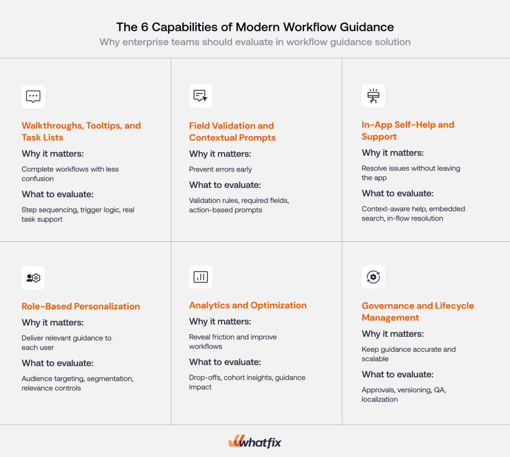
Walkthroughs, tooltips, and task lists
Walkthroughs, tooltips, and task lists are the foundation of workflow guidance. They help users move through a process step by step and are especially useful during new rollouts, workflow changes, and process reinforcement. But for enterprise teams, their value depends on how well they support real tasks, not just navigation.
These patterns should help teams:
- guide users through multi-step workflows in the right sequence
- reduce confusion during new rollouts and process changes
- reinforce key actions without sending users to separate documentation
- support task completion inside the application

Field validation and contextual prompts
Modern workflow guidance should not only show users what to do next. It should also help prevent mistakes before they create downstream issues. This is especially important in systems where incorrect inputs, missing fields, or skipped steps affect compliance, reporting, approvals, or rework.
Enterprise leaders must look for guidance that can:
- prompt users when required fields, actions, or approvals are missing
- prevent incorrect inputs before submission
- improve data quality at the point of entry
- reduce avoidable rework across ERP, CRM, HCM, procurement, and finance workflows
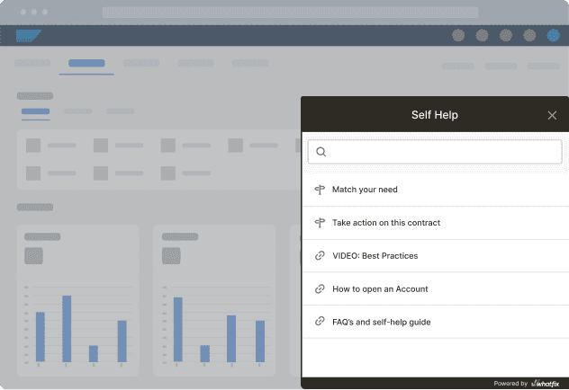
In-app self-help and support
Not every user question should become a ticket. In-app self-help gives users a way to resolve routine process questions without leaving the application or waiting for support. This makes guidance more scalable, especially during go-lives, process changes, and high-volume operational periods.
This capability is valuable because it can:
- reduce dependence on service desks and SMEs
- answer routine workflow questions in context
- lower support burden during rollout and steady-state use
- help users stay productive without breaking task flow
Role-based personalization
Enterprise workflows are rarely the same for every user. Process steps often vary by role, region, business unit, seniority, or use case. Workflow guidance must reflect those differences so users see the support that is relevant to the work they actually perform.
For enterprise teams, this means being able to:
- deliver different guidance to different user groups
- align support to role-specific workflows and responsibilities
- reduce noise from irrelevant prompts or steps
- improve adoption across multi-role and multi-region environments
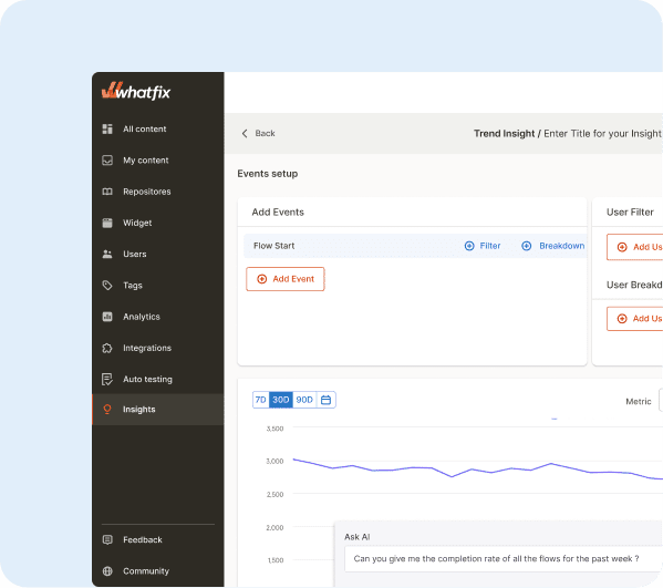
Analytics and optimization
Workflow guidance must not be static after launch. Teams need visibility into where users struggle, which workflows create friction, and what guidance actually improves task completion. Without that feedback loop, guidance becomes reactive and hard to improve systematically.
Analytics must help teams:
- identify where users struggle and where workflows create drop-offs
- understand what guidance improves completion and performance
- prioritize the highest-friction workflows and user cohorts
- continuously refine guidance based on real workflow behavior
Guidance content governance and lifecycle management
Workflow guidance is only useful if it stays accurate. At enterprise scale, content sprawl, inconsistent updates, and weak quality control quickly become operational problems. In-app content governance is what allows teams to maintain trust in guidance as workflows, applications, and release cycles change.
This becomes essential when teams need to:
- manage approvals and QA
- maintain release discipline and controlled changes
- support versioning and localization
- refresh guidance after application updates
- scale content operations across teams, regions, and workflows
Why Whatfix Is the Enterprise-Grade DAP for Guided Workflows
Enterprise teams need workflow guidance that can scale across complex applications, changing processes, and diverse user groups. Whatfix is built for that environment, combining the capabilities organizations need to improve execution, reduce friction, and drive stronger adoption outcomes.
Guided workflows as part of a unified adoption layer
Whatfix connects guidance to the broader adoption lifecycle so teams can support users before, during, and after go-live.
With Whatfix, teams can:
- prepare users before production with hands-on simulation training
- guide users in the flow of work with in-app guidance and self-help
- measure behavior, friction, and workflow outcomes with analytics
- optimize guidance continuously based on real usage data
This matters because enterprise adoption is an ongoing cycle of readiness, execution, reinforcement, and optimization. Whatfix gives teams one system to manage that cycle end to end.
Built for enterprise application reality
Many workflow guidance tools are designed primarily for simple web environments. Enterprise teams need broader coverage across the systems employees actually use every day.
Whatfix is built for that reality with support for:
- web applications
- desktop applications
- mobile applications
- Citrix and VDI environments
- cross-application workflows
- a broad range of enterprise software and custom applications
For application owners and transformation leaders, that means guided workflows can scale across the environments that matter most, not just the easiest ones to instrument.
Governance and content lifecycle management at scale
Workflow guidance at enterprise scale requires more than content creation. It requires structure, control, and operational discipline. Without that, guidance quickly becomes outdated, inconsistent, and difficult to trust across releases, teams, and regions.
Whatfix supports enterprise-grade content governance with:
- approvals and QA
- controlled changes and rollout discipline
- versioning and rollback
- localization support
- staging and release operations
- structured lifecycle management for ongoing updates
This is especially important for teams managing regulated workflows, frequent release cycles, or large multi-team deployments where quality and consistency cannot depend on manual effort alone.
AI across the workflow guidance lifecycle
Enterprise teams need to move faster without losing control. Whatfix applies AI across the workflow guidance lifecycle to help teams scale content creation, improve guidance, and identify where workflows need attention.
Whatfix AI includes:
- faster content authoring
- smarter user guidance
- insight generation and friction analysis
- more efficient content operations
- conversational support experiences within self-help
For digital adoption and enablement teams, this reduces manual effort while making guidance more responsive to real user behavior.
Services and enablement support
Enterprise scale does not come from software alone. Teams also need a clear path to rollout, governance, and long-term adoption success.
Whatfix supports that with:
- author training
- dedicated enablement and customer success support
- implementation and migration support
- templates and program resources to accelerate rollout
For teams evaluating workflow guidance solutions, this matters because adoption programs often fail in execution, not in strategy. Strong support makes it easier to operationalize the platform across teams, workflows, and change programs.
Whatfix gives enterprise teams a practical way to standardize workflow execution, reduce friction, and improve the value they get from software investments. For organizations managing complex applications, frequent change, and diverse user groups, it provides the structure needed to scale guidance with confidence. Request a demo to see how Whatfix improves workflow execution at scale.


