A new enterprise application rollout is not truly live just because users can have production access. For enterprise application owners responsible for a mission-critical system, the real adoption test comes when a user attempts the first important workflow and experiences friction.
They cannot submit a request, complete an approval, correctly update a record, or move a task forward without workflow errors, asking a subject matter expert for help, or opening a support ticket.
In enterprise software change management, friction arises from workflow complexity, approval logic, policy rules, and production-specific exceptions that users encounter only when they begin real work. Until users can complete those priority workflows correctly and independently, the software may be deployed, but it is not operationalized.
Poor digital adoption acts as operational drag on the entire organization. Forrester found that a mid-sized enterprise of about 1,000 employees could lose an estimated $10.9M annually due to poor digital adoption.
Alternatively, organizations that approach this challenge from an operational standpoint create a business advantage. Whatfix’s 2026 State of Enterprise Digital Transformation ROI report found that organizations that invest in a digital adoption program see a measurable lift against their peers who haven’t built an operational model. Organizations using a DAP report:
- 64% faster time-to-value on new rollouts
- 37% lift in user proficiency at the three-month mark
- 67% lift in overall value realization from digital transformation investments.
This playbook shows how to design role-based onboarding, add in-app guidance at the points where users stall, measure proficiency by cohort, and run a 90-day post-launch optimization cadence that reduces support demand and accelerates software value realization.
Keys to successfully onboarding users to enterprise software
- Identify the top workflows by role.
- Define proficiency thresholds for each workflow.
- Map the first-day, first-week, and first-month journey.
- Add in-app guidance where users stall.
- Measure time-to-proficiency and support dependency.
- Optimize weekly for the first 90 days.
What is the role of user onboarding for internal software adoption?
User onboarding is the stage in enterprise software rollouts that helps users complete priority workflows correctly, efficiently, and within required error, policy, and compliance thresholds. It drives awareness of new applications, familiarizes users with new UI, highlights critical features and tasks users are responsible for, and accelerates workflow adoption.
Training completion? That is exposure, not readiness. Onboarding is complete only when users can perform their responsibilities and tasks in the live application, where validation rules, dependencies, exception paths, and operational consequences shape execution.
That is why onboarding cannot be treated as a one-time activity tied to go-live or new hire training. In enterprise environments, software onboarding must continue through new releases, workflow redesigns, policy updates, role transitions, and feature rollouts to keep teams productive and user execution consistent.
The goal is proficiency by role, not onboarding content completion
Effective onboarding is built around the top workflows each role must perform, not the amount of content assigned during training. Requesters, approvers, managers, analysts, and infrequent users do not need the same onboarding path because they perform different tasks, face different risks, and encounter different decision points within the application.
This means proficiency must be defined by role:
- Requester: completes transactions without delays, missing fields, or rework
- Approver or manager: makes timely decisions with the right context and follows the correct approval path
- Analyst or high-frequency user: executes repeat workflows with speed, accuracy, and consistency
- Infrequent user: completes occasional tasks correctly when action is required
How user onboarding differs from training and rollout planning
These three functions support adoption in different ways:
- Training builds familiarity with the system
- Rollout planning coordinates launch across stakeholders, timelines, communications, and support
- User onboarding enables correct execution inside the live application
A successful technical deployment does not guarantee successful execution. Users need support inside real workflows, where approvals, validations, dependencies, and exception paths shape behavior.
Training introduces the system. Rollout planning prepares the organization for change. User onboarding closes the gap between launch and reliable execution by guiding users through production environments, ultimately driving business outcomes.
What is time-to-proficiency?
Time-to-proficiency is the median number of days it takes a new or role-change user to complete the top workflows for their role correctly, independently, and within acceptable error or compliance thresholds.
Who owns user onboarding for internally-used software?
| Role | What they own | Metric they care about |
| Enterprise application owner | Adoption and performance for the application | Time-to-proficiency, workflow completion, errors |
| Digital adoption program owner | Scaled onboarding model across apps and roles | Guidance engagement, friction reduction, support containment |
| L&D or enablement lead | Readiness, training path, reinforcement | Readiness completion, confidence, proficiency checkpoints |
| Service desk / ITSM owner | Support demand and repeat issues | Tickets per active user, self-service resolution |
Why enterprise software users stall after first use
Go-live readiness and the first few weeks after go-live are critical for achieving adoption goals. For customer-facing rollouts, 75% of users drop off after the first week.
While internal software rollouts differ, the same principles apply: users fall back to legacy workflows, follow approved steps, or submit a support ticket.
Here’s why application users experience an adoption cliff after initial rollout:
1. Access, permissions, and environment issues act as a task blocker
Users often stall before they reach meaningful execution. SSO issues, incomplete role provisioning, restricted environments, and mismatches between training and production create friction at the exact point where users should be building momentum.
A workflow may look straightforward in training, but production introduces real permissions, live data, and tighter controls. When users cannot access the right fields, records, or actions, time-to-first-successful-task slows immediately.
2. Validations, approvals, and exception paths create the real learning curve
Every team member has unique responsibilities that are ever-present within enterprise applications. Users must navigate required fields, approval routing, duplicate checks, exception handling, and multi-step workflows that often vary by role, region, or scenario.
This is where onboarding either supports execution or leaves users to figure it out in production. A user may understand the workflow at a high level but still fail on the details that determine whether the task is completed correctly, routed properly, or requires additional rework.
3. Static documentation breaks when workflows keep changing
PDFs, knowledge base articles, slide decks, and one-time training lose value quickly in live enterprise environments. Workflows change, policies shift, fields move, approval paths evolve, and releases introduce new friction points.
When application onboarding content falls behind, users are left with guidance that reflects how the workflow used to work, not how it works now. That gap slows execution and increases guesswork, rework, and reliance on support.
4. Users default to tickets when guidance is missing in the workflow
When users cannot find help at the point of execution, they fall back on the fastest workaround: opening a ticket, messaging a colleague, or escalating to a subject-matter expert. At that point, ticket volume is not just a support issue. It signals that onboarding is failing inside the workflow.
This surge in IT tickets results in support overload; enterprise teams can experience a 250% surge in daily support tickets due to new software migrations and rollouts.
Repeated “how do I” tickets should be treated as an onboarding design problem. When guidance is missing at the moment of need, support teams become the system users rely on to complete routine tasks.
Common stall points after first login
| Friction point | Likely cause | Workflow impact | First intervention |
| User cannot start a task due to a permission issue | SSO issue, missing role, incomplete permissions | Delays first successful action | Fix access and role provisioning before onboarding begins |
| User starts a task but cannot complete the workflow | Required fields, hidden dependencies, validation failures | Abandonment, rework, slower ramp time | Add guided steps and field-level support at known friction points |
| Task gets routed incorrectly | Approval logic unclear or role context missing | Delays, exceptions, resubmissions | Reinforce approval logic and decision points in the workflow |
| User follows outdated instructions | Static documentation no longer matches production | Errors, confusion, repeated support requests | Refresh onboarding content based on live workflow changes |
| User opens repeated support tickets | No contextual help at point of need | Support burden increases, SMEs become onboarding backstop | Add self-service and in-app support for top repeat questions |
The operational cost of slow user onboarding
Slow user onboarding timelines cause downstream impact across core workflows, including things like slowing work inside mission-critical systems, increasing support demand, raising execution risk, and delaying time-to-value of new rollout and releases. Each causes further compound effects on key business outcomes. Let’s explore each below:
1. Longer ramp time slows throughput
When users take longer to reach proficiency, core workflows operate below expected capacity. Requests sit in queue longer, approvals slow down, service volumes take longer to recover, and teams take more time to reach target productivity.
In enterprise environments, that drag compounds quickly across new hires, role-change users, and newly launched teams. The cost is lower throughput across the workflow, not just slower individual ramp time.
2. Ticket spikes turn support into the onboarding plan
Weak onboarding shifts routine execution questions to the service desk, application admins, and subject matter experts. That drives avoidable ticket volume, pulls experienced staff into low-value support work, and reduces the capacity available for higher-priority issues.
The cost is not just more tickets. It is a more expensive operating model for helping users complete basic tasks.
3. Errors, rework, and exceptions increase when users learn inside production without guidance
When users are not onboarded effectively, execution quality drops. Bad data enters the system, approvals are routed incorrectly, submissions come back for correction, and exception handling becomes inconsistent.
The cost shows up as rework, delayed downstream tasks, process breakdowns, and higher risk in workflows that depend on accuracy and compliance.
4. Delayed proficiency delays software ROI
Enterprise software only delivers value when users can perform consistently in production. When proficiency is slow, productivity gains arrive later, support costs stay high, and adoption of key workflows lags behind the investment.
The cost appears in underused licenses, lower team output, slower value realization, and weaker returns from expensive transformation programs.
A 6-step user onboarding playbook to support enterprise software adoption
Effective user onboarding is built around the workflows users must execute in production. This playbook helps enterprise application owners reduce ramp time, lower support demand, and move users to reliable execution faster.
Step 1. Prioritize the top workflows by role
Do not start with feature lists or full-system walkthroughs. Start with the five workflows that matter most for each role.
Prioritize workflows using four filters:
- Volume: tasks users perform most often
- Risk: tasks with compliance, financial, or operational consequences
- Error cost: tasks where mistakes create rework, delays, or downstream issues
- Ticket volume: tasks that generate repeated support questions
If a workflow is high-volume, high-risk, or ticket-heavy, it belongs in the first onboarding wave.
Step 2. Define what proficiency looks for each user role
Once the top workflows are clear, define proficiency by whether users can complete them correctly, independently, and within the expected time.
Use two core measures:
- Time-to-first-successful-task: how long it takes a user to complete a priority workflow correctly for the first time
- Time-to-proficiency: how long it takes a user to execute that workflow consistently, without avoidable errors or support dependence
Different roles need different thresholds because they carry different levels of frequency, risk, and decision responsibility.
Step 3. Map the first-day, first-week, and first-month user journey
Onboard users in the order they encounter work, not in the order features appear in the application.
Use a simple structure:
- First day: complete the first critical task successfully
- First week: repeat core workflows with less support and fewer errors
- First month: handle exceptions, edge cases, and role-specific variations with confidence
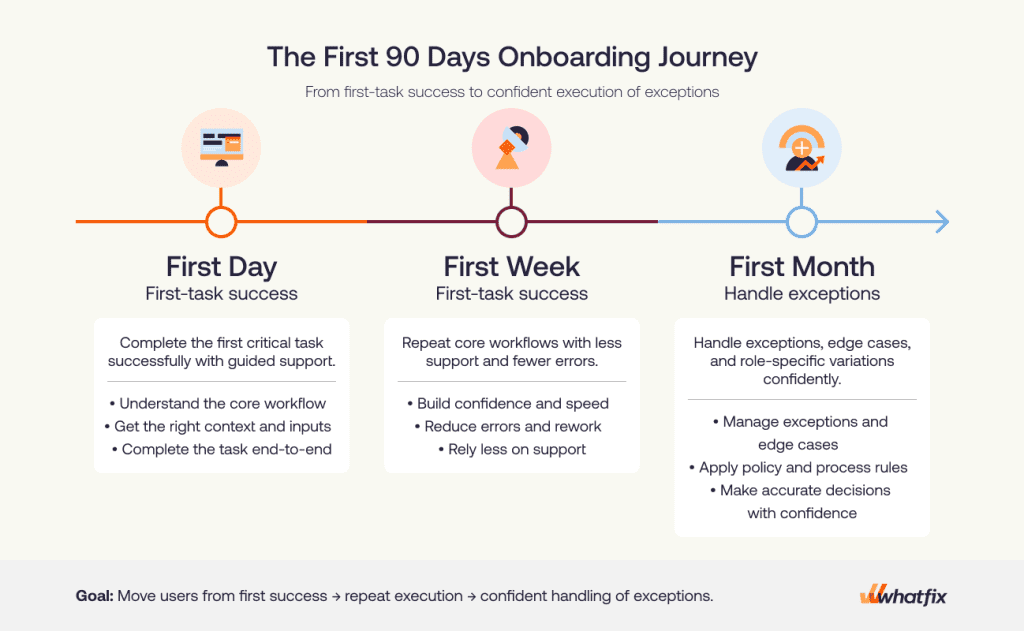
A good journey map answers four questions:
- What is the first workflow the user must complete?
- What usually causes failure in that workflow?
- What should the user be able to do by the end of week one?
- What exceptions or advanced tasks appear by the first month?
If a workflow is unlikely to appear in the first 30 days, it should not dominate early onboarding.
Step 4. Add in-app guidance and self-service at the exact points where users stall
Once failure points are clear, add support inside the workflow. Use the support method that matches the friction:
- Guided execution: for multi-step workflows where users need help moving through the task
- Field-level help: for required fields, policy-driven inputs, and error-prone entries
- Task lists: for role-based onboarding progression
- Contextual self-service: for repeat “how do I” questions
Focus on placement. In-app guidance should appear where users are most likely to pause, abandon, or make an error.
For example:
- If users fail on approval routing, reinforce the decision point before submission.
- If they enter bad data in a critical field, add field-level validation or contextual help there.
- If new hires repeat the same first-week questions, surface a role-based task list in the application.
- If infrequent users forget a periodic task, make that help searchable in the workflow.
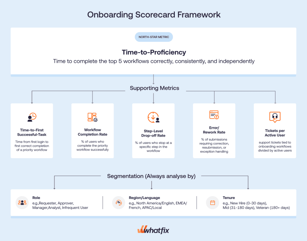
Step 5. Build a scorecard that proves proficiency is improving
Start with one outcome metric: time-to-proficiency. For onboarding, this means how long it takes users to complete their top workflows correctly, consistently, and without avoidable support or rework.
Baseline before launch if you are replacing an existing process. If the workflow is new, baseline immediately after the first onboarding wave.
Use a focused KPI set:
| Metric | What it tells you | Why it matters |
| Time-to-first-successful-task | How quickly users complete their first priority workflow correctly | Shows how much friction exists at the start |
| Time-to-proficiency | How long it takes users to perform key workflows independently and consistently | Best measure of onboarding effectiveness |
| Workflow completion rate | Whether users finish the workflow successfully | Highlights where onboarding is failing to drive execution |
| Step-level drop-off rate | Where users stop or abandon the workflow | Pinpoints the exact stage that needs intervention |
| Error and rework rate | How often users submit incorrect or incomplete work | Shows whether users understand the workflow well enough to execute cleanly |
| Tickets per active user | How much support users need during onboarding | Reveals when support is acting as the real onboarding layer |
| Self-service resolution rate | How often users solve issues without opening a ticket | Indicates whether your support content is reducing dependency |
Do not rely on blended averages. At minimum, segment by – role, region or language, and tenure. Optional cuts include – business unit, site, or environment.
Each metric should lead to an action:
- High time-to-first-successful-task means first-task friction needs attention.
- Concentrated drop-off means that step needs targeted guidance.
- Rising tickets per active user means repeat questions should move into in-app or self-service support.
- High error and rework means stronger field-level help, validations, or decision support is needed.
Also, do not use these as headline proof of onboarding success:
- training completion
- content views
- generic engagement
- email open rates
Step 6. Run a weekly optimization loop for the first 90 days
Onboarding must run like an operating cadence, not a one-time content build.
For the first 90 days after launch or major workflow change, use a weekly loop to:
- review friction signals
- identify the top failure points
- ship targeted fixes
- re-measure impact
A simple weekly operating model looks like this:
| Task | Deliverable | KPI impacted |
| Review performance data | Weekly summary of friction points and baseline performance data and segment by cohort. | Time-to-proficiency, completion rate |
| Review support signals | Repeat-ticket list to identify trends in “how do I” issues” | Tickets per active user, self-service resolution |
| Prioritize fixes | Ranked intervention backlog to prioritize highest-impact, lowest-effort fixes. | Error rate, drop-off rate |
| Ship intervention | Create or update in-app guidance, self-help content, and validation support that target specific friction point. | Completion rate, rework rate |
| Re-measure performance | Weekly summary, this time reporting on the fix to see if any measurable improvement from benchmark. | Time-to-proficiency, completion rate, tickets per active user, rework rate, error rate, etc. |
How to keep enterprise onboarding updated through frequent releases and workflow changes
Enterprise onboarding loses value quickly when it does not keep pace with workflow change. The goal is not to refresh everything after every release. It is to update onboarding where execution risk, user friction, and support demand are increasing.
Use release notes, tickets, and analytics as onboarding inputs
Do not rely on release notes alone. The best onboarding updates come from four inputs used together:
- App-owner changes: new fields, changed steps, approval logic, policy updates
- Repeat tickets: the questions users keep asking after release
- Analytics drop-offs: where users abandon, stall, or slow down in the workflow
- User feedback: where guidance is unclear, missing, or no longer relevant
This keeps onboarding tied to live execution. If a release changes a workflow but users are still completing it cleanly, you may not need a major intervention. If one changed step starts driving drop-off, errors, or ticket volume, update onboarding there first.
Apply minimum governance so content does not become noise
Onboarding content must move fast, but it still needs control. Without basic discipline, teams end up with overlapping guidance, outdated steps, and inconsistent variants across roles or regions.
Keep content governance simple by:
- QA: check that guidance matches the live workflow
- Approvals: define who signs off on changes for high-risk workflows
- Version control: track what changed, when, and why
- Retirement rules: remove outdated content instead of layering new content on top
- Localization checks: confirm translated content still matches local process and policy requirements
Run a lightweight cadence to keep onboarding useful
A simple operating cadence is usually enough:
- Weekly: fix top friction points and repeat-ticket drivers
- Monthly: review the scorecard, identify broken cohorts, and reprioritize updates
- Quarterly: consolidate overlapping content, retire stale assets, and audit workflow coverage
This prevents onboarding from becoming a one-time launch asset that slowly drifts out of sync with the application.
Recommended cadence for onboarding maintenance
| Cadence | Input reviewed | Action taken | Owner |
| Weekly | Repeat tickets, workflow drop-offs, urgent release changes, user feedback | Fix the highest-friction steps, update guidance for repeat issues, patch broken content | App owner, digital adoption owner |
| Monthly | Onboarding scorecard, cohort performance, workflow errors, self-service gaps | Reprioritize onboarding backlog, refine support by role or region, address persistent failure points | App owner, enablement lead |
| Quarterly | Content inventory, workflow changes, localization needs, stale assets | Retire outdated content, consolidate overlap, validate coverage across top workflows | Digital adoption program owner, content/governance owner |
How Whatfix accelerates enterprise software user onboarding
For enterprise application owners, the onboarding problem is rarely lack of content. It is a lack of support at the point of execution.
Whatfix closes that gap with pre-production readiness, in-app guidance, self-service, and analytics that show where onboarding is improving and where it still breaks. Here’s how:
Mirror for role-based readiness before production
Some workflows are too risky to learn for the first time in production. That is especially true in ERP, HCM, CRM, and other enterprise systems where mistakes can trigger rework, bad data, routing errors, or compliance issues.
Whatfix Mirror helps teams prepare users before they touch the live application by giving them a safe environment to practice role-based workflows. This is especially useful when:
- the workflow is high risk or high consequence
- the first attempt in production cannot afford errors
- role-change users need to learn new paths without carrying over old habits
- new hires need hands-on practice before live execution
For app owners, this creates a cleaner transition into production because users arrive with workflow familiarity, not just training exposure.

DAP for in-app onboarding on the top workflows
Once users are in the live application, onboarding works best when support is embedded in the flow of work. That is where Whatfix DAP helps reduce friction on the tasks that matter most.
Application owners can support top workflows with:
- Flows for guided execution through multi-step tasks
- Smart Tips for field-level help and policy reinforcement
- Task Lists to structure onboarding progression by role
- Field Validation to reduce preventable errors before submission
This matters because most onboarding failures happen after login, inside real workflows. Instead of sending users back to static documentation or training content, app owners can guide execution directly where users pause, abandon, or make mistakes.
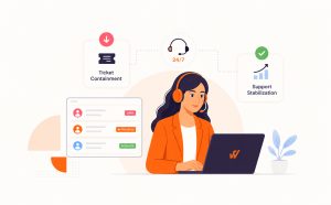
Self Help for ticket containment during onboarding waves
During onboarding waves, support demand rises fast. Users ask the same how-to questions, service desks absorb avoidable tickets, and subject matter experts become the fallback support model.
Whatfix Self Help helps contain that load by giving users contextual answers inside the application, at the moment of need. That makes it part of the onboarding system, not just a support feature.
For app owners, that means:
- fewer repeat tickets on core workflows
- lower dependence on service desks and SMEs
- faster issue resolution during launch, role transitions, and release cycles
- better user confidence without forcing users out of the workflow

Product Analytics for measurement and prioritization
Onboarding improves faster when teams can see exactly where users are struggling. Whatfix Product Analytics gives app owners the visibility to measure execution, identify friction, and prioritize the next intervention based on actual user behavior.
That creates a practical loop to:
- identify where users drop off or slow down
- ship targeted onboarding support in the workflow
- measure whether completion, error, or support metrics improve
- prioritize the next highest-friction workflow or cohort

AI where it speeds execution with governance intact
Whatfix AI helps enterprise teams scale onboarding operations faster without weakening control. For application owners, the value is not in handing decisions to AI. It is in reducing the manual effort required to build, update, and optimize onboarding across changing workflows, roles, and regions.
In practice, Whatfix AI can help teams:
- accelerate the creation and updating of in-app onboarding content
- surface friction patterns and broken cohorts faster
- identify where users need more guidance, support, or reinforcement
- reduce the effort required to keep onboarding aligned with frequent releases and workflow changes
That gives app owners more operational leverage without handing over decisions that require process ownership, compliance judgment, or governance discipline.
Whatfix brings Mirror, DAP, Self Help, Product Analytics, and Whatfix AI into one platform, giving enterprise teams a better way to reduce time-to-proficiency, contain support demand, and keep onboarding aligned to live workflows. Instead of relying on disconnected training, support, and measurement tools, application owners can run onboarding as a single, measurable system. If your team needs to improve onboarding performance at scale, schedule a demo to see how Whatfix can help.