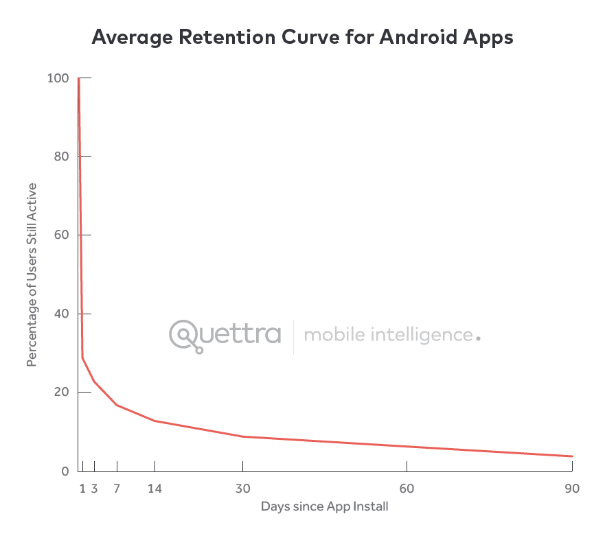
1 out of 4 of users will abandon an application after using it once. 95% of your users will eventually churn over the next three months, and 55% of customers say they have returned a hardware product because they couldn’t figure out how to use it.
To build a viable product, you need more than conversions. You need a product experience that facilitates simple user activation, has a stick product, and drives high user retention rates. The first step is to ensure your users understand how your product helps them accomplish their goals – and that starts with a well-designed and effective onboarding user experience (UX).
The term ‘onboarding UX’ is a combination of terms. To understand it better, we need to deconstruct what both of them mean individually.
- User onboarding is the process of guiding new users to find value in your product so they can become familiar with how it works and start using it consistently.
- User experience (UX) refers to any interaction with a product and how it forms a user’s opinion about a product.
If we combine those two definitions, we can understand onboarding UX better.
What Is Onboarding UX?
Onboarding UX refers to the design framework behind how new users interact with your product during the onboarding stage and how it forms their opinion about the product and gets them to start using your product consistently. The goal of onboarding UX is to make it simple for new users to start using your product, reduce your product’s time-to-value, build habits, and drive overall product adoption.
Why Does Onboarding UX Matter?
Onboarding UX is critical to the retention and long-term success of your users. It’s the UI elements and interface that enables product-led onboarding.
Here are a few of the most critical reasons behind the importance of practical onboarding UX matters.
1. Creates a strong first impression
A strong onboarding UX enables users to understand how they can and should use your product. Startup consultant & VC Andrew Chen says that 77% of users won’t sign into an application three days after installing it. Three months later, your user retention drops to less than 5%.
There’s so much competition, even among useful, engaging products, that if a user doesn’t understand how to maximize all the benefits your product offers, they’re likely to churn and never return.
Optimizing your product onboarding helps you answer the questions:
- What does this product do?
- How do I start using it immediately?
- Is it as intuitive as the products I already use?
- Can I fit it into my existing workflow?
This is most relevant in the age of app stores where we install apps, take one look at it, uninstall, and go back to the App Store (or Play Store) to circle through five other alternatives before choosing one.
2. Reduces your users’ TTV and shows that your product solves their pain points.
Unlike products like Excel or Google Docs (which have one major selling point), modern software products (both B2B, B2C, and mobile apps) have robust feature sets and use cases.
But this can get in the way of your marketing and customer retention efforts if a customer can’t pinpoint the one problem your product is supposed to solve for them.
Onboarding is the perfect opportunity to create that “aha!” moment where a user understands the total value of a product in their workflows, which reduces churn, increases customer lifetime value, and helps you build an army of product evangelists.
3. Introduces customers to features they may be unaware of or initially unwilling to try
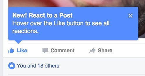
Modern SaaS products have a robust feature set with advanced user flows. You can use hotspots, alerts, and tooltips to draw your users’ attention to advanced (or new) features, those that they’re not using, and any tips that can enhance the value they get out of your product.
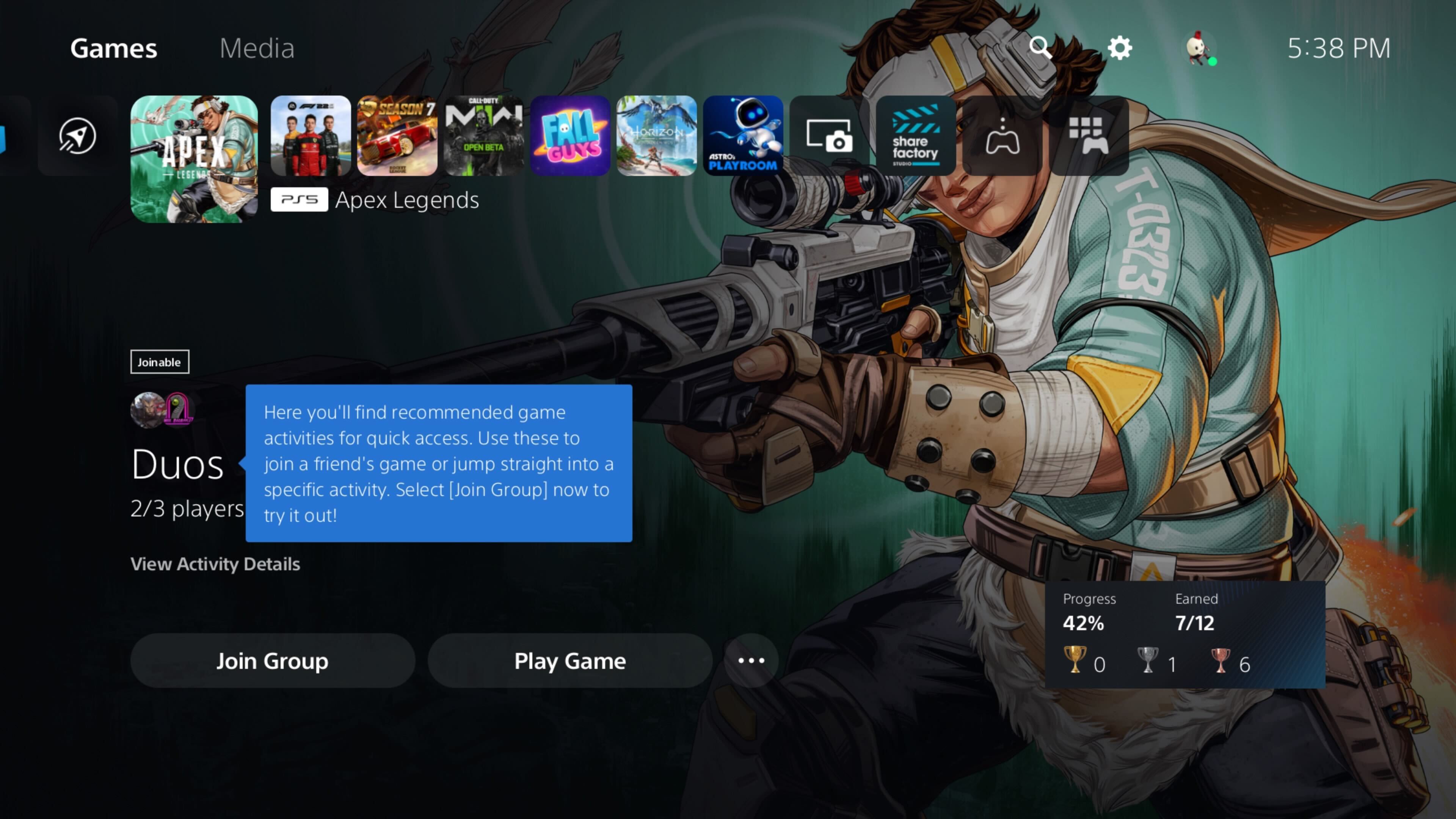
For example, when Sony launched its new PS5 console, it utilized tooltips throughout its new interface to introduce users to new features.
Categories of UX Onboarding Patterns
Depending on where a user is at in their product journey, you may be looking to teach new users how to get started or to invite existing users to try out features they’ve been ignoring —in each case, you need a different approach to capture your users’ attention without becoming obnoxious.
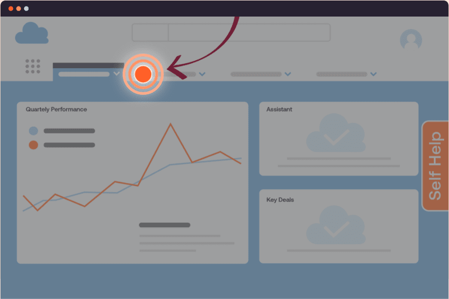
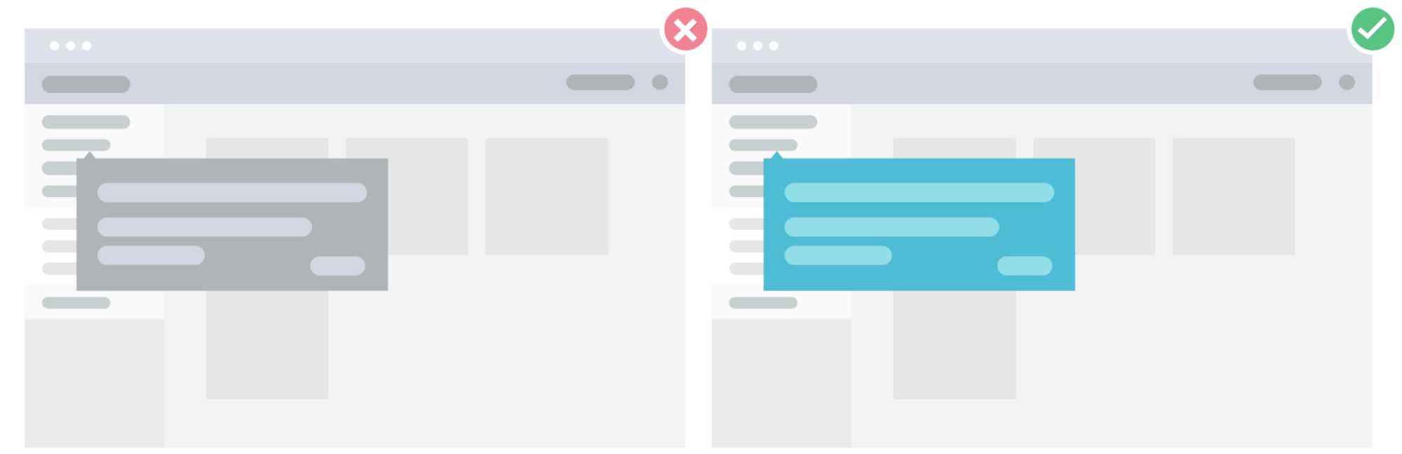
1. Annotated onboarding patterns
Annotated patterns draw attention to specific features in your product with subtle cues, notes, or highlights.
For example, you can use non-intrusive visual cues like flashing hotspots or tooltips to get users to try out a new or unused feature. Like the name implies, annotated onboarding patterns try to gently draw an existing user’s attention to features, settings, or configurations that can help them get more out of your product.
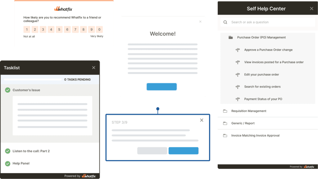
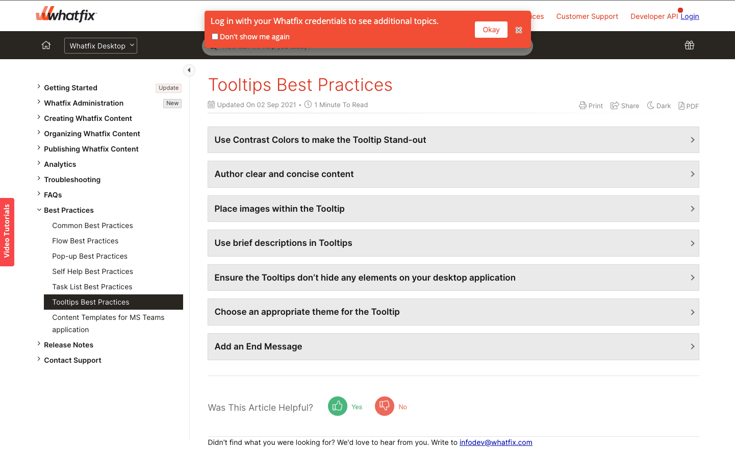
You can see an example below from our Whatfix Support and Community portal. Customers can access the our FAQ, support, and community posts in their entirety by logging in, and we gently nudge users to do so with a UX tooltip.
2. Embedded onboarding patterns
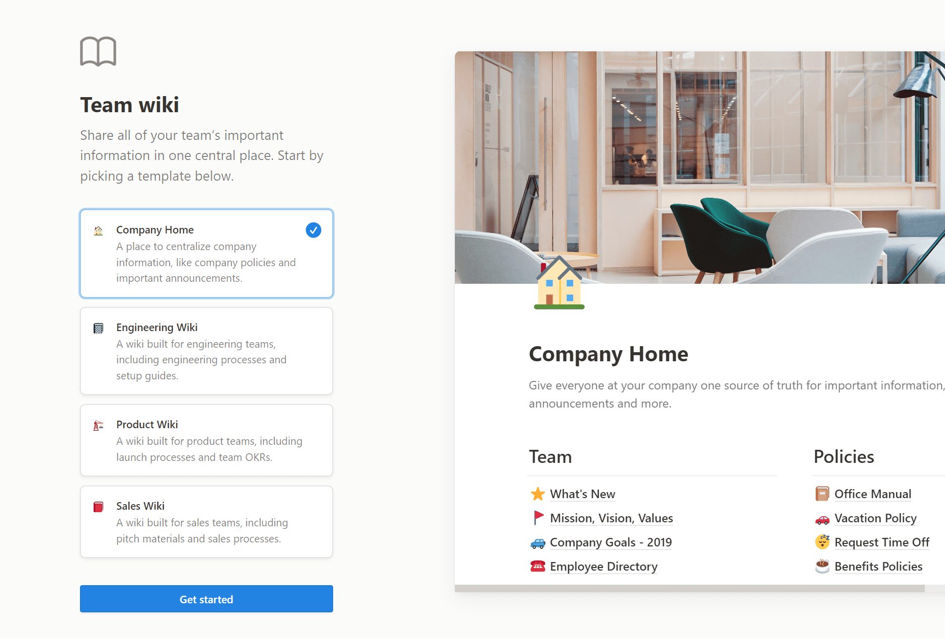
Embedded patterns include checklists, task lists, slideouts, pop-ups, and self-help wikis. They’re a prominent extra layer on your product’s interface to capture your users’ attention and one of the best practices for new user onboarding.
They’re hard to miss and take up a lot more screen space. They’re more suited to new users who’re just getting started using your product, and they can be annoying to experienced users who have mastered how to use your product for their particular use case and may not want to get anything more out of it.
For example, you can use a digital adoption platform like Whatfix to create a new onboarding task list for your new Salesforce users that guide them through its most commonly-used workflows and tasks.
3. Dedicated onboarding UX
A dedicated onboarding layout takes up the entire screen space on a page, and it’s often used to collect data e.g. via signup forms, welcome screens, surveys, questionnaires, etc.
9 Types of Onboarding UX/UI Patterns
Here are the most common UX/UI patterns used during user onboarding.
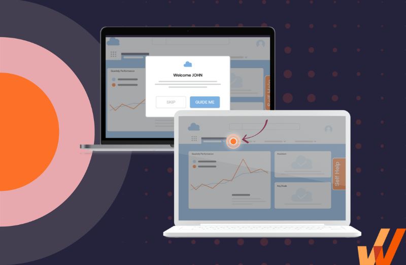
1. Product tours
Like a physical tour, product tours virtually walk new users through your user interface and basic features step-by-step. This happens through a series of images, videos, and flows users can cycle through. This shows them an animation or walkthrough of your product’s features, how it works, and which elements they can interact with, depending on how your product tour is coded.
Organizations with the resources can build their own product tour using in-house engineering and open-source frameworks. To empower product managers or teams without the development resources to build in-house, you can invest in a software for creating product tours. These platforms provide no-code tools to create in-app tours, as well as behavior analytic features to analyze and improve their performance.
Regardless of whether you take a build vs buy approach to user onboarding, ensure product tours are included.
2. Interactive flows and walkthroughs
Interactive walkthroughs are similar to product tours. In a sense, are the evolution of the product tour. These guided walkthroughs take users through core flows and advanced features with embedded step-by-step instructions that take them through each step of a process.
3. In-app guidance
This particular pattern uses prompts and (non-intrusive) messaging to teach users how a product’s features work right inside the user interface. These cues and tips are usually programmed to show up when a user signs up, tries out a new feature, or has difficulty using the said feature.
In-app guidance acts like a layer on top of your application. Users can use the resources offered to learn how your product works through explainer videos and articles (right inside the application), or links that point to more extended external resources.
4. Onboarding checklists and task lists
User checklists or task lists are also known as guided task lists, and they are a list of to-dos a user needs to complete as part of the onboarding process. They break down your product’s main features into simple steps showing new users how it works.
5. Hotspots
Hotspots, or beacons, draw attention to unused features, issues, and alerts without distracting users. As the name implies, hotspots use a flashing mechanism to attract a user’s attention and you can have multiple on the same page.
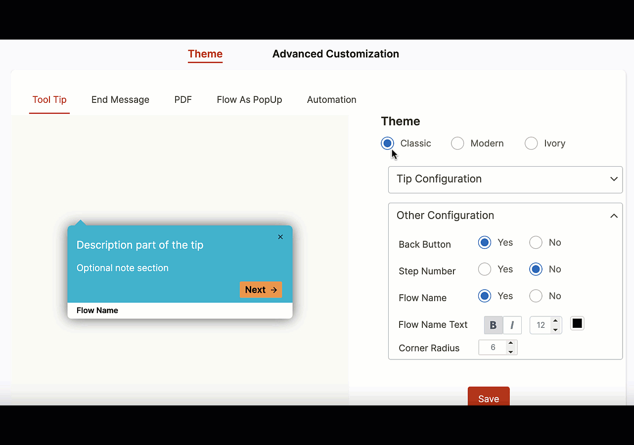
6. Tooltips
Tooltips, or smart tips, are brief messages that appear when a cursor hovers over an icon, image, hyperlink, or another element inside your product’s UI. Tooltips can be used with hotpots to draw your user’s attention and give them some contextual info when they check it out. T
7. Alerts
Alerts are triggered by an event carried out inside a product, or generally when a condition is fulfilled. For example, you can program alerts that pop up when users upload a wrong file format or to inform them when they’re about to delete their data.
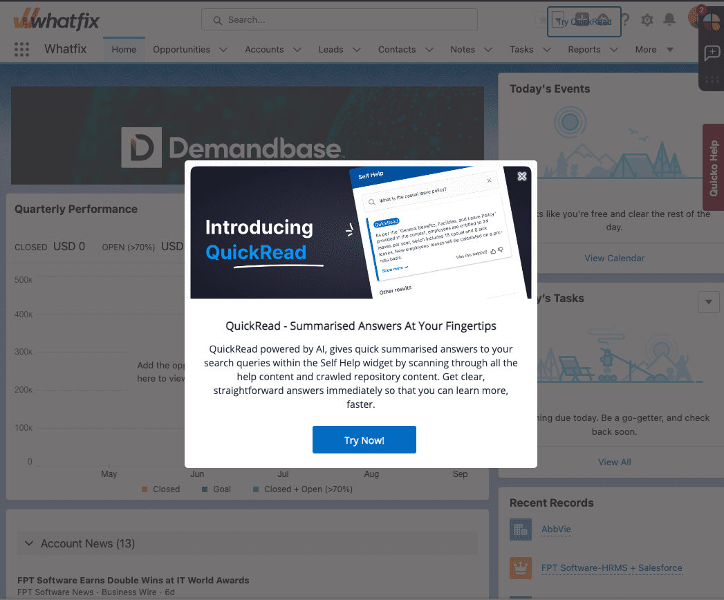
8. Pop-up alerts and videos
These are pop-up windows, also known as modal windows, which can contain videos users may watch without leaving the page or website, or an announcement on a product release, new feature, or company news.
They’re usually programmed to be triggered by some action your user makes: clicking a button, signing up, trying out a feature, ignoring a feature for a specific period, or trying to exit the page. You can use third-party video hosting like YouTube or Vimeo to embed them on your website.
Pop-up videos can either be a huge annoyance, or they can help your users find onboarding Nirvana. Make them short, simple, and ask your users to perform just a few actions simultaneously.
9. Meta onboarding
This refers to teaching users how a product works by giving them simple tasks to complete inside your application.
For example, when a new user first signs into Notion, you get a welcome document that invites you to complete tasks, format text inside the editor, reorder your content, right-click and delete something —right inside that onboarding page. We expand on this further down as one example of a great onboarding UX.
Toucan is another great example; it’s a browser extension that teaches you new languages by changing the words on your screen into the language you’re learning. When you land on Toucan’s sign up page, the text is in English but several words are in Spanish and when you hover it it translates back to Spanish —just as if you were already using the extension. It was so captivating, I quickly read their entire homepage (to discover and hear a pronunciation of the Spanish words) and signed up right away.
If you do it right, meta onboarding can be super-effective—it engages new users immediately, grabs their attention with a few quick wins, and leaves the impression that your product will be easy to use.
Create contextual user onboarding flows, drive adoption of new features, and make in-app announcements with Whatfix
Whatfix is a no-code digital adoption platform that enables product managers to create contextual in-app guidance, product-led user onboarding, and self-help user support – all without engineering dependencies. With Whatfix, create branded product tours, user onboarding checklists, interactive walkthroughs, pop-ups, smart tips, and more – all enabling customers and users with contextual guidance at the moment need. With Whatfix, analyze, build, and deliver better user experiences.
How to Design an Effective User Onboarding UX
An effective onboarding experience is one that is built with your users in mind: I know that sounds so reductive (like, who doesn’t know that), but you have to put yourself in your users’ perspective; they may never have heard about your product; they may even be using an alternative at the moment, and they have little time.
If you want to capture their attention, they need to feel like the product was designed exactly for them. You can follow these five best practices, powered by user onboarding software, to start building your new user onboarding experience.
1. Understand your users and why they signed up for your product
No matter how simple your product feels, your customers will use it surprisingly differently.
For example, Excel was originally designed as a database for technical users. Today, people use it to organize classes, create meal plans inside it, manage finances, create a content calendar, manage new hires and HR-related data, as a digital asset manager, or as a simple repository for your favorite websites.
Slack was designed for office conversations, but you can use it for private groups, class reunions, and even sending personal DMs to users outside your organization. In the same way, your users will have different ideas for your product, and if it doesn’t fit into their niche use case, they will churn.
So, anticipate those use cases and customize the onboarding process based on what the user wants to use your product to do.
Some great examples are Monday, Lemlist, Hunter, Intercom, Zendesk, Shopify, and Hotjar.
- When you sign up, Zendesk asks for your company’s name and headcount, as you can see here. Further, into the onboarding process, you have to specify whether you’re using Zendesk to create helpdesk resources for businesses, individual customers, or internal users.
- Monday is a work management platform you can use as a CRM, project tracker, project management dashboard, and digital asset manager. When you sign in for the first time, the Monday dashboard asks you to specify what you’re going to be using the product for: marketing, HR, project management, CRM, task management, creative design, or software development. With that information, you get a bundle of suggested templates to start from instead of a black canvas you have to customize by yourself.
- Shopify asks whether you already own a business, your current revenue, and whether you’re building a store for a client or yourself —all of which will help them recommend the right resources to guide you as you set up your online store.
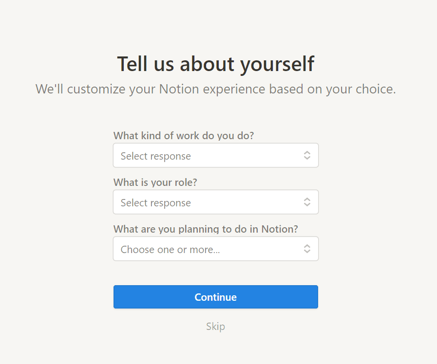
- Notion also interviews new users about what kind of work you do, your role, and what you plan to use Notion for, so it can recommend the best resources to help you get started.
Different user personas will need your product for their different use cases, so learning what their situation looks like will help you recommend the right features, templates, and resources based on other user feedback and usage patterns.
With a tool like Whatfix, product managers can analyze and segment users into cohorts to create more contextual onboarding experiences that are tailored to cohorts.
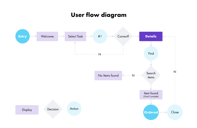
2. Map out your user journey
How do users get from point A to B inside your product UI? Again, this is another place where product teams fail: you build a straightforward path new users should follow when they sign into your product. But your users don’t think as you do, and when they can’t seem to figure out your product, they churn.
To avoid that, clearly define (in detail) how users should navigate your application with a well-planned user journey mapping exercise. Again, Slack is a perfect example.
- When you sign into a particular workspace, Slack asks you to select the channel members you want to add to your sidebar to make it easy to contact them. After that, you can head into the app to start discussing.
- After you create a Notion workspace, you get a list of tasks to complete one after the other that help you learn how Notion works and how it’s different from alternatives like Google Docs, ClickUp, and Airtable.
Don’t overwhelm users with tooltips, highlights, and alerts pulling them in every direction. Offer them one cue after another that explains how to use your product, step by step.
3. Define your user personas
Different user personas will need your product for different use cases, so you’ll need a slightly different intro to get them hooked on your product. For example, enterprise UX design is much different than designing UX for a small B2B company.
A startup founder may use HubSpot as a fundraising CRM for tracking conversations with potential investors, while a VP of Sales will use HubSpot to monitor their team’s pipeline, opportunities, forecasts, etc.
An undergrad may use Notion to track their lifestyle (water intake, goals, reading) and class timetables while a director of content uses it to manage their content calendar, assign projects to their freelancers, and store assets (such as images, references, and clippings).
You can use welcome screens and intro surveys to figure out what users want to use your product for, so you can push the best onboarding experience and user flow suited to their specific use case. You can also empower product managers to create cohorts based upon user segmentation, enabling users with contextual flows designed for their specific use case.
4. Optimize for mobile & web-friendliness
Make sure your design elements and user interface are designed to render well on mobile, web, and any other channels your users will be accessing your application. This also includes following general best UX/UI practices when designing and launching UX elements such as product tours and tooltips.
For example, you should use contrasting colors when creating tooltips and pop-ups to showcase the importance of its message and grab your users’ attention.
5. Analyze, test, and reiterate
With UX design tools, experiment with different onboarding tactics to see which one reduces your dropoff rates the most.
For instance, if your product is a B2B SaaS platform that costs several thousands of dollars, your users will have no issue spending 1 hour on an onboarding demo with a product expert—they’ve invested so much into your product already and going the extra mile doesn’t seem like a big commitment.
On the other hand, if you’re selling a freemium B2C SaaS product (i.e., Notion, ClickUp, Code, Slack), you really need to give your users a great first impression as quickly as possible so that they can find an aha! moment that’ll get them using your product more consistently.
But there’s no surefire way of knowing which onboarding tactics will click with your users. So, you should test different onboarding patterns, observe how they affect your conversions, user activations, and retention rates, and then determine which ones to adopt long-term.
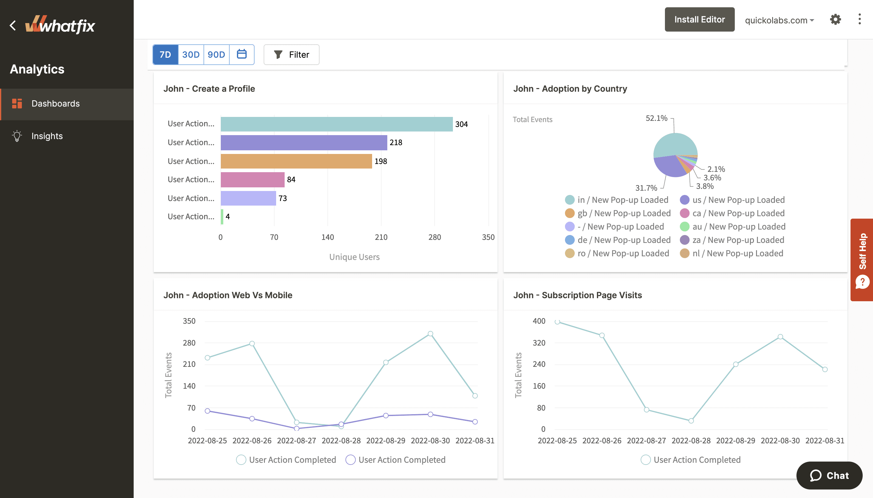
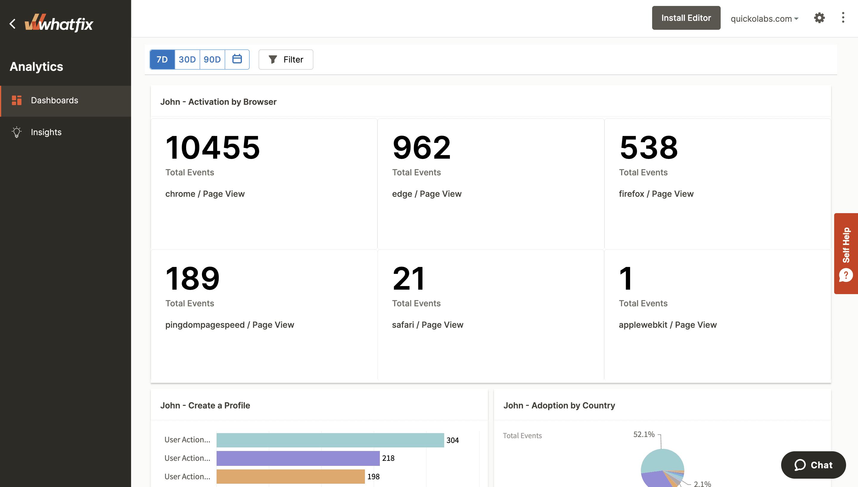
With a product analytics software like Whatfix, product teams can capture user behavioral analytics to understand the effectiveness of user flows, measure and track key user onboarding metrics, and gauge overall product adoption. This allows product teams to make data-driven decisions when testing new onboarding flows or launching new in-app guidance content.
There are many fantastic online courses and resources available for new designers creating onboarding flow UX. One of our favorites is Figma’s Design Crash Course on user onboarding UX flows, which you can watch below:
Examples of Great Onboarding UX
There are many great examples of onboarding flows you can reference when creating your new user onboarding UX.
Here are a few specific examples we’ve mentioned throughout this article that we wanted to showcase that have fantastic onboarding UX design:
1. Notion
When you sign up for an account, Notion first asks you the kind of work you do, your role, and how you plan to use Notion so it can recommend the right templates and settings to help you get started.
After that first into, Notion populates your workspace with templates, resources, and databases based on the options you selected earlier.
The trick is to get you to start playing with Notion right away, see how it works for yourself, and get an aha! moment when you discover how intuitive and customizable their platform is.
Finally, Notion generates a list of to-dos for you to complete and check off your list, such as:
- Click anywhere to start writing
- Hit the forward slash / to cycle through all the type of content formatting options
- Click toggle blocks to expand nested content
- Reorder content by dragging and dropping
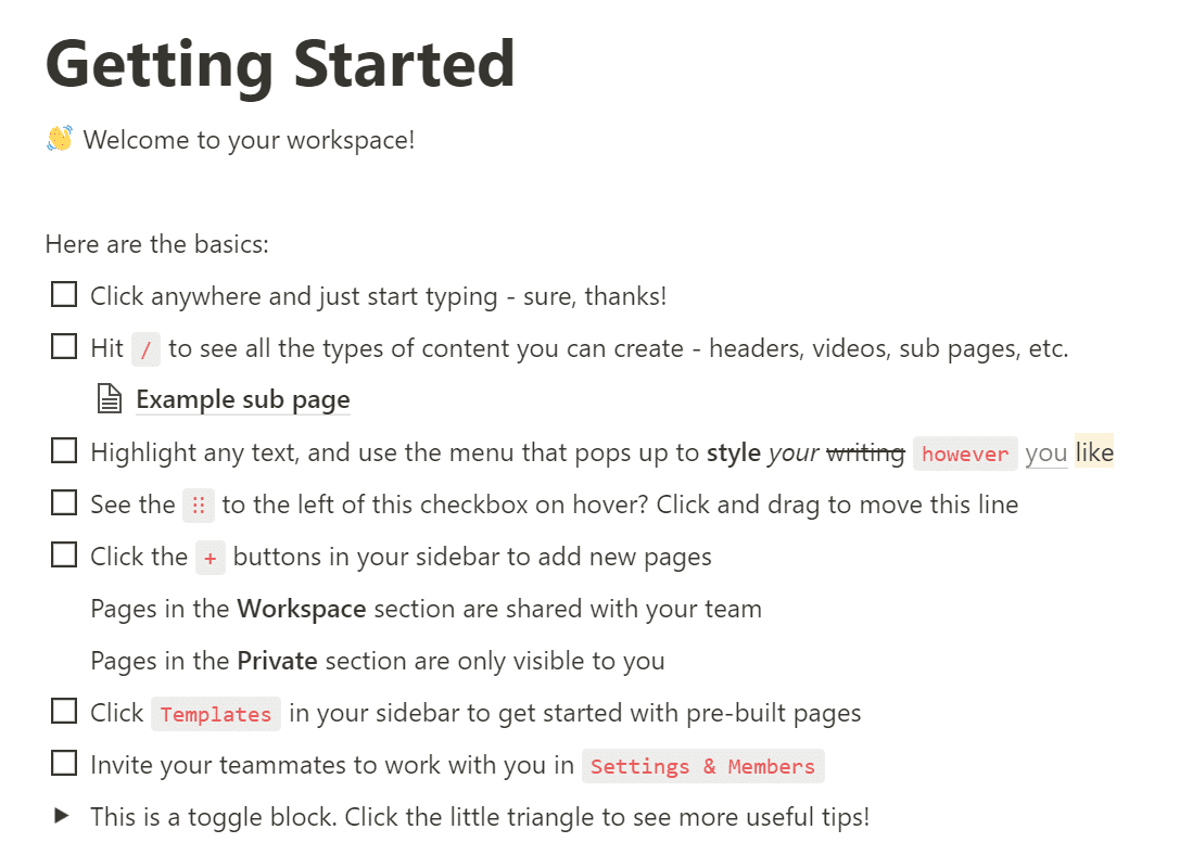
What makes this onboarding effective? The getting started to-do list is a very simple onboarding checklist —it aims to teach users how Notion works by making them actually use it for themselves.
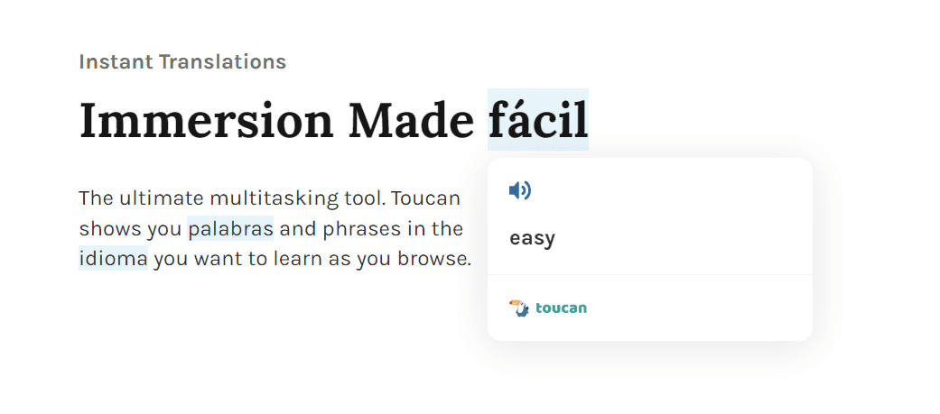
2. Toucan
Toucan is a Chrome extension that helps you pick up new languages by changing random words in your browser into the language you’re trying to learn —or, like their tagline says, you can learn a language without leaving your browser.
Toucan is a browser extension, so you don’t need to sign up to use it, but once you land on their website, this is what greets you:
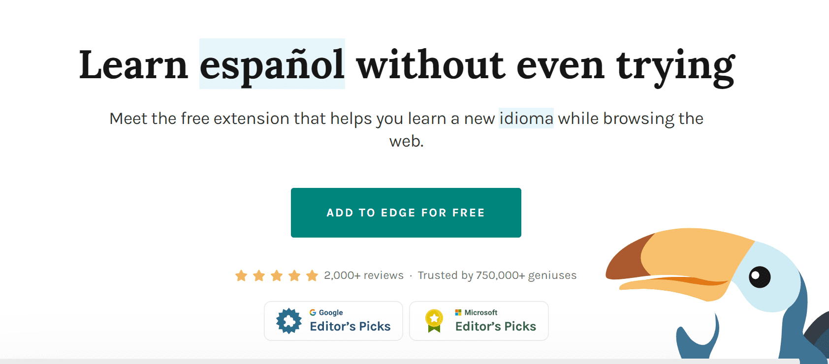
My browser is set to English by default, but as you can see, a few words all over Toucan’s homepage are randomly translated into Spanish.
The aim is to get you to hover over the words, and when you do, the Spanish word (the Spanish word here is Spanish; meta, I know) translates to English —and you can even hear a pronunciation by a native speaker.
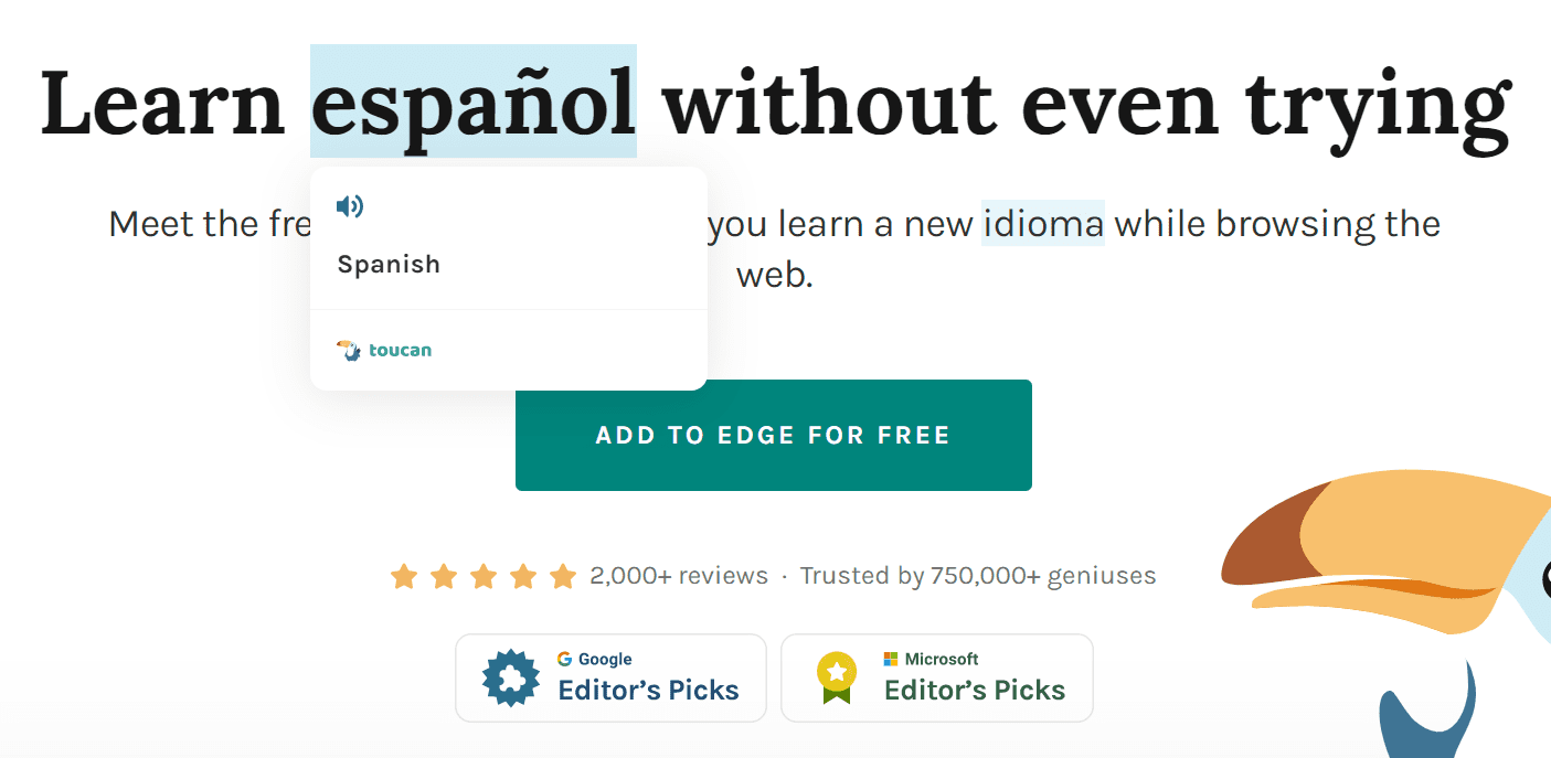
What makes this onboarding effective? That little demo shows you a perfect picture of how Toucan works in less than 10 seconds: you can learn a language in your browser just by installing their extension and then using your browser just as you usually would.
As you keep scrolling through the website, there are dozens of words randomly translated to Spanish and as you hover each one, it translates back to English (or whatever your browser’s default language is).
This is also a perfect example of meta onboarding: Toucan aims to teach you how to use their product by actually making you use it in a low-commitment way for just a few seconds to demonstrate that you can really start learning new words, simply by surfing the web with their extension installed.
Whatfix makes it easy to scale up your onboarding experience whether you have 5k users or 5 million.
Whatfix’s digital adotion platform acts as a canvas on top of your applications that shows users how to start using your product, with suggested tips, explainers, checklists, and contextual alerts that pop up when users interact with elements inside your application.
Instead of coding onboarding elements from scratch, you can provide onboarding on-demand with Whatfix’s no-code editor so that you never stifle your users and don’t leave them to figure it all out themselves.
With Whatfix Analytics, you’re empowered to collect user behavioral analytics to understand how effective your onboarding UX is, friction points in new user flows, feature and product adoption, and more – all enabling you with the insights to make data-driven UX decisions that drive results.
Learn more about Whatfix’s guided onboarding and product analytics platform now!


Thank you for subscribing!