How customers and end-users interact with a platform influences a company’s business results. Product usage should be at the heart of every significant decision the team must make, from design to marketing and beyond. Doing this helps a company, its product ops team, and its customers move in tandem toward more value for users and more success for the business.
However, some companies make the mistake of guessing or assuming what users are doing on their platform, how much it meets their needs, and the pros and cons from a customer perspective. These assumptions are a concern because they often lead to product development disconnected from the user base—and customers notice.
To start making better decisions and moving faster toward your company’s goals, investing in a product analytics strategy is crucial. In this guide, we’ll go through everything from the benefits of a strategy to key metrics that your organization should start monitoring today.
What are Product Usage Analytics?
Product usage analytics quantify what users do on your platform, when they do it, and for how long. While it might sound simple, the precise information that your product analytics can offer is actually quite nuanced. Here are some examples of usage-based product analytics and events:
- Level of engagement for features and user flows across different segments of users
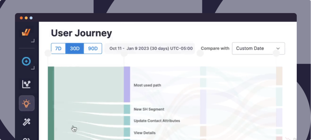
- The most common user journeys and paths
- Drop off or user friction in different paths and flows on the platform
- Frequency and length of user sessions
- Location and device details
- Feature adoption levels across different user segments
- Effectiveness of different aspects of your experience, including your customer onboarding flow
We’ll take a closer look at what you can learn from each of these metrics later on, but for now, consider this example.
Let’s say that your product is a CRM. Product usage analytics would give insights into how frequently your users access information stored in the CRM, how many users are working from mobile devices, and what features your users find most useful based on task completion and customer satisfaction metrics. With that information, you can make strategic business decisions like optimizing your mobile app for a better on-the-go experience or creating a quick-access look at crucial CRM data.
In short, product usage analytics measure the user experience, enabling you to better cater to your customers’ needs and meet your organization’s business goals.
Types of Product Usage Data
Product usage data is a broad category for all of the information and metrics that measure the experience of users on your platform. In this section, we’ll explore the two primary types of usage data.
Quantitative Data
Quantitative data is objective, metric-based information about user behavior on your platform. Most likely, these are the data points that you already associate with product analytics intuitively. Here are some examples:
- Event tracking: how often and when do users do specific actions?
- Funnel analysis: where do users drop off in a given flow?
- Feature engagement and usage: how often do users utilize specific features, and what behaviors are correlated with each other?
- Cohort analysis: what do different customer segments do on your platform, and with what frequency?
- Conversion rates: which users are most likely to convert? Which actions are most associated with higher conversion rates? What is the conversion rate for each customer segment?
Qualitative Data
Qualitative data are more subjective, but no less crucial, insights that give color and nuance to the quantitative metrics that you’re monitoring. Often, the quantitative data tell you what and the qualitative data tell you why.
For example, you may see in your funnel analysis that users tend to drop off at a specific point in a particular flow. You can then use qualitative methodology to understand why users are dropping off – are they confused? Is there a bug? Do they not understand the value proposition of continuing further?
Some examples of qualitative data include:
- User session recordings
- Heatmaps
- Customer feedback and interviews
- In-app surveys
Overall, a nuanced and complete picture of product usage involves both quantitative and qualitative methodology, with metrics that tell you what’s going on and qualitative methodology telling you why. With all of this usage data, your team can make calculated decisions to serve your users better and hit your KPIs.
How to Maximize the Benefits of Tracking Product Usage
The bottom line about product usage data is that it allows you to make decisions based on data rather than assumptions. When your team truly commits to this process, it’s mutually beneficial for both you and your customers: you move closer to your organizational goals, and your customers have the sense that you’re optimizing your platform in a way that suits their needs.
In this section, we’ll look in more detail at how to harness the power of your product usage data in order to maximize the benefits for both your company and your user base.
Build and optimize products based on data
This mindset is quite possibly one of the most powerful tools you have as an organization when it comes to influencing the company’s success in fulfilling its overall mission.
Rather than engaging in endless debates about which roadmap items to pursue or which product iterations will have the most impact, you can use actual data to make quick and informed decisions.
To get started, you need a product analytics tool, such as Whatfix Product Analytics, which allows you to monitor and analyze all of the key metrics that we discuss in this guide without the help of a developer or even a data analyst. Once you have your analytics platform, you’re well on your way!
Benchmark user adoption and analyze feature usage
User adoption and feature usage are two groups of metrics that give you an overall understanding of where your users are finding value in your platform – and where they aren’t. You can look at:
- What proportion of your user base sticks around after onboarding?
- Which features do users use again and again?
- Which features do users tend to use once and not more?
- Which features are most correlated with user retention and platform adoption overall?
By benchmarking these adoption and usage metrics, you establish the status quo – this is what’s happening now. From there, your team can create specific, numerical goals for improving overall usage and adoption of key features.
Not only can you set goals, but you can also then create experiments with new product iterations and actually measure their effect on your usage and product adoption metrics, allowing you to know for sure that what you implement leads users to higher adoption and usage rates.
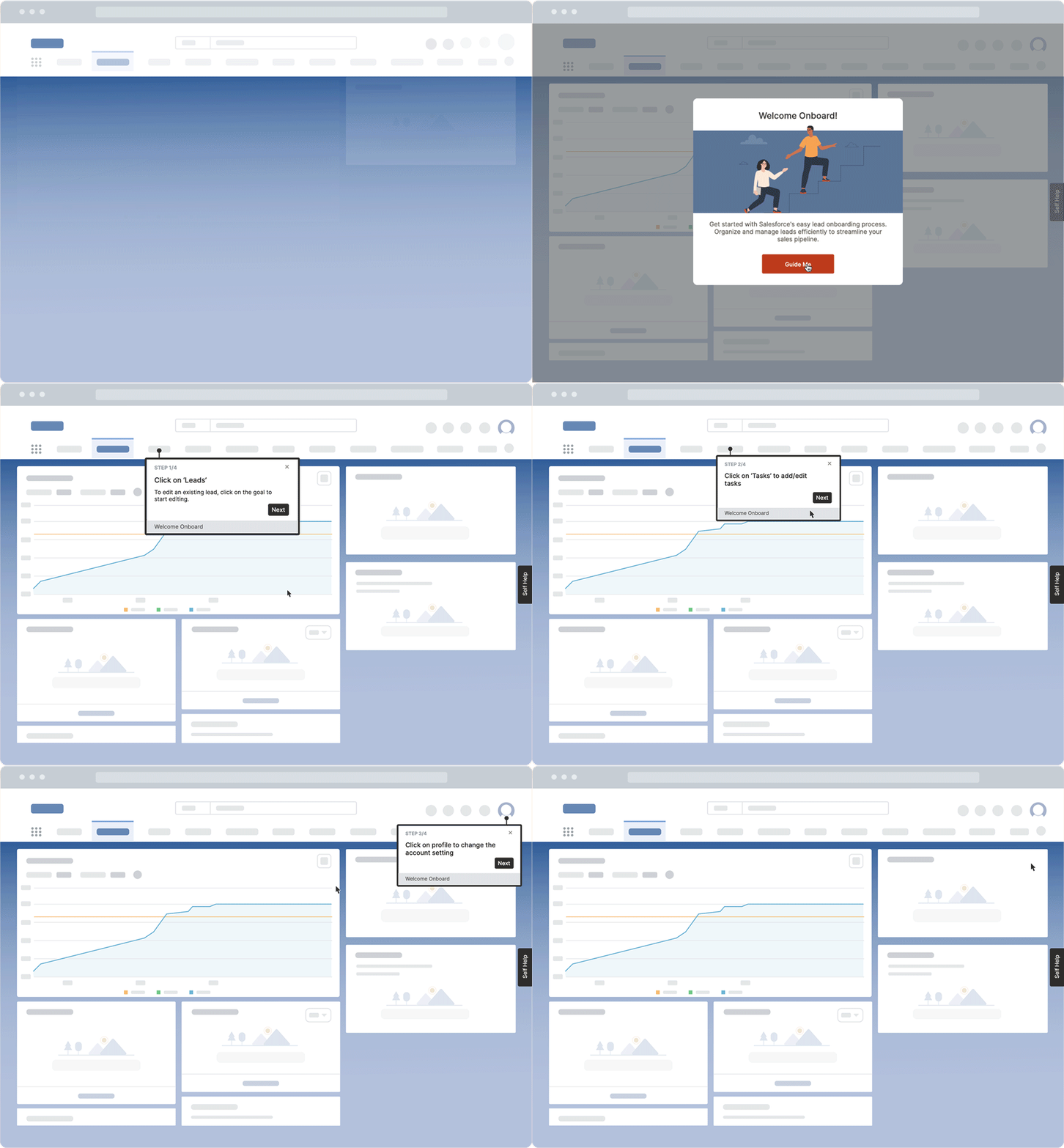
Reduce time-to-value with better onboarding flows
The time-to-value metric measures how long it takes your users to complete an action that represents the core value proposition of your platform. With product usage data that looks at your onboarding flow and what happens after, you can ensure that your onboarding consistently reduces the amount of time that it takes for customers to get tangible value from your platform.
User onboarding is one of the most impactful elements of the user experience, and it’s where you set your customers up for success by giving them a sense of what you have to offer and how to utilize it. Once you determine what event constitutes a user truly getting something worthwhile from your platform, you can then design experiments for your product iterations that show which updates get your customers to value faster, increasing the likelihood that they’ll retain in the long term.
Spots areas of friction and optimize key conversion points
Many product analytics tools have features like Funnels in Whatfix that allow you to visualize and analyze key flows within your platform. With this data and these visualizations, you can look at the user journey and see:
- Where do users tend to drop out of a flow?
- What actions within a given flow are correlated with higher conversion rates?
- Are there any other indicators of friction or confusion in your platform’s key flows?
By looking at these types of metrics in your product usage data, you can easily identify which areas of your platform are causing friction for your users – and then react to it in order to improve the experience and create healthier funnels and flows.
Identify root causes of problems and take a data-driven approach to roadmap prioritization.
As you begin your product data journey, you’ll see that friction is a fact of life for most SaaS platforms. Your feature set is dynamic, so inherently, there are always issues with awareness and comprehension in the user journey. By utilizing both types of product data – quantitative and qualitative —, you can develop a nuanced picture of where your users struggle and prioritize product roadmap items accordingly.
For example, if you notice that users tend to drop off in large numbers at a certain point in a particular flow, you can do some usability testing for a qualitative glance. Is there a UX problem? If yes, you can prioritize UX improvements in the roadmap and then do an experiment to see if it relieves some of the drop off.
Better understand customers and personalize experiences for different cohorts
It’s unlikely that all of your customers fit the exact same profile. They may vary in terms of their role at their organization, the size of the company that they work for, or their primary goal in using your platform – among other potential factors. Using tools such as Cohorts on Whatfix, you can segment your users according to user types and then look at their product usage data accordingly.
You can monitor the behavior of each user segment and customize the user experience based on product usage data to best match the needs of each group.
A digital adoption platform (DAP) is an incredibly useful tool when it comes to customizing the experience for each relevant customer segment. You can use mechanisms like in-app pop-ups or product walkthroughs to highlight and educate users about the areas of the platform that are most relevant for them, likely increasing adoption and retention.
Important Product Usage Metrics to Measure
Though your analytics dashboards will vary depending on your organizational needs, some key metrics are considered universally important to measure. In this section, we’ll discuss some of the most important product usage metrics.
These metrics generally require an initial setup on a product analytics tool, and then you can simply view your dashboard to keep an eye on them. With the right tooling, you don’t need to calculate key metrics over and over again.
1. Usage frequency
Usage frequency measures how often a customer uses your product. It’s an at-a-glance metric that helps you better understand how often your users need to access your platform and to what extent it’s incorporated into their routines and workflows.
To find usage frequency, set the desired time period and count the number of times that a user logs in and does an action on the platform. Based on this metric, you may decide to offer new flows and features to increase the frequency with which your customers need to use your platform.
2. Time-to-value
Time-to-value is the amount of time it takes for a customer to complete an action or hit a milestone that provides tangible value to them. It’s sometimes referred to as the “aha” moment. Lower time-to-value is generally a predictor of better retention and lower churn.
To measure time-to-value, you need to identify what value is for your users. The value you set should be measurable, such as completing a specific action. Next, you’ll measure the time between a user’s onboarding and when they reached the event that you’ve defined as valuable.
You’ll want to prioritize user onboarding initiatives and other product iterations that decrease time-to-value.
3. Time spent using the product
Time spent using the product is a high-level metric that tells you how much time a user spends on your platform in a given time period. It’s sometimes referred to as time-on-site. Ideally, your users would use your product frequently and spend significant time on it, indicating that you’re a valuable part of their routine workflows.
Note: The right amount of time depends a lot on your platform. While a media site that generates revenue from the number of ads that a user sees might always want to optimize for more time on site, a SaaS platform might want to spend some time defining a sweet spot that reflects regular usage but not flows that takes too long to complete from a user perspective.
To calculate this metric, you’ll measure each user session within a given period and then calculate the total amount of time that the user was actively using your platform.
4. Product and feature adoption
Product adoption tells you how many new users have become active platform users. To find your product adoption rate, divide the number of new and engaged users by the total number of new signups.
Feature adoption is similar, but it looks specifically at what your entire user base has adopted features. To find your feature adoption rate, divide the number of users of a specific feature by the total number of users on the platform.
Overall, you’ll want to pursue product initiatives that increase overall product adoption and key feature adoption rates. Both metrics indicate that users are getting value from your platform and your ongoing product iterations.
5. Bug reporting metrics
Finding and fixing bugs on your platform helps improve the overall user experience and customer satisfaction. Metrics around bug reporting help you understand how frequently you have bugs and whether or not they’re being handled efficiently.
You can consider monitoring several specific bug-reporting metrics, including:
- the number of bugs reported in a given period
- the total number of bugs fixed in a given period
- the average amount of time between when a bug is reported and when it is resolved
These metrics will indicate when you might need to improve your internal processes for dealing with bugs so that your customers aren’t bogged down by technical issues, which can interfere with having a great experience.
6. Customer retention rate
For your product to grow, keeping your customers in the long term is a key ingredient of your overall strategy. Your customer retention rate tells you the percentage of customers who continue to use your platform within a specific time. For example, your monthly retention rate tells you what percentage of your user base sticks around for at least a month.
To find your customer retention rate, divide the number of existing users you have at the end of a period compared to the number of users you had at the start of that time. Be sure not to count any new users added during this period in your count.
You can use your customer retention rate to understand the effect of product iterations on their ability to keep users engaged and coming back to your platform over time.
7. Churn rate
Churn rate is the opposite of your customer retention rate. It tells you the number of users that have stopped using your product within a specific time period. Unlike customer retention rate, you want to keep your churn rate as low as possible.
To find your churn rate, divide the number of customers that you lost within a specific time period by the number of customers you started with during that same period. As with customer retention rate, you don’t want to include any new users in your count.
You’ll want to measure the effect of all significant product iterations on churn and optimize for lowering it over time.
8. Free-to-paid conversions
If you offer a free plan for your customers, measuring your free-to-paid conversion rate can help you identify how many of your users find enough value in your product to upgrade their membership to a paid plan. Measuring free-to-paid conversions can help you better understand how many free users you need to onboard to grow your paid memberships and reach your revenue goals.
Free-to-paid conversions can also provide insights into what features or upgrades your users find valuable enough to pay for. This can help you make smarter decisions about pricing and product offerings.
Calculating your free-to-paid conversion rate involves examining the percentage of your users who upgrade from free to paid within a given time period.
9. Daily/Weekly/Monthly active users
The number of users who have created an account is an interesting metric. Still, more telling is the number of users who are actively engaging with your platform within a given period of time. For example, daily active users (DAUs) tell you the number of users that engage with your platform daily by completing at least one action.
Calculating your active users is simple: calculate the sum of active users within whatever time period you’re measuring. Active users are generally communicated in hard numbers rather than percentages.
Your active user metrics are helpful for understanding which product iterations give enough value to encourage more users to utilize your platform more frequently.
Product Usage Tracking Click Better With Whatfix
Product usage metrics provide the insights you need to scale your business successfully and create a product your audience loves. The analytics themselves tell you what’s going on with your users and allow you to react and optimize for a better user experience.
For many teams, Whatfix is a strategic partner, offering both Product Analytics to monitor and analyze usage and a DAP to help react swiftly to what you see in the data. Let’s review how each platform can power your product usage strategy.
How to use Whatfix Product Analytics for an optimal usage strategy
With Whatfix Product Analytics, you can supercharge your efforts to monitor and react to product usage data. Here are some of the primary ways that you can do just that:
- No-code event tracking setup and management: You don’t need a developer or data analyst to view data, add new events, and so on. This means that anyone on your product team can quickly and easily access the data they need without blockers or dependencies
- Capture custom user events: Uour team can decide which events are worth tracking and capture them right within the platform
- Benchmark user metrics: Use Product Analytics to figure out where you stand now and monitor your metrics over time to see progression, improvement, and opportunities
- Analyze usage from a qualitative perspective: Product Analytics allows you to track and measure metrics like your customer satisfaction score, which helps you understand the impact of your product iterations on how happy users are with the platform and/or specific features
- Create a data-driven plan for user flow testing, iteration, and optimization: Product Analytics offers the ability to plan all of your product iterations, micro and macro, based on metrics rather than assumptions
How to use the Whatfix DAP to improve product usage metrics
The Whatfix Digital Adoption Platform (DAP) allows non-technical team members, such as a CSM or product manager, to iterate on the user experience and build in-app experiences without needing a developer. Though many of your usage metrics will suggest new features and flow amendments, a DAP also allows you to improve the user experience quickly.
Here’s how you can use the Whatfix DAP to improve the user experience based on usage data:
- Create, launch, and test new in-app guidance, self-service support, and user communication: If you see in the data that users need help, you can offer it to them at just the right time without the help of a developer.
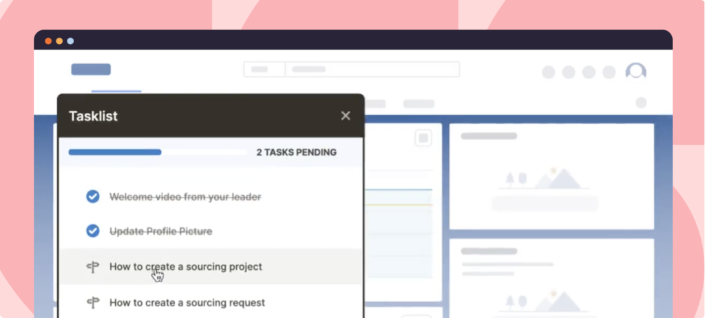
- Create personalized, product-led onboarding experiences with Tours and Task Lists: When you see in your analytics that users need more initial awareness and education around certain features and flows, you can optimize your onboarding with product tours and checklists to motivate and help users learn more.
- Drive feature adoption with Flows: Drive adoption of advanced features or provide additional support when you notice friction in a particular workflow.
- Support users in the flow of work with Smart Tips: If you see that users sometimes need extra help, you can offer a Smart Tip while they’re amid a workflow rather than forcing them to break focus and seek help on their own
- Communicate product-related news and announcements with Pop-Ups: When you have a new feature or a product improvement, use the DAP to alert your users on-platform and increase your adoption rate.
- Provide on-demand support with Self Help, an in-app help center that integrates with your knowledge base and other support repositories: Self Help is easy to maintain and update as needed, so your users always know where to go when they need extra guidance to get something done.
Ready to learn more about how Whatfix can empower your product development? Schedule a demo today!
