One out of four users will abandon an application after using it once. 95% of users will eventually churn over the next three months, and 55% of customers say they have returned a hardware product because they couldn’t figure out how to use it.
To build a viable platform, you need more than conversions. You need a product experience that facilitates simple user activation, has sticky workflows, and drives high user retention rates. The first step is to ensure your users understand how your product helps them accomplish their goals, starting with a well-designed and effective onboarding user experience (UX).
The term ‘onboarding UX’ is a combination of terms. To understand it better, we need to deconstruct what each means individually.
- User onboarding is the process of guiding new users to find value in your product so they can become familiar with how it works and start using it consistently.
- User experience (UX) refers to any interaction with a product and how it forms a user’s opinion about a product.
If we combine those two definitions, we can understand onboarding UX better.
What Is Onboarding UX?
Onboarding UX is the design framework behind how new users interact with your product when they first begin to use it. It helps users form their opinions about the platform and, ideally, gets them started on using it consistently. The goal of onboarding UX is to make it simple for new users to start using your product, reduce your product’s time-to-value, build habits, and drive overall product adoption.
Why Does Onboarding UX Matter?
Onboarding UX is critical to the retention and long-term success of your platform. The UI elements and interface enable product-led onboarding, giving users a great foundation to incorporate your product into their day-to-day workflows.
How and why does that happen, exactly? Here are a few of the most critical reasons behind the importance of practical onboarding UX.
1. Creates a strong first impression
A strong onboarding UX makes it easy for users to understand how they can and should use your product to gain value. Startup consultant and VC Andrew Chen says that 77% of users won’t sign into an application three days after installing it. Three months later, user retention drops to less than 5%.
Below, you can see a typical retention curve for Android apps.
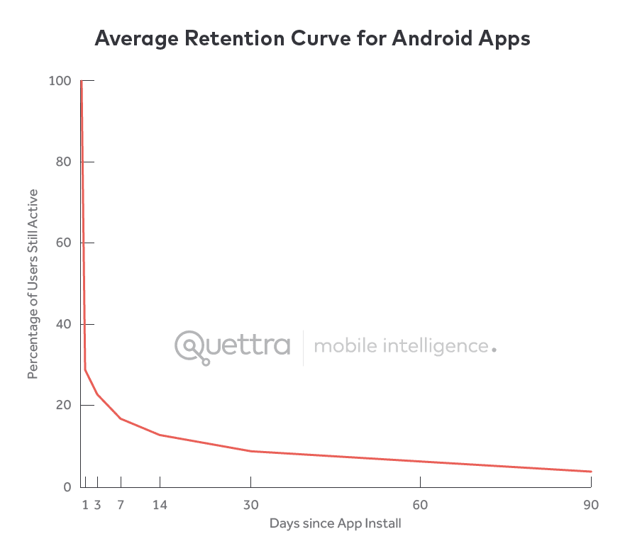
There’s so much competition among so many excellent products that if users don’t understand how to maximize the platform’s benefits, they’ll likely churn and never return.
However, your product onboarding UX can be an antidote to some of these dismal statistics. An effective onboarding experience helps users form their first impressions of your platform, answering questions like:
- What does this product do?
- How do I start using it immediately? Can I get value from it already?
- Is it as intuitive as the products I already use? Is there a learning curve?
- Can I fit it into my existing workflow? Does it make things any easier?
- How does this compare to what I use already? Is it any better?
If your onboarding experience helps users answer these questions positively, these first impressions are likely to keep them coming back to the platform.
2. Reduces Time-To-Value (TTV) and guides users toward their “aha!” moment
Unlike products such as Excel or Google Docs, which have one obvious value proposition, most SaaS platforms and mobile apps have robust feature sets and use cases. Though this is ultimately a value driver for customers, it can also negatively impact customer retention if it takes users too long to understand the problems you solve and how to reap the benefits quickly.
Onboarding is a critical strategy for avoiding this issue because it’s the perfect opportunity to create that “aha!” moment when a user understands the platform’s value in the context of their workflows.
Reaching their “aha!” moment and reducing the TTV reduces churn, increases customer lifetime value, and helps you build a community of product evangelists.
3. Increases customer awareness and understanding of unique features that drive value
Your SaaS platform probably has a robust set of features and advanced user flows that aren’t necessarily intuitive to new users without a bit of effort. In your onboarding UX, you can use hotspots, alerts, and tooltips to guide users with:
- Features they may not assume you have
- Tools that they have not yet tried to use
- Tips and tricks for getting the most out of some of your more advanced features and flows
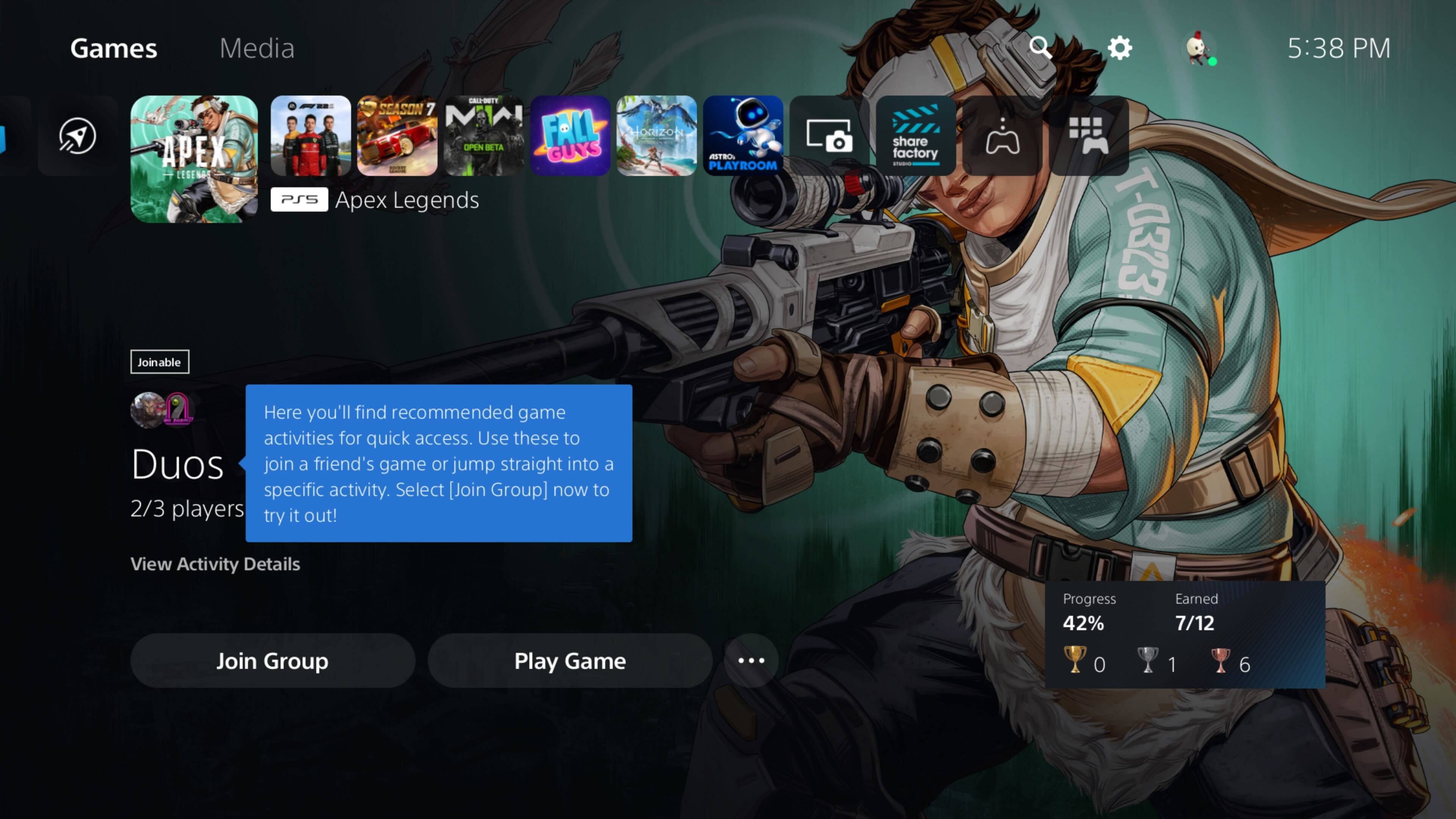
For example, when Sony launched its new PS5 console, it utilized tooltips throughout its new interface to introduce users to new features.
Tip: You can use a digital adoption platform (DAP) like Whatfix to create personalized onboarding journeys that raise awareness and guide users precisely in this way. Whatfix DAP allows you to add tooltips, product walkthroughs, and more without any code.
By creating awareness and providing guidance to users during onboarding with the right design elements, you’ll increase the chances that they’ll get value from more advanced features and remain loyal in the long term.
Types of UX Onboarding Design Patterns
Depending on where a user is in their product journey, you may want to teach new users how to get started or invite existing users to try out features they’ve been ignoring. In each case, you need a different approach to capture your users’ attention without becoming obnoxious.
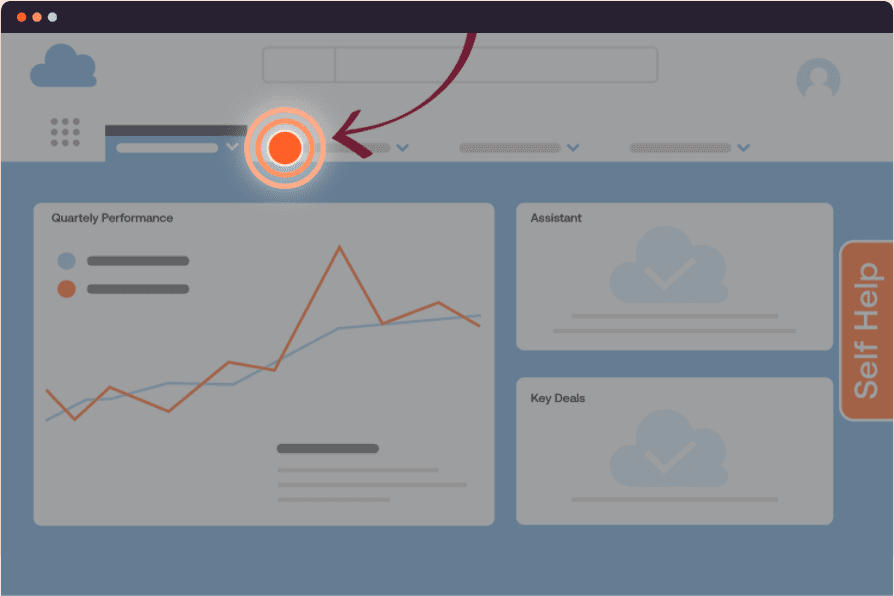
1. Annotated onboarding patterns
Annotated design patterns draw attention to specific features on your platform with subtle cues, notes, or highlights. For example, you can use non-intrusive visual cues like flashing hotspots or tooltips to get users to try out a new or unused feature.
As the name implies, annotated onboarding patterns gently draw users’ attention to features, settings, or configurations that can help them get more out of your product.
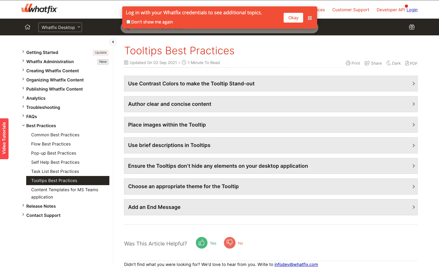
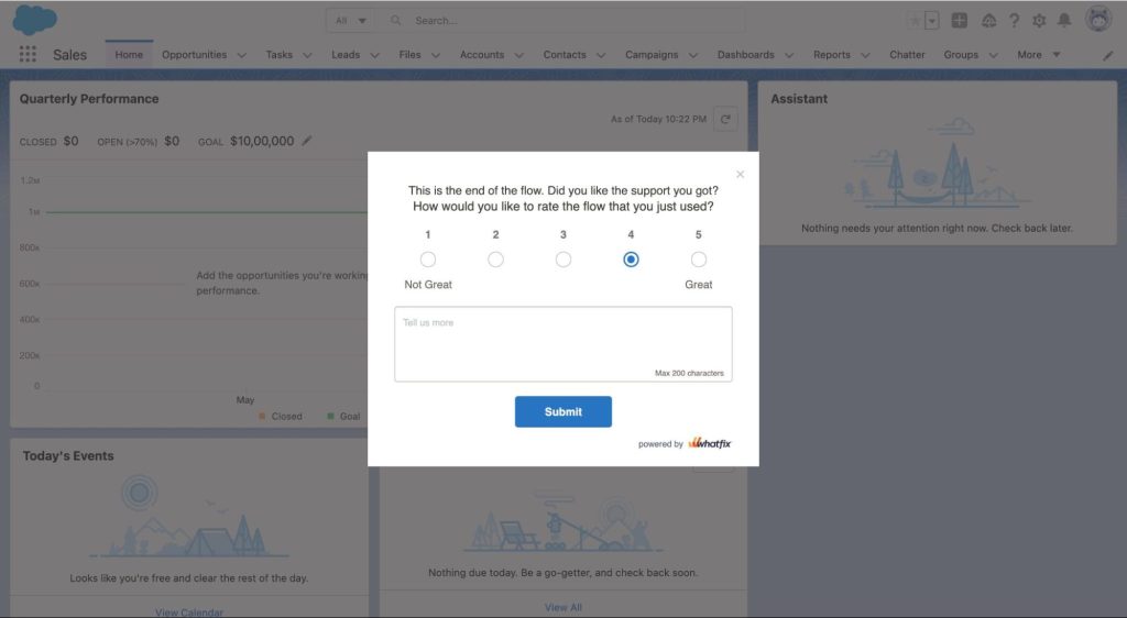
Below is an example from our Whatfix Support and Community portal. Customers can access our FAQ, support, and community posts by logging in, and we gently nudge users to do so with a UX tooltip.
2. Embedded onboarding patterns
Embedded patterns include checklists, task lists, slideouts, pop-ups, and self-help wikis. They’re a prominent extra layer on your product’s interface that captures your users’ attention and is one of the best practices for new user onboarding, primarily because they’re hard to miss and take up much more screen space.
Embedded onboarding UI is best suited to new users, but it can be annoying to users with a few sessions under their belts, even if they’re still technically in an onboarding flow.
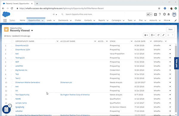
The embedded onboarding example below shows how you can use a digital adoption platform (DAP) like Whatfix to create a new onboarding task list for your new Salesforce users that guides them through its most commonly used workflows and tasks.
3. Dedicated onboarding UX
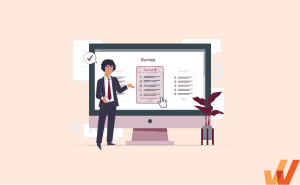
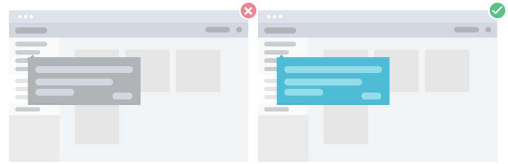
A dedicated onboarding layout takes up the entire screen space on a page, and it’s often used to collect data via signup forms, welcome screens, surveys, questionnaires, and so on. As you can see in the example below, it’s an aggressive form of onboarding that is helpful when you have something absolutely essential to communicate with users or need a particular piece of information from them to personalize their flow.
Types of Onboarding UX/UI Patterns
In this section, we’ll review some of the most common UX/UI patterns used during user onboarding so your team can consider which might be useful to add to your current onboarding flow.
1. Product tours and walkthroughs
Like a physical tour of a location, product tours and walkthroughs virtually walk new users through your interface and features step-by-step. Product tours are a series of images, videos, and flows users can cycle through, learning as they go.
Each product tour is unique, but some of the most common UI elements used in tours are:
- Screen overlays: in-the-moment guidance that gives the user crucial information for succeeding at a particular task in that moment
- Welcome surveys: given at the outset of a product tour, often to personalize the tour to include the relevant features and flows
- Tooltips and in-app messages: these interactive elements typically appear on screen on top of features and flows, showing users where they can go to accomplish tasks and giving more contextual information as they go (see Workaday’s example below)
- Video content: engaging videos, often animated but sometimes featuring real people, can give significant value to a product tour, highlighting the value proposition of particular aspects of the platform and giving users the essentials for how to make use of them
Organizations with the resources can build their own product tour using in-house engineering and open-source frameworks. To empower product managers or teams without the development resources to build in-house or who prefer to save those resources, teams can invest in software for creating product tours.
Platforms like Whatfix provide no-code tools to create in-app tours, as well as behavior analytics to analyze and improve their performance continuously. Whether you take a build vs. buy approach to user onboarding, product tours are a must-have element when it comes to your SaaS user onboarding UX.
2. In-app guidance
This pattern uses prompts and non-intrusive messaging to teach users how a product’s features work inside the user interface. These cues and tips are usually programmed to appear when a user signs up, tries out a new feature, or shows signs of difficulty using it.
In-app guidance acts like a layer on top of your application for users who need help but want to get it without disrupting their workflow.
In-app guidance can take many forms, such as explainer videos and articles offered at the right moment or links that point to more extended external resources within the platform itself. This can keep users from giving up or leaving the platform to consult other resources, like YouTube or ChatGPT.
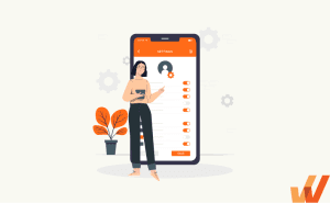
3. Onboarding checklists and task lists
User checklists or task lists, also known as guided task lists, are a list of to-dos that a user needs to complete as part of the onboarding process.
They break down your product’s main features into simple steps, and their effectiveness relates to the fact that users not only learn about your platform, but also get a sense of accomplishment as they move through and tick items off the list.
In the example below, you can see what a user task list powered by the Whatfix DAP looks like from a user perspective.
4. Hotspots
Hotspots, sometimes called beacons, are UI elements that draw attention to unused features, issues, and alerts without overhauling a user’s workflow. As the name implies, hotspots often use a gentle flashing mechanism to attract a user’s attention, and you can consider having more than one on a page if it gives value to the user.
Here are a few examples of when hotspots can be useful:
- Pointing out features that a specific user hasn’t utilized yet
- Drawing attention to a new feature or flow
- Showing users where they can get more help or resources when they haven’t taken an action in a while or show other signs of confusion
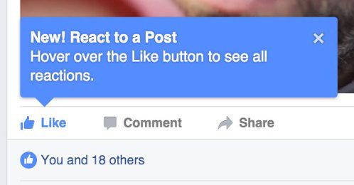
5. Tooltips
Tooltips, sometimes called smart tips, are brief messages that appear when a cursor hovers over an icon, image, link, or another element in your platform’s UI. You can do this whenever you want to communicate with the user, but it’s especially useful when announcing new or unused features.
Tooltips can be used in conjunction with hotspots to draw your user’s attention and give them some contextual info. Below, you can see the tooltip that Facebook used when rolling out reactions beyond the traditional ‘like’ button that its users already knew.
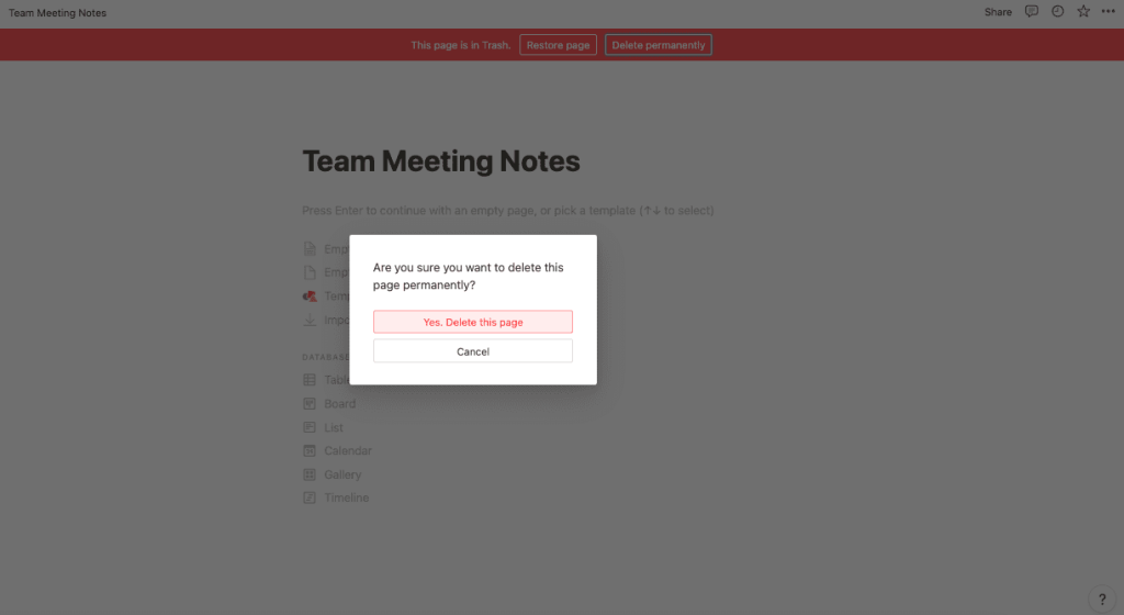
6. Alerts
Alerts are messages triggered by an on-platform event performed by your user. For example, you can program alerts that pop up when users upload the wrong file format or to inform them when they’re about to delete their data.
Typically, these are fairly intrusive UI elements (see the example below) and should only be used when providing mission-critical information to a user.
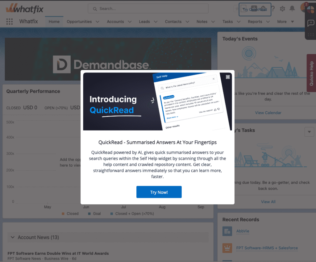
7. Pop-up alerts and videos
These are pop-up windows, also known as modal windows, conveying information to a user. Some examples of pop-up alert use cases are:
- Videos that users can watch without leaving the platform
- Product release announcements
- New feature alerts
- Company news relevant to users
Pop-ups are usually programmed to be triggered by a user action, such as clicking a button, signing up, trying out a feature, ignoring a feature for a specific period, or trying to exit the page.
Tip: You can use third-party video hosting like YouTube or Vimeo to embed videos in your pop-up alerts.
Pop-up alerts can either be a huge annoyance or help your users immensely during onboarding. To ensure they’re effective, make them short, simple, and targeted at just the right moment.
8. Meta onboarding
The meta onboarding method is a hands-on learning method that teaches users how a platform works by giving them simple tasks.
Toucan is a great example of meta onboarding. It’s a browser extension that teaches you new languages by changing the words on your screen into the language you’re learning. When you land on Toucan’s sign-up page, the text is in English, but several words are in Spanish. When you hover over those words, they translate back to Spanish, as if you were already using the extension. Uniquely, their onboarding experience begins with this immersive approach even before you sign up!
Done well, meta onboarding can be super-effective—it engages new users immediately, grabs their attention with a few quick wins, and leaves the impression that your product will be easy and worthwhile to use.
9. Progress Bars
One of the primary challenges in onboarding design is creating an experience that encourages users to complete their onboarding fully. When users drop off before finishing, they often lack knowledge and awareness about the platform, which affects their experience and retention prospects. Progress bars are a common UI element that is an antidote to this issue.
Users can see the progress bar fill up as they move through the various onboarding stages, giving them a sense of accomplishment and reassurance that the end is in sight.
10. Launchers
Most of us have experienced a well-intended but overly intrusive onboarding experience. When designing your onboarding UX, it’s important to provide users with the guidance they need to succeed on the platform without being excessive and creating an annoying, disjointed experience.
Launchers are customizable buttons, icons, or widgets embedded within your platform that can help you strike a balance because they’re a visually obvious element of your UI, but users don’t have to click them. They offer contextual guidance because when a user proactively clicks them, it leads them to something helpful, such as:
- A help doc or knowledge base page
- An instructional video
- A pop-up with more information relevant to the task they’re currently trying to complete
11. Help Centers
While completing onboarding, users often want to delve more deeply into a particular workflow or area of functionality on the platform. For example, they may find something particularly relevant to their work and want to explore the details. While your typical onboarding UX involves a fast-paced overview, help center access is a great way to accommodate these situations where users want more detail.
At some point in onboarding, a help center can be denoted with a hotspot or a beacon, making users aware that it exists. Different organizations approach help centers in different ways, but a searchable knowledge base, such as Self Help available via the Whatfix DAP, is a great option for giving users access to more detailed information while onboarding.
How to Design an Effective User Onboarding UX
An effective onboarding experience is built with your users in mind. While this may sound obvious, we’re often so familiar with our platform that we forget what it’s like to explore it for the first time when you’re slightly impatient to get value and slightly overwhelmed.
In this section, we’ll discuss some key best practices for building a user-centric onboarding experience powered by user onboarding software.
1. Understand your user personas and their use cases for your platform
Even if the functionality of your platform is relatively narrow, and especially if it’s not, different users will use it differently.
For example, Excel was initially designed as a database for technical users. Today, people use it to organize classes, create meal plans, manage finances, create a content calendar, manage new hires and HR-related data, as a digital asset manager, or as a simple repository for their favorite websites.
When it comes to your onboarding UX, the idea is to anticipate those varying use cases and customize the onboarding process based on what the user wants to use your product to do.
Let’s look at examples of how a wide range of platforms do just that.
- Zendesk asks for your company’s name and headcount when you sign up. During onboarding, you also have to specify whether you’re using Zendesk to create helpdesk resources for businesses, individual customers, or internal users. From there on, your experience will be customized based on your answers.
- Monday is a work management platform you can use as a CRM, project tracker, project management dashboard, and/or digital asset manager. When you sign in for the first time, you need to specify what you will use the product for. With that information, you get a bundle of suggested templates to start from instead of a blank canvas that you have to customize by yourself.
- Shopify asks whether you already own a business, what your current revenue is, and whether you’re building a store for a client or yourself —all of which help them recommend the right resources to guide you as you set up your online store.
Different user personas will need your platform for their different use cases, so learning their situation will help you recommend the right features, templates, and resources based on other user feedback and usage patterns.
With a tool like the Whatfix DAP, product managers can analyze and segment users into cohorts to create more contextual onboarding experiences tailored to each cohort.
2. Map out user journeys for different user personas
When users aren’t sure what to do next to work toward getting value from your platform, they’re very likely to churn. It’s important to define the user journey and communicate next steps to your users to keep them moving through onboarding and beyond.
Your team should complete a user journey mapping exercise for each user type and create a guided experience for each. Here are a couple of examples of how this plays out on familiar platforms:
- When you sign into a particular workspace, Slack asks you to select the channel members you want to add to your sidebar to make it easy to contact them. After that, you can head into the app to start chatting.
- After you create a Notion workspace, you get a list of tasks to complete one after the other that help you learn how Notion works and how it’s different from alternatives like Google Docs, ClickUp, and Airtable.
Tip: Don’t overwhelm users with superfluous tooltips, highlights, and alerts pulling them in every direction. Offer them one cue after another that explains how to use your platform step by step.
3. Optimize for mobile & web-friendliness
Ensure your design elements and user interface are designed to render well on mobile, web, and any other platforms your users may use to access your platform.
This also includes following general best UX/UI practices when designing and launching UX elements such as product tours and tooltips. For example, you should use contrasting colors when creating tooltips and pop-ups to showcase the importance of the message and grab your users’ attention.
Tip: If you need to prioritize design decisions, use your product analytics tool to see where most users access your platform. For example, many SaaS platforms find web access and responsiveness more important to their customers than a seamless mobile experience.
4. Analyze, test, and reiterate
With UX design tools, it’s important to experiment with different onboarding tactics to see which ones reduce your dropoff rates and correlate with user retention in the long term.
For instance, if your product is a B2B SaaS platform that costs several thousand dollars, your users will have no issue spending one hour on an onboarding demo with a product expert—they’ve invested so much into your product already, and going the extra mile doesn’t seem like a big commitment.
On the other hand, if you’re selling a freemium B2C SaaS product (i.e., Notion, ClickUp, Code, Slack), you need to give your users a great first impression as quickly as possible so that they can find an “aha!” moment that’ll get them using your product more consistently.
General rules aside, there’s no surefire way of knowing which onboarding tactics will click with your users before you test them. So, you should experiment with different onboarding patterns, observe how they affect your conversions, user activations, and retention rates, and then determine which ones to adopt long-term.
With product analytics software like Whatfix Product Analytics, product teams can capture user behavioral analytics to understand the effectiveness of different onboarding experiences. This allows teams to make data-driven decisions when testing new onboarding flows or launching new in-app guidance content.
Onboarding UX Trends to Watch in 2025
Onboarding is as old as digital platforms, but UX strategies are constantly evolving. In this section, we’ll look at some current trends driving user onboarding UX.
GenAI and digital assistants
Generative AI has profoundly altered most aspects of the tech industry, and user onboarding is no exception. Many companies find that artificial intelligence has provided unprecedented opportunities for guiding users as they learn the platform.
Here are some ways in which AI is currently powering onboarding experiences:
- Digital assistants that give users what they need: Companies use highly advanced assistants to allow users to be active participants in their onboarding experiences. For example, users can indicate when they’d like to learn more about something or when they have a specific goal on the platform. The assistant can provide information and relevant media or even direct users to where they should go to accomplish their desired goals.
- AI-powered chatbots that offer on-the-spot assistance: As users move through their onboarding, many platforms offer AI-powered chatbots that are consistently available so that a new user can get help in a moment of confusion or frustration. Rather than waiting for support agents, users can solve problems right away and are more likely to stay on the platform.
- Predictive and nuanced analytics powered by AI that personalize the onboarding experience: Analytics powered by artificial intelligence can do a lot with data analysis, performing tasks like predicting potential churn well before it happens and offering users content or guidance to prevent it. Another example of this is using AI to identify nuanced customer segments based on user behavior, which the product team can then use to create more tailored experiences.
Advanced funnel and friction analysis with analytics
Long gone are the days when all SaaS customers have the same onboarding experience. Every year, user behavior analytics get more and more powerful, enabling companies to understand their users in a very detailed way and offer an experience related directly to their needs.
Here are some examples of how companies partner with Whatfix Product Analytics or similar platforms and use data to augment their user onboarding experiences:
- Use highly advanced funnel analysis to detect areas where users tend to drop off and then iterate on those stages of user onboarding
- Identify specific segments or cohorts of users and offer an experience that is based on their needs and desired value from the platform
- Connect onboarding behaviors to important metrics like customer retention to optimize the onboarding flow in favor of important KPIs
Increased usage of omnichannel onboarding experiences
Companies are increasingly taking an omnichannel approach when courting new users to create an engaging and dynamic onboarding experience that inspires customer engagement.
Here are some examples of multichannel onboarding experiences:
- The use of social media: Some platforms incorporate social media into onboarding, offering social content that shows how customers utilize specific features or inviting customers to engage with the company and other users on specific channels such as Twitter or Instagram.
- Mobile apps for SaaS platforms: Though SaaS platforms are often utilized on web or desktop in the context of users’ day-to-day work, many platforms find value in offering a mobile app and encouraging users who are onboarding to utilize it. For example, Google Drive makes users aware of its mobile apps early on in the flow, realizing that the ability to make quick changes or apply comments on the go can contribute to the overall value proposition and motivate users to keep utilizing the tool.
- Human touch points during the onboarding process: Many companies have a cadence of meetings or check-ins with sales, support, and/or account managers as a part of their onboarding. This channel adds to on-platform onboarding by building relationships and loyalty, offering customers a place to get help with anything that may not be fully aligned with the current automated experience.
Examples of Great Onboarding UX
In this section, we’ll look at some great examples of onboarding flows you can reference when creating or revamping your own flow.
Notion
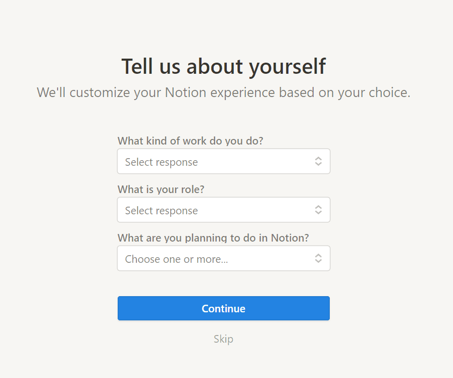
When you sign up for an account, Notion first asks you the kind of work you do, your role, and how you plan to use Notion so it can recommend the right templates and settings to help you get started.
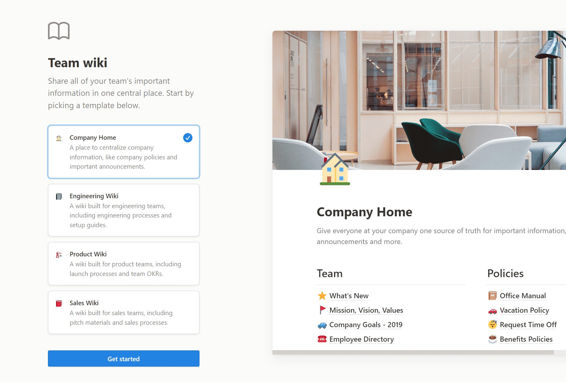
After that first intro, Notion populates your workspace with templates, resources, and databases based on the options you selected earlier. You’re then free to explore and engage with Notion pages relevant to your work.
The value here is that when you start using Notion immediately, you can see how it works for yourself and experience an “aha!” moment when you get tangible value, potentially even in your first session!
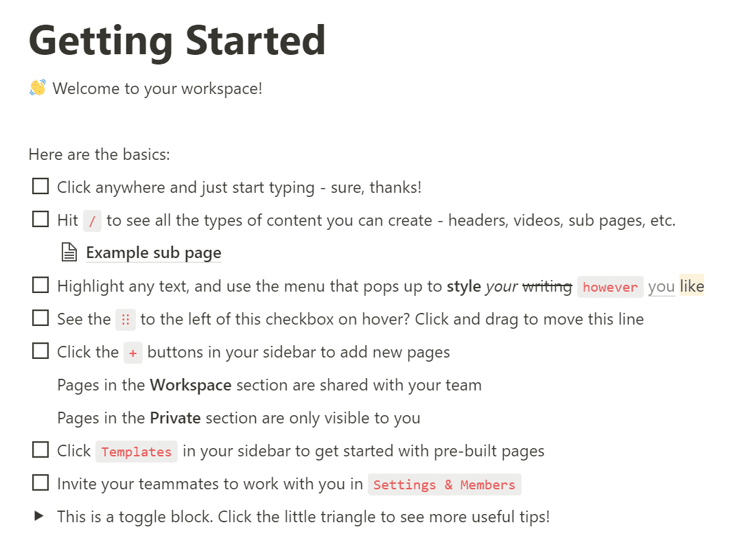
Finally, Notion generates a list of to-dos for you to complete and check off your list, such as:
- Click anywhere to start writing
- Hit the forward slash / to cycle through all the types of content formatting options
- Click toggle blocks to expand nested content
- Reorder content by dragging and dropping
By giving you a list of tasks, they are creating awareness of key features and guiding you toward getting value in a hands-on, engaging way.
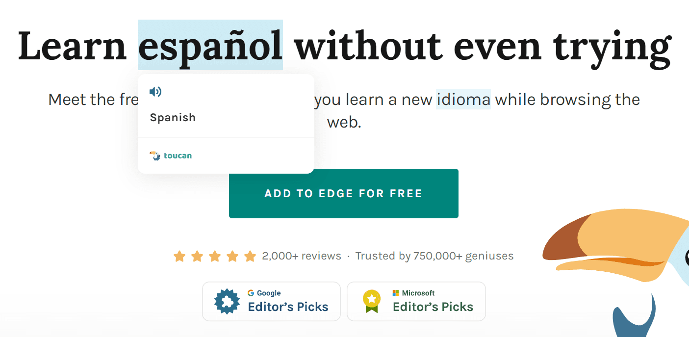
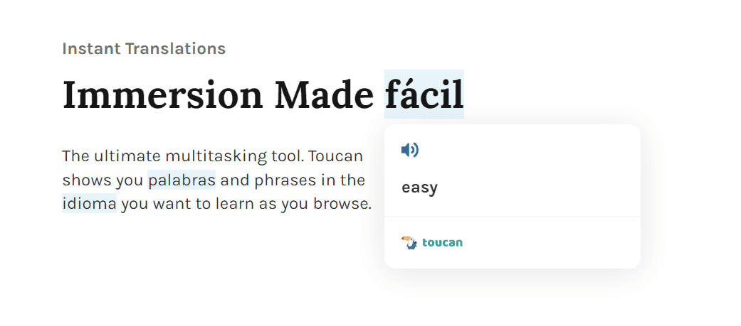
Toucan
Toucan is a Chrome extension that helps you pick up new languages by changing random words in your browser into the language you’re trying to learn — like their tagline says, you can learn a language without leaving your browser.
Since Toucan is a browser extension, you don’t need to sign up to use it, giving them a unique onboarding approach:
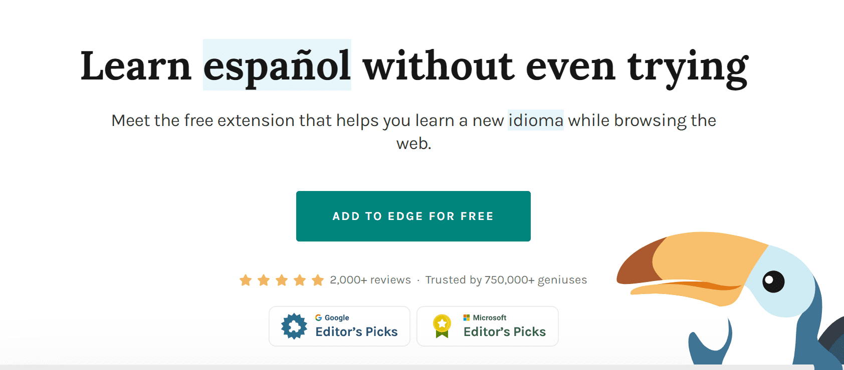
My browser is set to English by default, but as you can see, a few words all over Toucan’s homepage are randomly translated into Spanish.
The aim is to get you to hover over the words, and when you do, the Spanish word translates to English, and you can even hear a pronunciation by a native speaker.
What makes this onboarding effective? That little demo, which takes less than 10 seconds to complete, shows you how Toucan works and provides immediate value.
This is also a great example of meta onboarding: Toucan aims to teach you how to use its product by actually making you use it in a low-commitment way for just a few seconds to demonstrate that you can really start learning new words simply by surfing the web with its extension installed.
Onboarding UX Clicks Better With Whatfix
By now, you’re probably full to the brim with ideas for creating or iterating on your onboarding experience. Whatfix makes creating, analyzing, and testing new versions of your onboarding simple without needing a developer or data analyst to assist.
Let’s take a closer look at why so many companies choose Whatfix to power their onboarding UX.
Create personalized, engaging onboarding flows without technical resources with the Whatfix DAP
Whatfix’s digital adoption platform (DAP) acts as a canvas on top of your platform – once it’s implemented, anyone on your team can create, test, and iterate on your customer onboarding.
With the Whatfix DAP, you can:
- Create engaging Product Tours to help users get to know the platform and its value propositions
- Use tooltips and other UI elements to guide specific user segments to the functionality and guidance that they need, exactly in the moment that they need it
- Create and maintain a comprehensive knowledge base in Self Help so that new users can find extra information when they need it, decreasing customer drop-off
- Use Surveys to get customer feedback at different points in the onboarding flow, helping you understand how your customers are feeling and improve the onboarding experience based on those insights
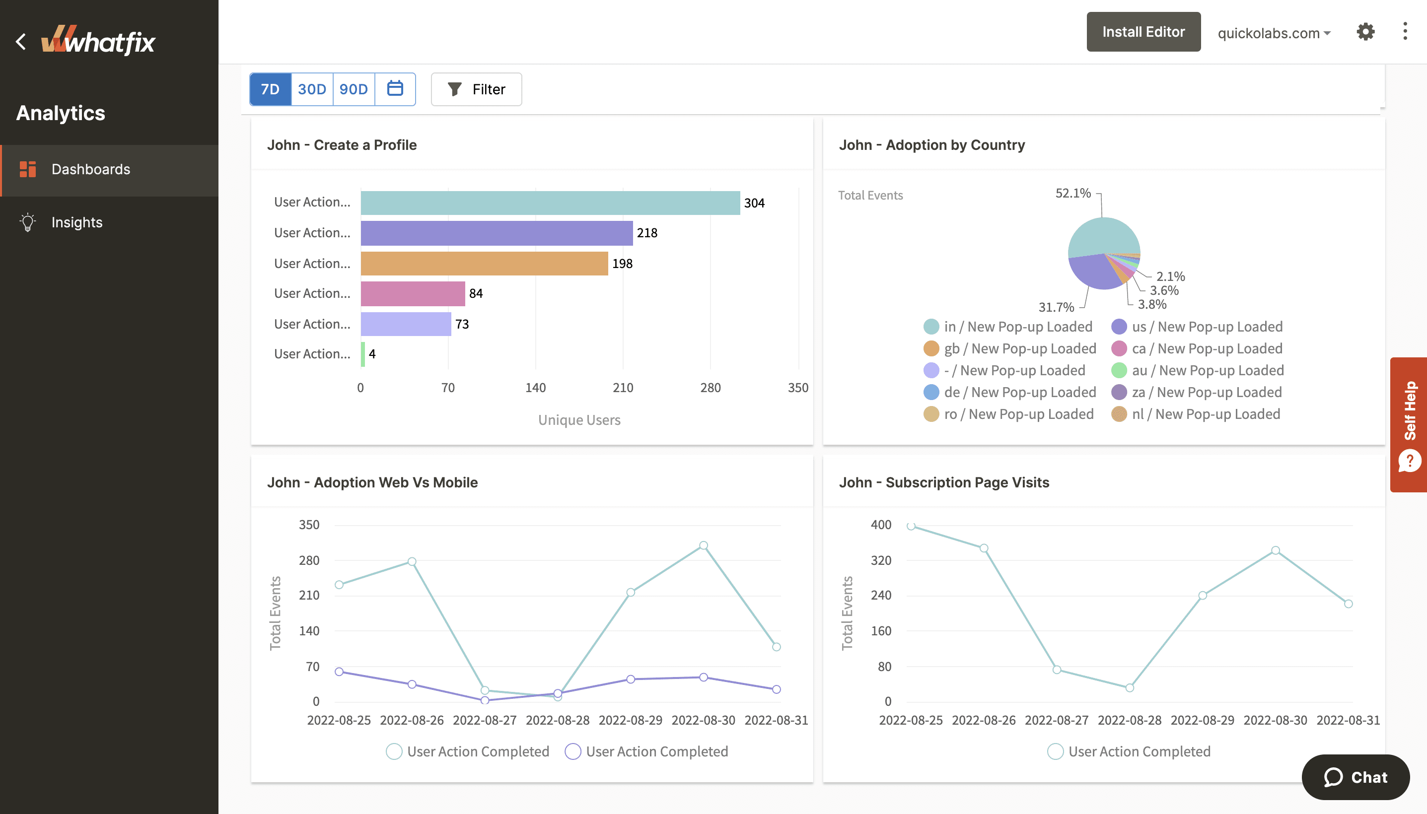
Analyze and tailor your onboarding experience to decrease friction and time-to-value with Whatfix Product Analytics
With an advanced, no-code analytics solution like Whatfix Product Analytics, anyone on your team can analyze and understand the user experience in a nuanced way. This allows your team to iterate on your onboarding UX in real time without waiting for a developer or a data analyst.
With Whatfix Product Analytics, you can:
- Visualize and identify areas of dropoff and friction in your onboarding to find key opportunities for onboarding iterations and UX improvements
- Set up customer events to track so that you can easily see how various onboarding iterations affect the key milestones in a user’s journey
- Benchmark and track onboarding success metrics such as time-to-value (TTV) and get a good understanding of how different onboarding iterations affect these metrics
Ultimately, your team can use all of this data to ideate new onboarding tests, each iteration bringing you closer to hitting your KPIs and improving the experience for new customers overall.
Are you ready to take your onboarding UX to the next level with Whatfix? Schedule a demo today!