









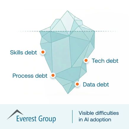



The weeks following a change rollout are when adoption is proven or lost. Users are executing updated workflows in production, and the earliest signs of failure are rarely seen across the whole program.
They appear inside one workflow, one step, or one cohort. A region stalls at a new approval path. New managers submit incomplete requests. Team members across larger departments are submitting similar help desk tickets every morning. By the time these patterns show up in monthly reporting, the damage has already spread into support queues, process delays, and leadership escalations.
This is where most enterprise change management efforts often fail to support organizational-wide adoption.
This article gives enterprise application owners and transformation leads a practical way to catch that risk earlier. Instead of relying on broad adoption averages, you’ll learn which change adoption metrics reveal workflow failure in the first 30 days, how to segment them by role, region, tenure, and environment, and how to turn red signals into weekly interventions.
The goal is a tighter operating system to stabilize critical workflows before weak adoption leads to missed business outcomes.
What Change Adoption Metrics Should Prove After Go-Live
For post-go-live teams, the goal is to prove that critical workflows are being executed correctly in production, by the right cohorts, with less friction each week.
Use three change adoption metric groups. Each serves a different purpose.
- Organizational performance metrics show whether the rollout is delivering the intended business outcome. Examples include workflow completion rate, cycle time, error rate, exception rate, tickets per active user, and process adherence.
- Individual performance metrics show whether users can execute workflows consistently. Examples include time-to-proficiency, step-level drop-offs, repeat failures, and help search patterns.
- Change management performance metrics show whether enablement activities reached users. Examples include training completion, comms reach, and guidance usage.
The third group matters, but it is supporting evidence. Training completion or communication reach can show that the rollout motion happened. They do not prove that adoption is working in production.
Leading indicators vs outcome validation
Post-go-live teams need both leading indicators and outcome validation, but they answer different questions.
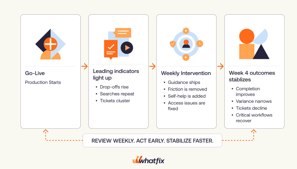
Leading indicators show where execution is breaking now. Examples include:
- step drop-offs rising at one workflow stage
- cohort variance widening week over week
- repeat ticket drivers clustering around one changed task
- help searches repeating before ticket volume spikes
Outcome validation shows whether the intervention worked by week 4. Examples include:
- workflow completion rate moving toward target
- time-to-proficiency improving for the lagging cohort
- tickets per active user declining after support content ships
- exception rates falling after workflow guidance is added
A change adoption metric only earns space in the scorecard if it leads to a decision and then to a shipped change. If nobody owns the response, it is reporting noise.
Keep change adoption metrics practical with these reporting rules
Every metric in the scorecard needs five things before it goes on a dashboard
- Operational definition: What exactly counts and what does not
- Cohort cuts: Which role, region, tenure, or environment the metric must be segmented by
- Data source: Which system produces the metric and how often it refreshes
- An accountable owner: Who reviews it and is accountable for acting on it
- Decision rule: What threshold or pattern triggers an intervention
What Change Adoption Metrics to Track
In the first 30 days after a change implementation, the goal is to identify where workflows are breaking and what to fix this week. This is where many transformation teams fall short.
Our 2026 State of Digital Transformation ROI report revealed that 61% of leaders still measure transformation success with only qualitative measures, making it difficult to quantify ROI or benchmark real progress.
For post-go-live teams, that is not enough. Stabilization needs workflow-level metrics that show where adoption is breaking down and what action should be taken next.
Primary change metric is workflow completion rate
Your headline metric should be workflow completion rate for critical tasks.
Set a 30-day target for each critical workflow. Then define stabilized using cohort consistency.
A change rollout is stabilizing when:
- completion rate is moving toward target for the workflow
- lagging cohorts are closing the gap
- variance between role, region, and tenure cohorts is narrowing
- support and exception signals are easing alongside completion gains
If the average looks healthy, but one high-risk cohort is still behind, the workflow is not stable.
Supporting change adoption metrics to track
Use a small supporting set to explain why completion is lagging
- Time-to-proficiency by role cohort: Shows how quickly each cohort can complete the workflow without repeated help or avoidable errors
- Step-level drop-off rate: Shows exactly where users are abandoning or failing within the workflow
- Error and exception rate: Captures validation failures, reversals, rejected submissions, and other signs of broken execution
- Tickets per active user by role: Normalizes support demand so one large team does not distort the signal
- Self-service resolution rate: Shows whether users can resolve issues in the flow of work without escalating to support
- Top repeat ticket drivers by workflow step: Helps pinpoint whether the same workflow moment is repeatedly generating support demand
How to Operationalize Your Change Adoption Reporting
Change adoption reporting must start with the workflows, cohorts, decision rules, and governance needed to make the dashboard useful. The goal is to give application owners and transformation teams a weekly operating view of where adoption is breaking, who is affected, what action is needed, and whether the intervention worked.
1. Define the critical workflows
Focus on the workflows carry the highest operational, compliance, or support risk if users get them wrong. Include:
- core production tasks that drive the intended business outcome
- high-volume tasks that affect a large user group
- high-risk tasks where errors create rework, delays, or compliance exposure
- exception paths and approval steps
Treat each workflow as a set of microbehaviors. Break it into observable steps such as field entry, approval selection, validation handling, and submission.
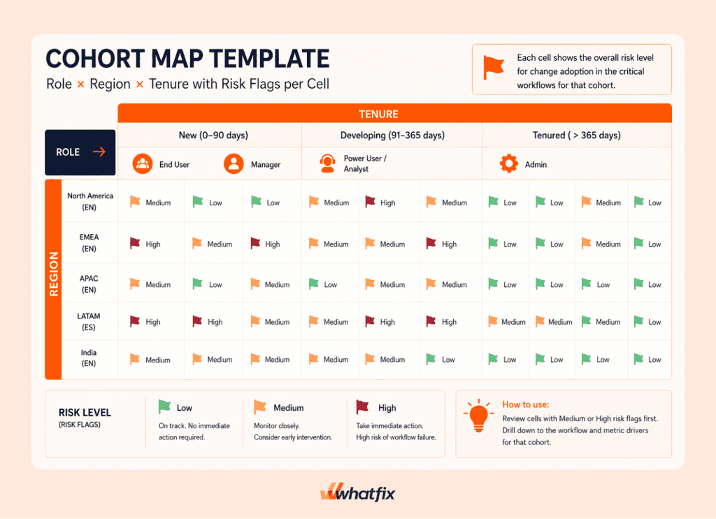
2. Segment users into cohorts
Do not review adoption metrics as one blended average. Segment users before you read the data so you can see where adoption risk is concentrated.
Required cohort cuts include:
- role
- region
- language
- tenure
Other useful cuts may include business unit, company branch, application environment, user type, or any business-specific grouping that helps explain adoption patterns.
This matters because rollouts fail in concentrated pockets. One region may struggle with a localized process. One role may hit a changed approval step more often than others. New users may fall behind while tenured users look stable.
If you’re only measuring overall averages, you miss key adoption risk points until it becomes a large problem
3. Set decision rules for each metric
Every metric must have a decision rule before it goes on the scorecard. A decision rule tells the team when a metric needs action, who must respond, and what type of intervention must happen next.
For example:
- If drop-offs rise at one workflow step, review what changed at that step and ship targeted guidance, field reinforcement, or workflow clarification before the next weekly review.
- If one cohort lags behind others, check whether the issue is tied to role, region, tenure, language, or environment, then create a cohort-specific intervention instead of retraining everyone.
- If tickets cluster around one workflow moment, add contextual self-help or guided support at that point so users can resolve the issue without leaving the task.
- If self-service usage increases but resolution does not, improve the content, placement, or searchability of help resources so users can complete the workflow without escalation.
Decision rules keep reporting operational. Metrics should not only describe what happened. They should tell the team what to fix this week and what to recheck in the next review.
4. Build the change adoption dashboard and reporting view
Once workflows, cohorts, and decision rules are clear, build the dashboard around the questions your weekly review needs to answer.
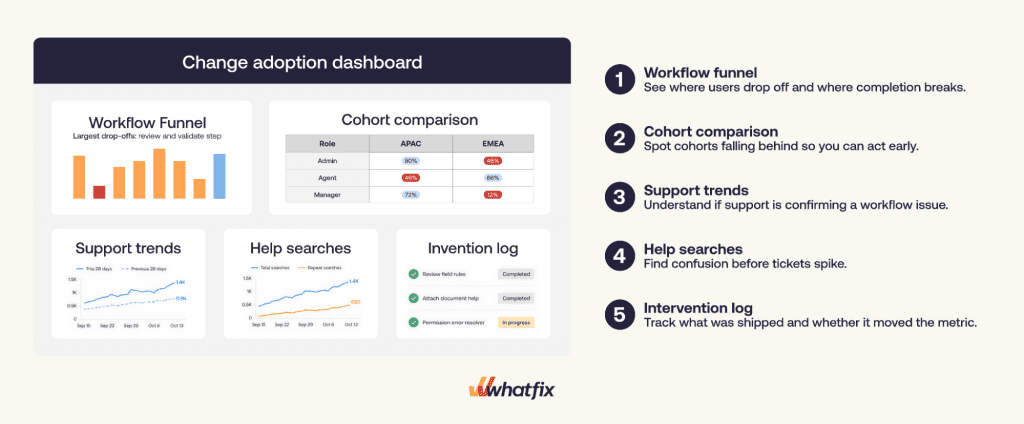
A strong change adoption dashboard should show:
- where the workflow is breaking
- which cohort is falling behind
- what support signal confirms the issue
- what intervention was shipped
- whether the metric moved after the change
Use a focused set of views tied to one workflow set:
- Workflow funnel with step-level drop-offs: Shows where users enter the workflow, where they fail, and where completion breaks.
- Cohort comparison by role, region, tenure, or environment: Shows whether one group is falling behind even when overall performance looks stable.
- Ticket trends and repeat drivers by workflow step: Connects support demand to workflow behavior and shows which steps are creating recurring issues.
- Help searches and top queries: Surfaces early confusion before it becomes ticket volume.
- Intervention log tied to metrics: Records what changed, when it changed, which cohort it targeted, and which metric it was meant to improve.
Together, these views create a closed loop. You can see the failure, confirm it with support and search signals, act on it, and then validate whether the intervention worked.
For the weekly reporting cadence, keep the review short and action-oriented:
- Review the workflow completion rate, cohort variance, and red metrics.
- Inspect the failing step, affected cohort, ticket drivers, and help searches.
- Assign the intervention owner and ship date.
- Log the expected metric movement for the next review.
5. Maintain governance for measurement integrity
A dashboard is only useful if the data behind it is trusted. Without basic governance, metrics drift and teams lose confidence in the signals.
Maintain integrity through:
- Consistent event naming: Workflow steps, completion events, errors, and exceptions should be defined the same way across releases. If definitions change, trends become unreliable.
- Controlled access to metrics: Limit who can create or modify tracked events and dashboard logic. Too many editors leads to inconsistent definitions and conflicting views.
- Alignment with workflow changes: Every time a workflow, field, rule, or approval path changes in production, the tracking should be reviewed and updated accordingly.
Without this discipline, the same metric can mean different things across weeks. Once that happens, the dashboard stops being a decision tool and becomes something teams have to explain instead of use.
The Leading Indicators That Predict Change Adoption or Failure Early
Once your reporting structure is in place, the next step is knowing which patterns deserve immediate attention. Leading indicators help teams separate normal post-launch noise from adoption risks that need intervention.
Single-step failure patterns
This is the most direct signal of workflow friction.
What to look for
- one workflow step where drop-offs increase week over week
- the issue is concentrated in a specific role, region, or tenure group
- earlier steps in the workflow remain stable
This pattern tells you the problem is something specific that changed at that step.
What it usually indicates: a new validation rule, unclear required field, changed approval step, or permissions issue.
What to do: focus on that exact step. Review what changed, validate whether the issue is cohort-specific, and ship targeted in-workflow guidance or fixes at that point. Avoid broad retraining. The issue is localized.
Cohort variance patterns
A rollout can appear stable at an aggregate level while one cohort continues to struggle.
What to look for
- overall completion looks acceptable
- one group consistently underperforms
- the gap between cohorts widens across weekly reviews
What it usually indicates: differences in role responsibilities, regional process variations, language or training gaps, or environment-specific friction such as VDI.
What to do: isolate the lagging cohort and compare it with stable groups. Identify what is different in their workflow experience and intervene specifically for that group.
Support signals patterns
Support data becomes valuable when it is tied to workflow behavior, not just volume.
What to look for
- ticket spikes linked to a specific workflow step
- repeat issues that continue beyond week 1
- higher tickets per active user for one cohort
What it usually indicates: users cannot complete a specific task without assistance, the issue is systemic rather than one-off, or one group is disproportionately dependent on support.
What to do: map ticket themes back to the workflow step causing the issue. Fix the root cause where possible and add contextual support at that moment so users can resolve issues without creating tickets.
Search signal patterns
Search behavior often surfaces confusion before users escalate to support.
What to look for
- repeated queries for the same issue
- queries that align with known drop-off steps
- rising search activity without improved completion rates
This is an early indicator that users are stuck but trying to self-resolve.
What it usually indicates: users are trying to self-resolve but lack clear, accessible, or contextual help.
What to do: analyze the exact queries users are entering and connect them to the failing workflow step. Improve or surface contextual help directly at that point so users can complete the task without leaving the workflow.
Across all these patterns, the principle is the same – find where the breakdown is concentrated, act at that point, and measure whether that specific fix improves behavior in the next review cycle.
How Whatfix Operationalizes Change: From Rollout to ROI
Whatfix helps teams move from detection to action by connecting the scorecard, the dashboard, and the intervention layer in one operating loop.
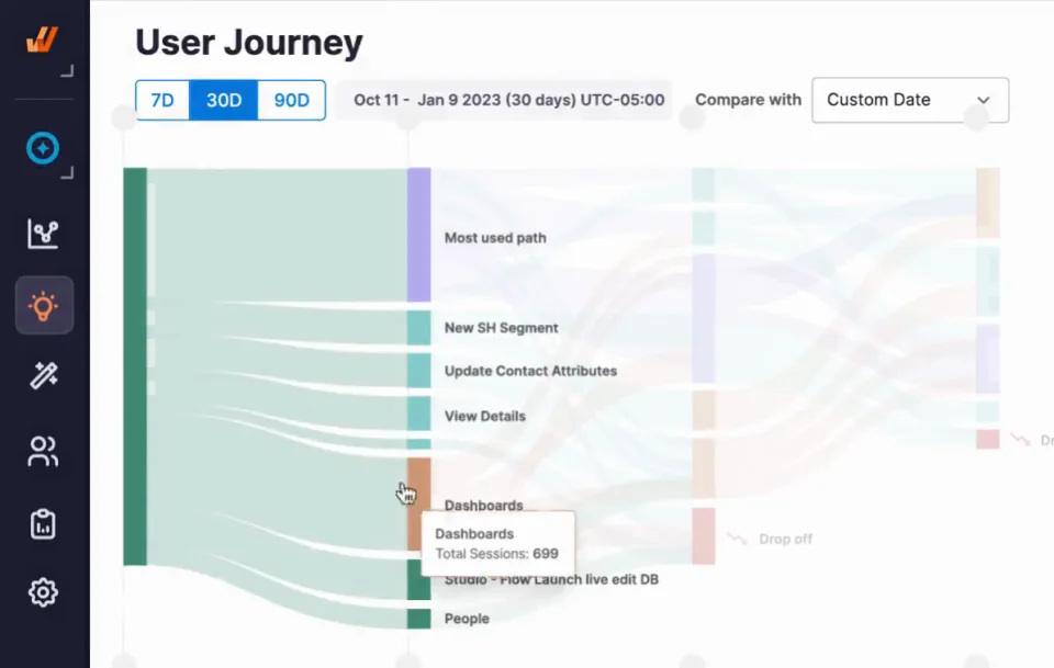
Product Analytics for funnels, cohorts, prioritization fixes, and adoption tracking
Whatfix Product Analytics helps teams build the views that matter most in the first 30 days after go-live:
- workflow funnels that show the exact step where completion breaks
- cohort views by role, region, and tenure to isolate who is falling behind
- trend views that compare week 1 and week 4 movement
- prioritization based on where drop-off, errors, and support load are concentrated
This is what prevents false wins. A blended average may look stable while one high-risk cohort is still struggling. Segmentation makes that visible early.
Whatfix DAP for targeted in-workflow interventions
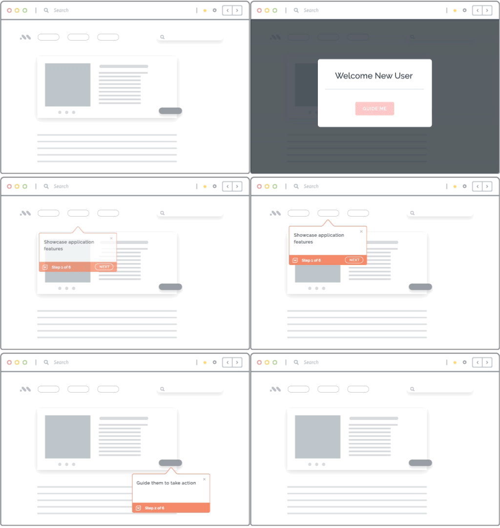
Once the failure step is clear, Whatfix DAP helps teams respond inside the workflow itself
- guide users at the exact step where they are dropping off
- reinforce required fields, approvals, and exception handling
- trigger in-app change prompts when a release introduces a new path, rule, or policy
- support a lagging cohort without forcing every user through broad retraining
This is what makes the response operational. Instead of sending another email, adding another training session, or asking support to absorb the issue, teams can place the fix where execution is breaking.
Self Help for ticket containment tied to workflow steps
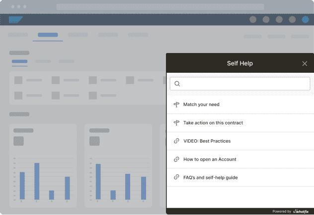
When support demand clusters around one task, Whatfix Self Help gives users contextual answers without pulling them out of the workflow.
- surface help in the workflow moment where confusion occurs
- deflect repeat questions before they become recurring tickets
- track self-service resolution rate
- monitor repeat drivers to see whether the issue is truly improving
This is especially useful when users are not blocked by a complex issue. They just need the right answer at the right moment to finish the task without opening a ticket.
Surveys for root cause signals when behavior data is not enough
Behavior data tells you where failure is happening but it does not always explain why.
Use targeted surveys when:
- a failing step has multiple possible causes
- the same cohort is struggling, but the root cause is unclear
- you need to confirm whether the issue is confusion, policy ambiguity, access, or confidence
Mirror for preparing users and testing workflows before the launch
With Mirror, IT and user enablement teams can quickly clone applications, workflows, and tasks to provide a risk-free sandbox for users to gain hands-on experience pre-launch. Paired with AI roleplay and guided workflows, users can adopt entire workflows and be ready for launch feeling confident they can complete their work without intervention.
Use this simulation environment to conduct user acceptance testing (UAT) to identify friction points, errors, and other workflow pain points before launch.

This is the value of an integrated adoption layer. Teams do not just detect risk earlier. They can intervene inside the workflow, measure whether behavior changed, and show leaders that stabilization is improving with evidence.
If you are looking to stabilize a major enterprise software rollout, Whatfix gives you the adoption infrastructure to detect friction early, intervene inside the workflow, and prove improvement with measurable adoption data.
Request a Whatfix demo to see how Product Analytics, DAP, Self Help, and in-app feedback work together to turn post-go-live risk into a measurable stabilization plan.