UserGuiding is a cost-conscious digital adoption platform that matches most of its competitors’ features, and offers product teams tools such as onboarding checklists, product tours, NPS surveys, in-app messaging, and resource centers where you can store all your product documentation and help articles.
UserGuiding also offers responsive customer support and just keeps improving its product. It’s a cheap option for early-stage startups and SMBs —it has just enough features to help you start teaching users how to navigate your website or application.
But once you start scaling up to your first couple thousand users, you might begin to notice that UserGuiding isn’t growing with your business; it’s a smaller company, and there’s still a lot of work required to scale up the platform for mid-tier and enterprise users.
This article will break down UserGuiding into the good, the bad, and the ugly. The aim is to help you understand if it fits your onboarding and digital adoption needs. To achieve that, we will examine UserGuiding’s core features, its limitations, and the best alternatives to explore a tool for building onboarding and in-app experiences.
What are the best alternatives to UserGuiding?
- Whatfix
- Userpilot
- Stonly
- Appcues
- Pendo
- HelpHero
- IntroJS
What Is UserGuiding?
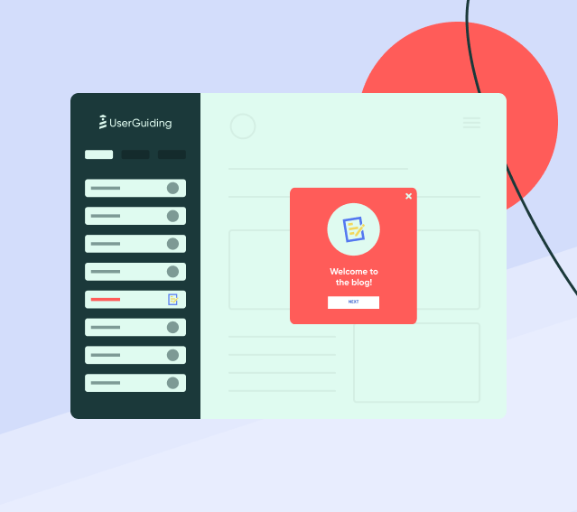
UserGuiding is a no-code onboarding platform designed to help product teams onboard new users and teach them how their product works with step-by-step walkthroughs. The aim is to help you reduce the time-to-value for your product so that new users can start loving it faster.
UserGuiding Features
UserGuiding has several features designed to help product companies educate new users on how their product works and how to navigate their UI.
1. Resource Center and User Support
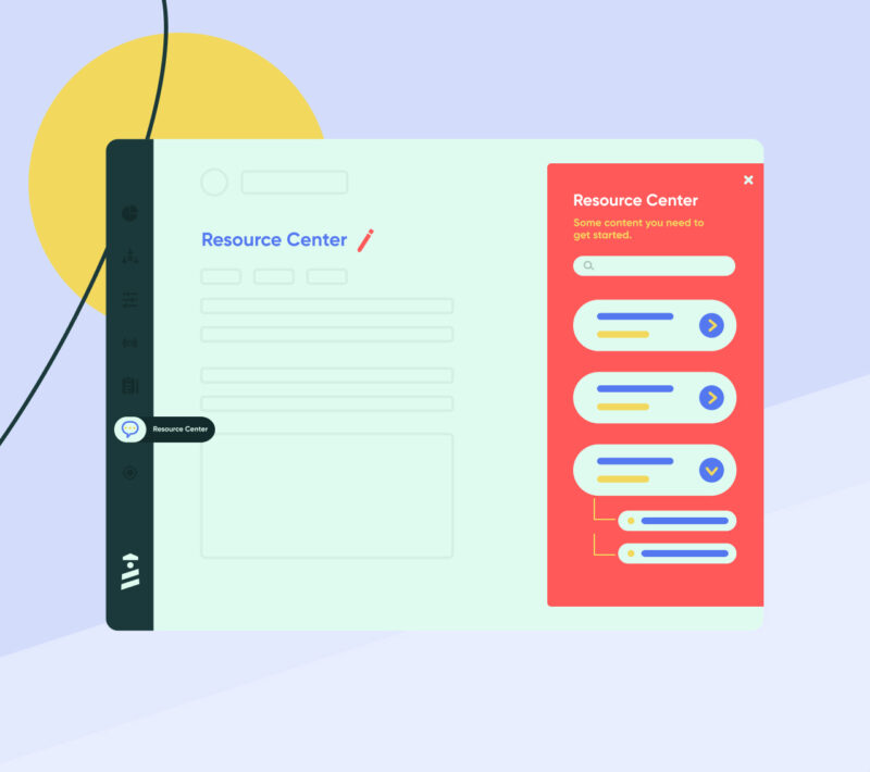
You can use UserGuiding to host resource centers that serve as a dock for all of your product documentation, blog posts, webinars, and help docs—essentially one place where you store all your product content so that users can access it easily.
The problem is that such libraries can quickly become bloated with outdated webinars and antiquated documentation and customers might have difficulty sifting through them all.
2. Onboarding and User Experience Analytics
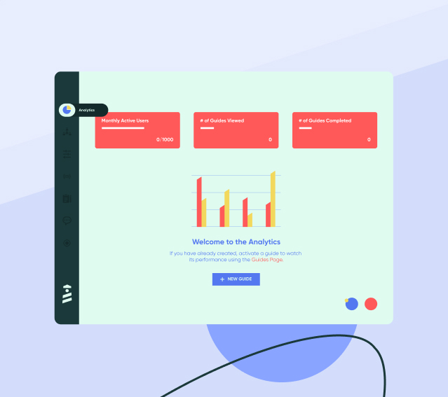
UserGuiding offers product analytics that’s designed to help product managers understand how users interact with their product, where they encounter issues, how many actions they complete, the product resources they view (and how often), and the features they use most.
Those metrics will help you understand how to build a user-friendly product experience, reduce churn, and increase your retention rates.
3. Net Promoter Surveys
Net promoter surveys are usually phrased like this, “On a scale of 1 – 10, how likely are you to recommend our product?”
That question is usually followed by a few others which can have either multiple choice answers or free text areas where users elaborate on their answers, explaining why they’re (not) likely to recommend your product, and suggest what you can do better.
UserGuiding helps product teams survey users right inside their product or website interface. It records their responses, automatically calculates your overall Net Promoter Score (i.e. promoters minus detractor), and shows you how your performance is improving or worsening.
4. Onboarding Checklists
When new users sign up for your product, it can be overwhelming to find their way around, try out new features, and get a grip on how the user interface works. An onboarding checklist is a list of actions a (new) user is expected to complete before they start using the product, to understand how it works and learn how to navigate the user interface.
They break down the product’s features into simple tasks a new user has to check off a list to master how the product works.
5. User Segmentation
UserGuiding helps with segmenting users on the onboarding experience to show different users unique content depending on their role, their pricing tier, language, preferences, etc.
It’s helpful when you’re marketing your product in different markets or to different user personas, or if you have a flexible product like Notion or ClickUp that can be used for a wide range of unrelated use cases.
UserGuiding Pricing
- Basic: $69 per month, for up to 2,500 monthly active users
- Professional: $299 per month, for up to 20k monthly active users
- Corporate: $499+ per month with custom user counts —enterprise users get service level and data processing agreements, personalized coaching, and unlimited access to all UserGuiding’s features
UserGuiding has Basic, Professional, and Corporate pricing plans that offer different levels of functionality and support more users the higher you go. Users can’t add more users to any pricing tier for a small amount, rather, you have to upgrade to the next plan.
4 Reasons to Consider a UserGuiding Competitor
UserGuiding might be a good onboarding platform, but you will feel limited because of its lackluster advanced product adoption features. If you’re wondering, both words cannot be used interchangeably as they refer to different things.
User onboarding aims to familiarize users with your product’s interface and to help them find their way around your website, application, or whatever resource you’re promoting; on the other hand, product adoption doesn’t end until your users start to depend on your product and use it as a part of their workflow. In many cases, product adoption continues even past that and is reflected as user support and help content.
We’ll break down UserGuiding’s limitations and why it may not be your best bet if you’re looking for a platform designed to help you engage your users from signup until they find their “aha!” moment.
1. UserGuiding is built specifically for user onboarding, not product adoption
That, on its own, is not a bad thing. Until you realize onboarding is just one part of the bigger equation of product adoption. After all, the aim of using banners, checklists, and visual highlights is not just to show users how your product works. The bigger picture goal is to cultivate their attention, get those users to adopt your product as their go-to, and keep them coming back.
I’m going to use Notion as an illustration to help you understand better the difference between onboarding and product adoption. Notion is a productivity and note-taking software you can use to write documents, manage tasks and projects, organize your calendar, etc.
Let’s say you sign up for a Notion account and review all the items on your onboarding checklist. Within a week you’ve learned how to create new documents, tasks, Gantt charts, wikis, etc. But, you still think Google Docs is simpler and does everything you need nicely so, while you might use Notion to take notes once, in a while, it never becomes your go-to notetaking and productivity platform.
In that case, Notion’s onboarding experience has worked great, and you’ve learned how their platform works. But you haven’t adopted it as an important part of your life. So, there’s no chance you will ever upgrade to a paid account.
That’s why product adoption beats onboarding, especially if you sell a freemium software product where users can stay on a free forever plan until they are ready to upgrade. User onboarding teaches users to navigate your product; adoption makes them committed users that can’t live without your product—and UserGuiding doesn’t do a very great job at it.
After the initial onboarding experience, UserGuiding lacks strong product adoption features that will help you engage users throughout the user lifecycle until they find their “aha” moment.
2. Limited localization functionality
If your product serves multilingual audiences, you need to localize your onboarding experience. An ideal product onboarding platform should be able to automatically translate guides, banners, pop-ups, and help docs to your users’ preferred languages.
At the moment, UserGuiding’s localization is poor at best. To serve onboarding resources in multiple languages, you must create different versions of the same guide. Those multiple copies count towards your limit (UserGuiding’s Basic plan is limited to 20 guides) and will easily push you up to a costlier tier (i.e. Professional at $3,588/yr).
3. You need to be familiar CSS to customize UserGuiding content
UserGuiding promotes its product as a no-code onboarding platform non-technical product managers can use to build onboarding experiences via a drag-and-drop interface.
That’s true for the most part, but once you start using their platform extensively, you will come across multiple use cases where you can’t adjust elements visually, and you’ll need to know how to code in CSS to customize them further.
4. Limited native analytics
UserGuiding offers native analytics showing how many of your users view your guides and interact with your onboarding elements. But those metrics are underwhelming unless you integrate with a third-party product analytics tool like Mixpanel.
UserGuiding’s native analytics limits users to basic metrics such as view counts and completion rates.
7 Best Alternatives to UserGuiding
If you’ve stayed with us so far, you may have doubts about using UserGuiding. Again, UserGuiding is not a bad product, but we think it’s inadequate for the needs of larger product-focused companies.
So, what alternatives should you consider instead?
How do they measure up compared to the features of UserGuiding that we already covered? In this section we are going to break down seven alternatives you can use instead of UserGuiding, by explaining their strengths, weaknesses, and everything in between.
1. Whatfix
- Review Rating: 4.6 out of 5 stars, across 238 reviews
- Pricing: Reach out for a custom quote
Whatfix is a digital adoption platform alternative to Spekit that has been named a Leader in G2’s Digital Adoption Platform category for 4 straight years. Whatfix is an all-in-one, no-code product adoption and analytics platform product teams can use to educate new users, increase retention, reduce churn, and help new customers find their “aha!” moment faster.
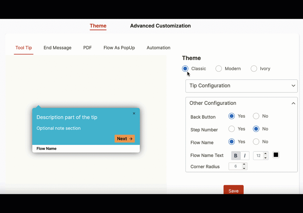
Whatfix acts like an extra layer on top of your application that helps new users understand how your product works and reduces your users’ time-to-value.
Whatfix’s core values are “Analyze, Build, Deliver”, which means understanding how users are engaging with your product, building new user flows and content to drive adoption, and deliver better overall product experiences.
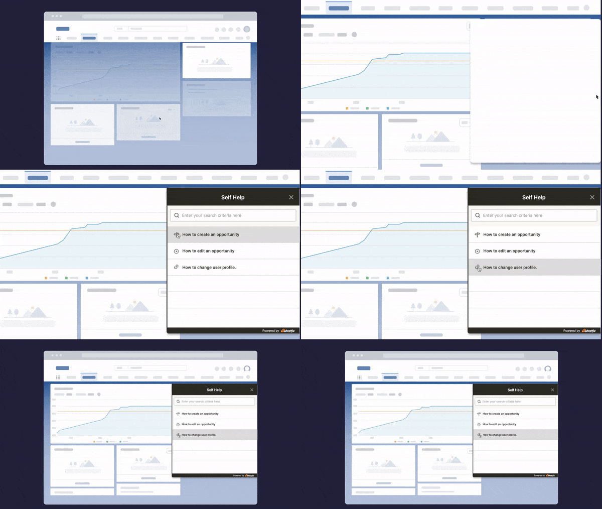
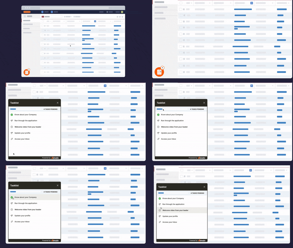
Whatfix’s core features include:
- Teach new users’ how to use your product with step-by-step walkthroughs that work on mobile and web applications; you can also insert images, videos, audio clips, and GIFs into your walkthroughs. Whatfix lets you reorder the steps of your product walkthroughs and to customize which slides your users see depending on their attributes (such as which pricing tier they are signed up to )
- Announce new features and product updates, or ask users to complete surveys with non-intrusive popups, hotspots, and notifications
- Collect feedback with dynamic surveys that can target specific groups of users, such as those who have completed their onboarding or their security certification
- Automatically translate your onboarding resources into 70+ languages from just one version
- Use our product analytics hub to learn how your users navigate your product, how often they read your help documentation. That’ll help you identify users who are about to churn and resolve their issues proactively.
Here are a few additional reasons to choose Whatfix as your DAP:
- Easy installation: While WalkMe installation requires some technical knowledge, starting with Whatfix is as simple as adding a browser extension.
- Automated content creation: When you create walk-throughs, Whatfix automatically generates the information in multiple content formats, including slideshows and videos.
- SCORM Compliance: Whatfix’s SCORM-compliant packages enable you to easily upload walk-throughs to your learning management system (LMS) to create interactive courses.
- Contextualized guidance: Whatfix offers relevant walk-throughs and self-help articles, depending on the person’s role and their location within the application.
Analyze, build, and deliver better experiences with Whatfix’s no-code product adoption and analytics platform.
Set up your personalized demo now
2. Userpilot
- Review Rating: 4.6 out of 5 stars
- Pricing: Starts at $249 per month, billed annually (i.e. $2988/yr)
Userpilot limits how much you can customize the onboarding process and their UI looks a bit outdated. Secondly, the product often isn’t as intuitive as you expect it to be, analytics are lackluster, and reporting is quite basic.
Their pricing also seems a bit steep (i.e. $2988/yr) and you will get bumped into their costliest tiers once you exceed 10k MAUs.
3. Stonly
- Review Rating: 4.8 out of 5 stars
- Pricing: Starts at $99 per month, billed annually (i.e. $1188/yr)
Stonly is a decent onboarding platform for building interactive guides and step-by-step walkthroughs for your website or SaaS product.
For what it’s worth, Stonly lets you embed your onboarding docs on your third-party applications (Zendesk, HubSpot, and Salesforce) but it lacks some basic features like checklists, tooltips for calling your users’ attention, and it doesn’t work out of the box either—you may need to rewrite some parts of your application to get Stonly to work, especially if your product’s frontend is built with a framework like AngularJS.
4. Appcues
- Review Rating: 4.7 out of 5 stars
- Pricing: Starts at $249 per month, billed annually (i.e. $2988/yr)
Appcues is easy to set up, and its Chrome extension helps you design onboarding elements on top of your webpages.
On the downside, its pricing is very steep once you upgrade from its basic plan (their mid-tier Growth plan costs $10,548/yr) and throughout the product, you’ll notice certain features are a bit underwhelming. For example, you can’t use conditional branching logic (i.e. if-then loops) to customize your NPS surveys based on a user’s answer to a previous question.
Secondly, Appcues’ basic plan, i.e. Essentials costs just $2988 per year, but it lacks so many can’t-do-without features like localization. Basically, if you’re onboarding customers in any language other than English, you need to upgrade to Appcues’ Growth plan (i.e. $10.548/yr).
It can also be difficult to integrate Appcues with your application, depending on the framework it’s built on.
5. Pendo
- Review Rating: 4.5 out of 5 stars
- Pricing: Contact for pricing
Pendo offers an impressive suite of tools for product-led growth —so much that it can be confusing figuring out how their platform works. It’s also the most expensive option ($15k to $50k per year) on our list and for that price point, it has poor filtering, complicated reporting, and customizing your guides with HTML and CSS often breaks some other parts of Pendo.
6. HelpHero
- Review Rating: 4.9 out of 5 stars
- Pricing: Starts at $55 per month, for 1,000 monthly active users (MAUs)
Compared to most of the UserGuiding alternatives we’ve covered so far, HelpHero is one of the cheapest, it offers a wide set of features that can easily compete with other alternatives, and you can get started almost immediately with HelpHero’s Chrome extension.
On the other hand, HelpHero’s offers limited no-code formatting, and to get a specific look, you will need to customize your elements with CSS. HelpHero also has poor documentation, offers limited analytics, and the aforementioned custom CSS can impact user experience and make your application load slower.
7. IntroJS
- Pricing: Free for non-commercial projects; mid-tier plan starts at $49.99 for a lifetime license
Intro.js is a lightweight JavaScript library that helps you add highlights and step-by-step walkthroughs to your product.
Although it is quite basic, Intro.js is a decent option if you’re a developer or hobbyist tinkering with a WordPress website, but not if you’re a business or a SaaS that just wants a solution that works out of the box. Secondly, its features are limited to floating tips, progress bars, and embeddable help docs.
Intro.js lacks advanced onboarding features such as checklists, help centers, and detailed user analytics; it offers zero feedback on how your users interact with your product or if they’re encountering friction at any stage.
Why Whatfix Is the Best UserGuiding Alternative
Compared to UserGuiding, Whatfix offers:
- A product adoption platform designed for the entire user lifecycle. UserGuiding focuses on the onboarding experience and on helping users become familiar with your product; Whatfix helps you cultivate product evangelists that love your product and promote it without any monetary incentive.
- Strong localization features—Your users can choose their preferred language, and Whatfix will automatically translate any onboarding or help resources they’re viewing. We currently support 70+ major languages including Spanish, French, German, Hindi, and Mandarin.
- A drag-and-drop interface that you can use to build experiences without code. You can also inject CSS and jQuery into your onboarding experiences to generate animations, and customize your layouts, colors, and fonts.
- Powerful product analytics that’ll help you track how your users are interacting with your onboarding resources at every stage of their lifecycle. You can also narrow it down to individual users to see how they’re engaging with your user documentation.
- Multi-channel product adoption—Whatfix works for desktop, mobile, web, and custom applications
Whatfix simplifies the onboarding process with step-by-step walkthroughs, and non-intrusive checklists, pop-ups, and self-help documentation that your users can navigate at their own pace. Our platform puts your onboarding on autopilot so that you can focus on building a great product.

